Designing a digital interface that is equipped to handle all of the capabilities modern cars have without simultaneously being a cluttered, overwhelming mess is a challenge, to say the least. Some automakers have gone for the kitchen sink approach of lavishing their dashboards with pillar-to-pillar touchscreens, which might be cool to look at in still images but are absolutely vexing to imagine using in practice.
If the idea of a five-foot dashboard display in your next car doesn’t appeal to you, you’ll be pleased to learn Lucid has demonstrated some restraint in designing the UI of its upcoming Air sedan. I actually went for a ride in a Lucid Air just this past weekend at the Amelia Island Concours d’Elegance, and while I got to see some of this system in action, the video Lucid released today offers a more comprehensive look into everything it can do and how it’s organised.
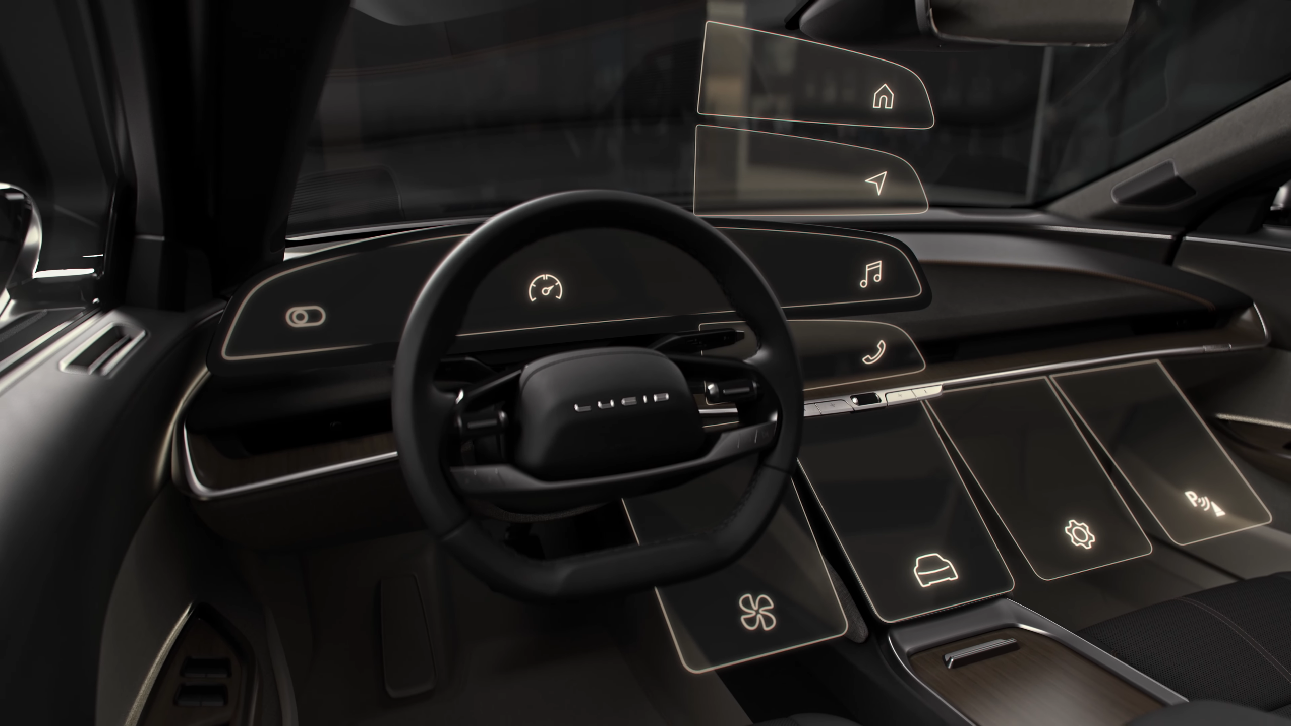
Dominating the left half of the dashboard is where you’ll find what Lucid calls the Glass Cockpit: a 34-inch, touch-sensitive instrument cluster display. It’s not really a singular 34-inch screen though — it’s actually three separate panels, broken up by categories and grouped by similar controls.
The smallest, left-most panel concerns critical functions related to things like the headlights, locks and windshield wipers. The next one to the right is of course the main cluster, with your speed and charge level. And the rightmost display above the middle of the dashboard is your typical infotainment screen, with items pertaining to media, communication and navigation. The interface itself is pretty spartan, warm and easy on the eyes, with readable fonts atop sparse gradient backgrounds.
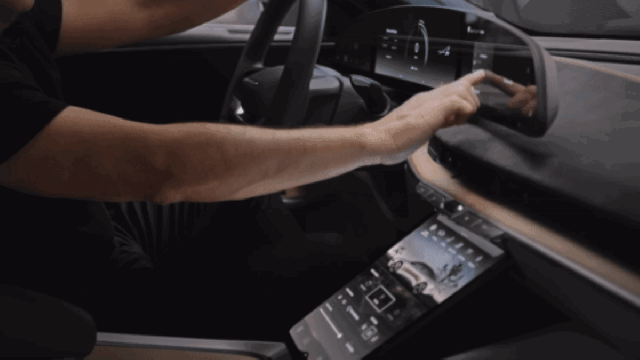
All three screens are mounted on a subtly curved panel oriented toward the driver — though, notably, none of those are the biggest display in the car. That’s devoted to what Lucid calls the Pilot Panel: a tablet that slides out from the centre of the dashboard and tilts down for easy operation for both the driver and front-seat passenger.
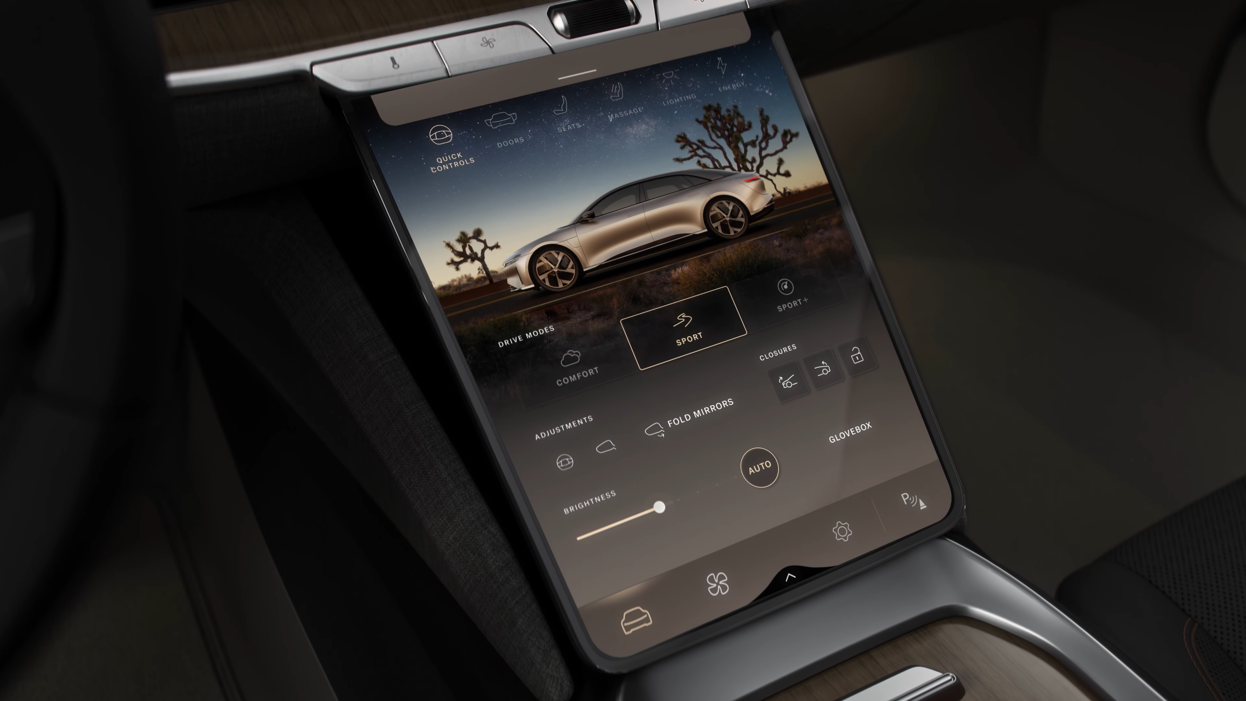
The Pilot Panel includes deeper functions for drive modes, the doors and seats, lighting and climate controls. There are also hard physical keys above it for dual-zone fan speed and temperature, in addition to a large central knob for volume. These are probably the most frequently-adjusted controls in a vehicle, so it’s great that Lucid is offering true buttons so drivers can keep their eyes on the road while fiddling with them. There are also knobs and buttons on the steering wheel, too.
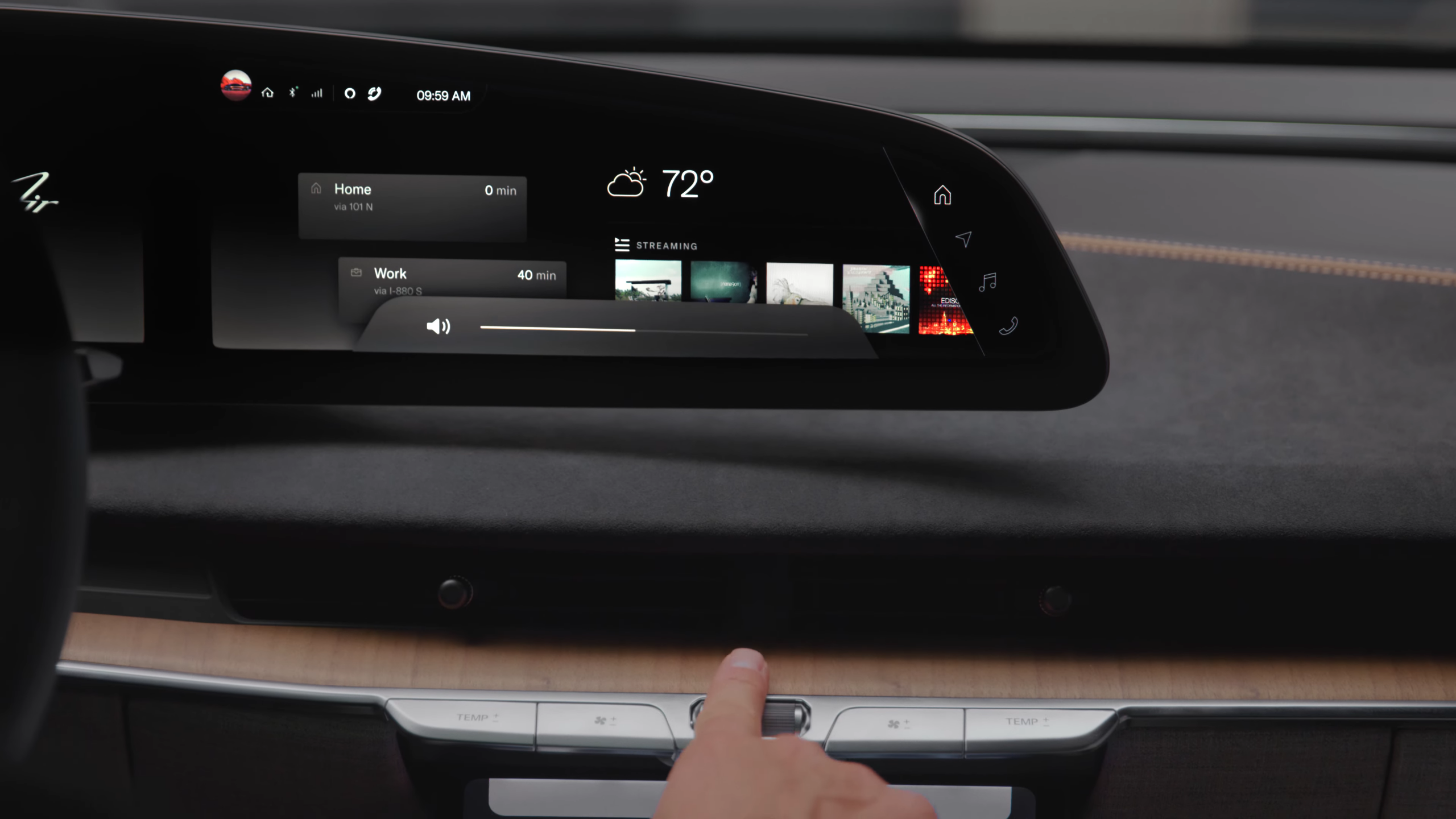
What’s more, items on the infotainment portion of the Glass Cockpit — like, say, a list of contacts — can be flicked down, drawer style, to the Pilot Panel for a closer look and further options. This is a clever idea to really tap into the versatility of a multi-screen interface like the Air will have, and a growing number of cars are getting.
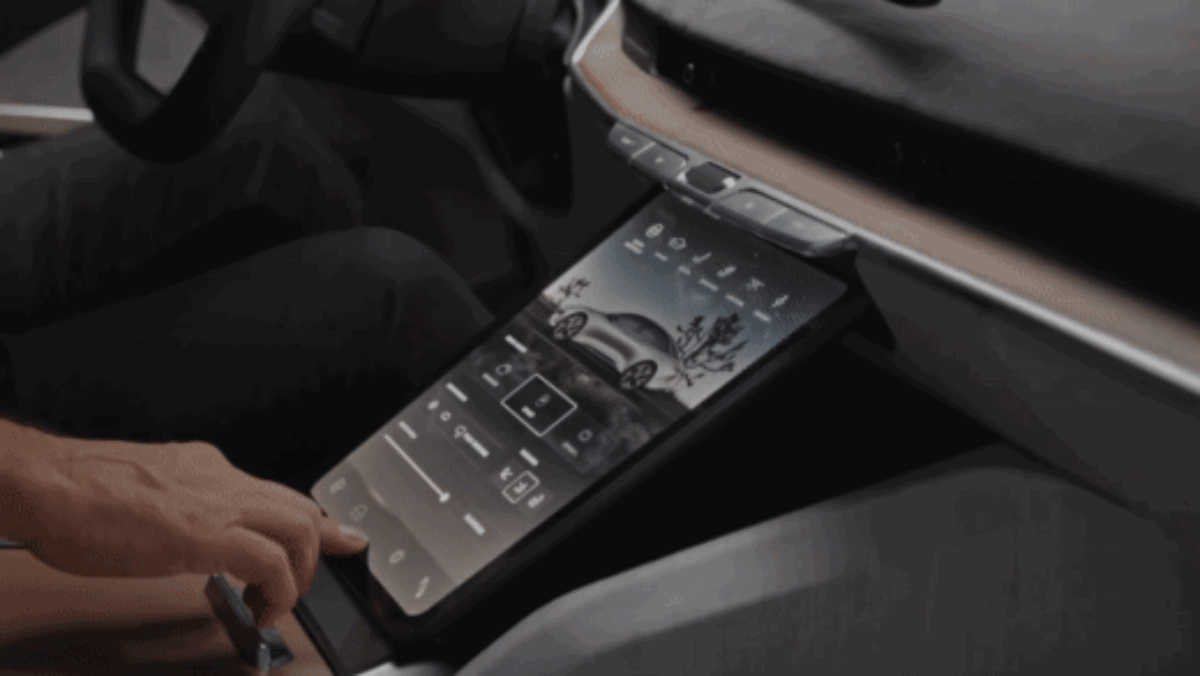
But if all the screens are getting to be too much, you can dim them using the brightness slider right on the Pilot Panel’s Quick Controls menu. And if you’d rather the tablet disappear entirely, tap the arrow at the bottom of it and it’ll retract neatly back into the dashboard, revealing another small space to store things.
The general aesthetic of the graphics themselves and the hideaway Pilot Panel gives me faith that Lucid was really sensitive to the distraction dilemma. Screens in cars are a touchy subject, especially among enthusiasts — there will always be those vehemently opposed to displays encroaching on their car’s interior. I can understand that, but the fact is cars have gotten so complicated — for better and worse — that a touchscreen is the only mechanism that can adequately cover every option and feature. Therefore, it’s imperative that manufacturers keep working to design more streamlined, common-sense interfaces. It’s too early to tell if Lucid has achieved that, but the startup certainly appears to have given it lots of thought.