Microsoft is changing even more Windows 10 icons as part of its latest Insider Preview Build 21343. The company has already redesigned the icons of its built-in apps and a few others, like Windows Security, Narrator, and Notepad. And back in 2018, Microsoft gave its Office icons a total overhaul. Even more changes came in 2020. (To be honest, I still have not gotten used to the Office icon changes, although I have come to accept it.)
This latest round of changes, which should eventually roll out to every Windows 10 computer, are as dramatic as the Office icon changes. But is it just me, or are Windows 10 icons starting to resemble macOS icons more and more as time goes on?
Let’s start with the Drive and Recycle Bin icons. Instead of a three-quarter view, both are now front-facing and look similar to the same icons on macOS. Exhibit A:
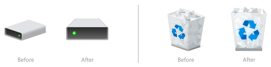
Note how the green dot on the drive icon has now switched places, from the right side to the left side. The drive icon on macOS Big Sur and Catalina (the icon that pops up when you insert a flash drive into the USB port) are also front-facing, but the green dot is on the right side, which is where the dot is on the current Windows 10 drive icon. The new Windows drive icon has less of a slope, but nevertheless it looks more Mac-like.
The new Windows recycle bin is also more Mac-like than before. It’s also front-facing and slightly taller. The macOS trash icon is circular, not rectangular, but it’s also partially see-through with papers almost overflowing at the top. The paper is a little more colourful than the Windows version, but still.
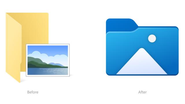
As if those macOS look-a-like icons weren’t bad enough, Microsoft is totally redesigning the Desktop, Documents, Downloads, Pictures, Music, and Videos folder icons. Exhibit B:
Microsoft says it’s re-doing these icons to make it “easier to tell them apart at a glance.” I’d argue the current icons are already easy to tell apart, given each icon already contains a music note, arrow, etc., but those bits of the icons hang out around an open manila folder rather than being embedded in the centre like the new icons in the image above. You know what else has icons like that? macOS.
They’re not as colourful, as Apple opted to make all its folders a single shade of blue. But they all have different icons in the centre to distinguish one from the other. The new Pictures and Desktop Windows 10 icons in particular are also different shades of blue, like macOS, but the rest of the new icons are more colourful — just like the colourful macOS icon bar on the desktop.
For Big Sur in particular, Apple wanted its icons to look more consistent with the ones on iOS. Microsoft is trying to do the same with these new Windows 10 icons.
“Several changes, such as the orientation of the folder icons and the default file type icons, have been made for greater consistency across Microsoft products that show files,” Microsoft said in its recent Windows Insider blog.
That’s all well and good, but it seems to be related to a larger trend of simplifying icons as much as possible. If you compare the icon changes from macOS Catalina to Big Sur, for instance, you’ll see noticeable changes to the Calculator, Calendar, and Mail icons in particular. (Not everyone was a fan of those, either.)
When we look back at when Microsoft started changing more of the Windows 10 icons in 2020, it even said then it wanted to maintain a consistent look across Android, iOS, and macOS. Having icons that are more Mac-like definitely helps with that mission, although it seems like it serves to make Windows 10 itself look more Mac-like instead of standing out. Maybe I just hate change, but these new icons are a no from me.