It’s no secret that the Arctic is in trouble. And while the worrying state of the ice in the region has made numerous headlines this year, they’re just the latest twists and turns in a long-term trend.
One of the best gauges for putting what’s happening in the region into perspective is the National Oceanic and Atmospheric Administration’s Arctic Report Card, a compilation of environmental observations and analyses that the agency has been producing annually for 15 years. It was released earlier this month, providing an in-depth look at the Arctic’s struggles as the climate crisis reshapes the region. But if you’re more of a visual person, NOAA made these neat — although worrying — graphics to help get a handle on what’s happened this past year and how it fits into the bigger picture.
Join us as we take a dive into a series of graphics that highlight key findings of the Arctic Report Card, and explain why you should care about what happens up there.
Ice on Land Continues to Dwindle
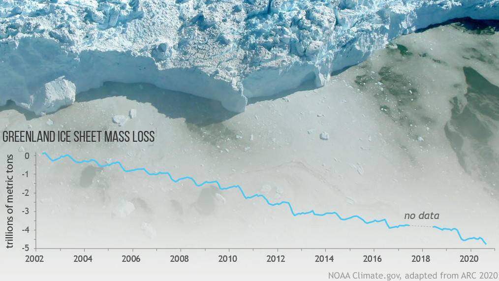
If the ice that blankets Greenland completely melts away, global sea levels would rise by 24 feet (7 meters). While it won’t all disappear overnight or even in the next few decades, recent trends paint a very worrying picture. Since 2002, the Greenland ice sheet has lost roughly 268 billion metric tons of ice per year on average. The annual record for ice loss occurred in 2019, which saw 532 billion metric tons vanish due to a staggering heat wave and bizarrely sunny skies. The loss raised ocean levels by 0.01 inches (1.5 millimetres), per the Arctic Report Card. That seemingly small rise is both a reminder that the sea level has risen roughly a foot (30 centimeters) since the start of the Industrial Revolution and a harbinger of what’s to come. The rate of rise is on track to quicken this century as the ice on Greenland, along with glaciers elsewhere, and the massive Antarctic ice sheet continue to melt.
Sea level rise is already harming coastal infrastructure, and the impacts will worsen in the future. But the melting ice sheet isn’t the only warning sign of what’s happening as temperatures rise in the Arctic.
The Arctic Is Losing a Startling Amount of Sea Ice in the Summer
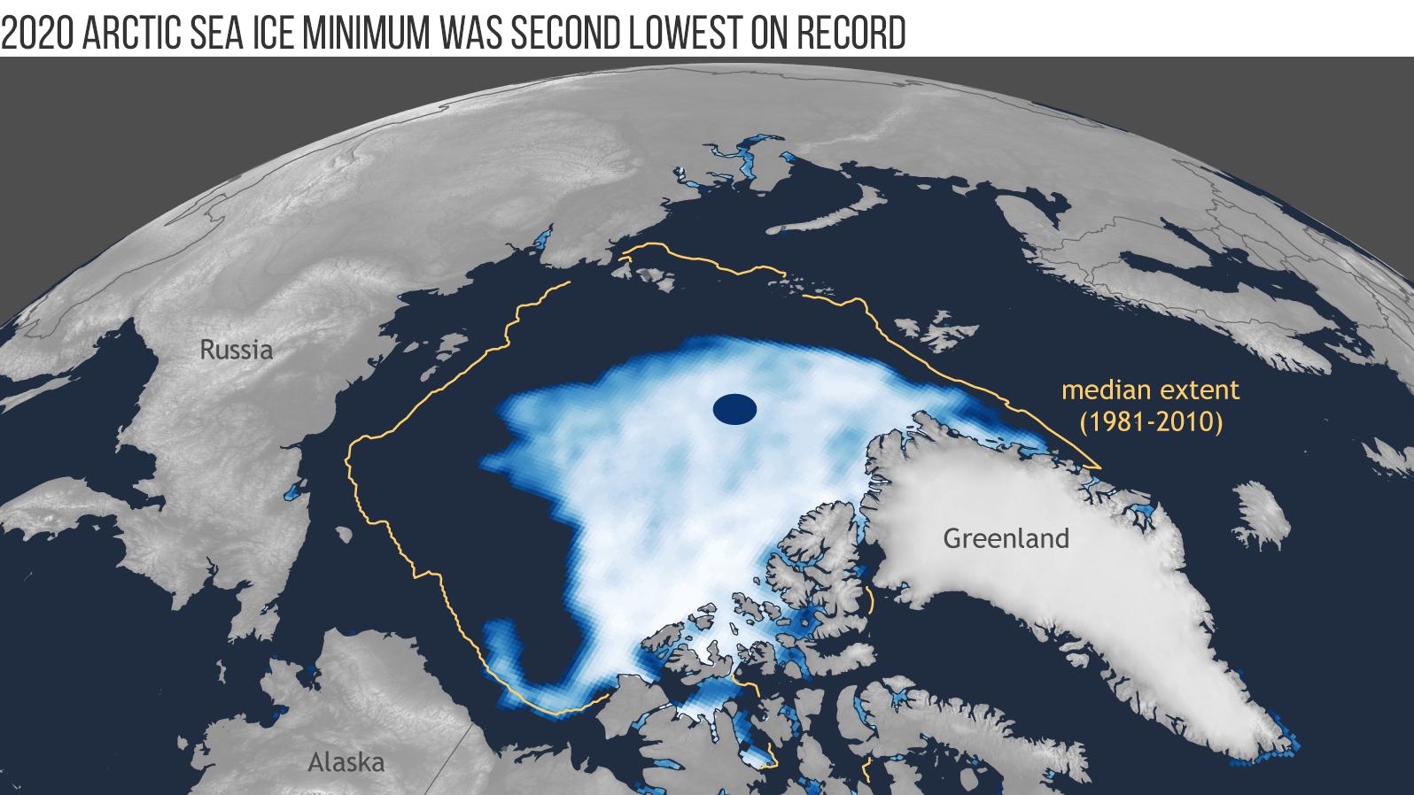
Though it doesn’t contribute to sea level rise since it’s already floating, Arctic sea ice is yet another indicator of the massive changes afoot. This year’s sea ice cover reached its second-smallest summer minimum on record, clocking in at just 1.44 million square miles (3.74 million square kilometers). The lowest ever minimum extent to date during the satellite era, or 1.32 million square miles (3.41 million kilometers), was recorded in 2012.
But this year’s annual summer minimum is just one startling aspect of a problem that goes back decades and is in fact more impactful if you look at it with a wider lens. The graphic above highlights the dramatic reduction of sea ice extent in just a few years. The gold line is the median ice extent for 1981-2010, in which half of the years had smaller extents and half had larger. Meanwhile, the light blue to white area represents the sea ice concentration on Sept. 15 of this year, the day of the summer minimum extent.
According to the Arctic Report Card, the downward trend for the summer minimum in 2020 is 13.1% per decade relative to the 1981-2010 average.
In Fact, It Has Lost an Area of Summer Sea Ice Larger Than 40 Maines
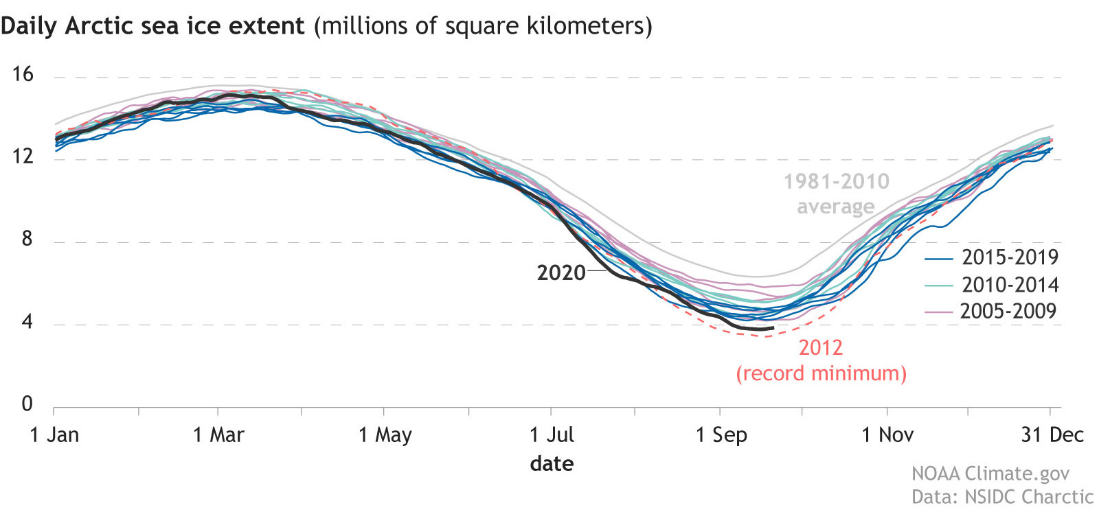
Another way to analyse Arctic ice is to think about the state of Maine. Yes, you read that right. As you can see in the graph above, the downward trend for the summer minimum extent is clear.
The 13.1% dip per decade relative to the 1981–2010 average tells some of the story. Each year that averages out to about 32,000 square miles (82,700 square kilometres) of ice lost. That’s roughly the size of Maine. So over the past four decades of satellite records, we’ve lost 40 Maines-worth of ice.
You can also divide the satellite sea ice record into thirds, which still shows that the average minimum extent for each third has been successively declining, with an especially dramatic dip from 2007-2020. From 1979-1992, the average minimum extent was 2.64 million square miles (6.85 million square kilometres); for 1993-2006, it was 2.37 million square miles (6.13 million square kilometres); and for 2007-2020, it was 1.71 million square miles (4.44 million square kilometres).
Though the rate of loss has slowed over the past 14 years, the Report Card notes this “reflects a changed Arctic with consistently low extent throughout the period;” the 14 lowest extents in the satellite era have all occurred in the last 14 years.
The Ice That Remains Is Younger
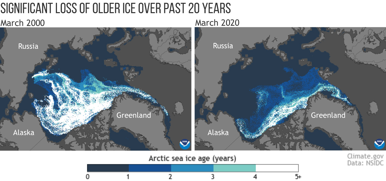
It’s not just the extent of the sea ice that has changed, it’s also the character. Arctic sea ice has gotten dramatically younger. As NOAA explains, when it comes to ice, age refers to thickness and durability. Young ice is thinner and more likely to melt in the summer. Older ice — which is typically four years or older — is ice that survives year-round and keeps thickening over time. Per the National Snow and Ice Data Centre, old ice can grow to be between six and 25-feet (1.8 to 7.6 meters) thick.
As you can see in the graphic, older ice in the Arctic is a sliver of what it once was. In 1985, 33% of ice in the Arctic was very old ice; in March 2020, only 4.4% of the sea ice was old.
According to NOAA, 20 to 30 years ago, the sea ice on the Arctic was dominated by old sea ice. As time went by though, old ice drifted out of the Arctic through the Fram Strait where it melted in the relatively warmer waters of the Atlantic. This wasn’t a problem then, as new batches of old ice were created in the Beaufort Gyre, which NOAA describes a “nursery” for young ice to grow thicker and stronger as it drifts around for many years. Today, summers in the southern branch of the Beaufort Gyre are often too warm for ice to survive, the agency said.
To use a phrase from the NSIDC, this “Benjamin Button ice” is an element in dangerous cycle, one in which increasing air and ocean temperatures more easily destroy first-year ice and weaken older ice. If this cycle continues and older ice disappears from the Arctic Ocean, the world may see ice-free summers in the Arctic as early as 2030.
The Northern High Latitudes Are More Flammable
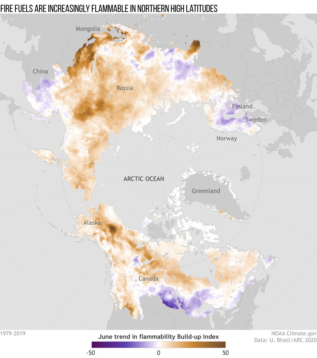
We not only have the melting ice to worry about. We also have to stress about the opposite: fire. According to the Arctic Report Card, rising surface temperatures in Northern Hemisphere high latitudes have made fire fuels — organic matter on the ground or above the surface such as trees and peat that will ignite and burn — more flammable over the past 41 years.
You can see this clearly in the graphic above, which shows the buildup index trend in June from 1979-2019. Brown indicates increasing flammability, while purple indicates decreasing flammability. The buildup index is an element of the Canadian Forest Fire Danger Rating System. It consists of a numerical rating of fuel available to catch fire and considers surface temperature, relative humidity, and 24-hour rainfall totals.
When the buildup index reaches certain levels, fires can burn more aggressively and intensely. The graphic indicates that the widespread increase in the buildup index in June at higher latitudes in both North America and Asia reflects that conditions are becoming more favourable for fire growth. Trends in the availability of dry, flammable fuels for wildfire growth are consistent with what we’ve seen on the ground in recent years as well as projections for the next century. Multiple climate scenarios project that there could be up to a fourfold increase in burned area across the higher northern latitude ecosystem by 2100.
The Oceans Are Hot, Too
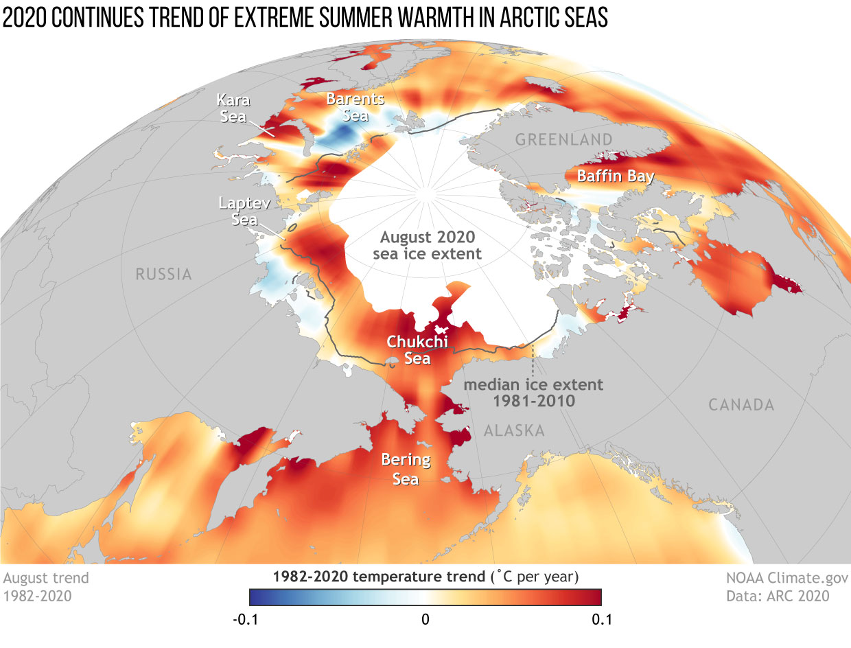
Considering all of the red and orange, you can probably guess what the graphic above reflects: rising sea surface temperatures in the Arctic in August, which is the peak of summer warmth. The red and orange areas indicate where waters are warming, while the blue areas show where they are cooling. The white areas, meanwhile, reflect 2020’s sea ice extent, a dramatic reduction compared to the median ice extent from 1981 to 2010, shown by the grey line.
According to Arctic Report Card, basin-wide sea surface temperatures across the Arctic Ocean have been warming by 0.5 degrees Fahrenheit (0.3 degrees Celsius) per decade. The situation is more drastic in many of the Arctic’s coastal areas, where August temperatures have been rising by as much as 1.8 degrees Fahrenheit (1 degree Celsius) per decade. The Chukchi Sea to the northwest of Alaska stands out for its especially strong warming as do parts of Hudson Bay. One notable exception, however, is the northern Barents Sea, which has experienced a cooling trend.
Ocean warming in the Arctic creates all sorts of problems for the region. More heats leads to less sea ice, which in turn leads to more sunlight being absorbed by the ocean, which consequently causes more ocean warming. Warmer oceans also delay fall freeze-up, affecting Indigenous peoples’ hunting and fishing activities while also making coastal areas more vulnerable to damaging waves during storms. It also reduces the amount of carbon dioxide the ocean absorbs from the atmosphere.
What Happens When You Lose Sea Ice
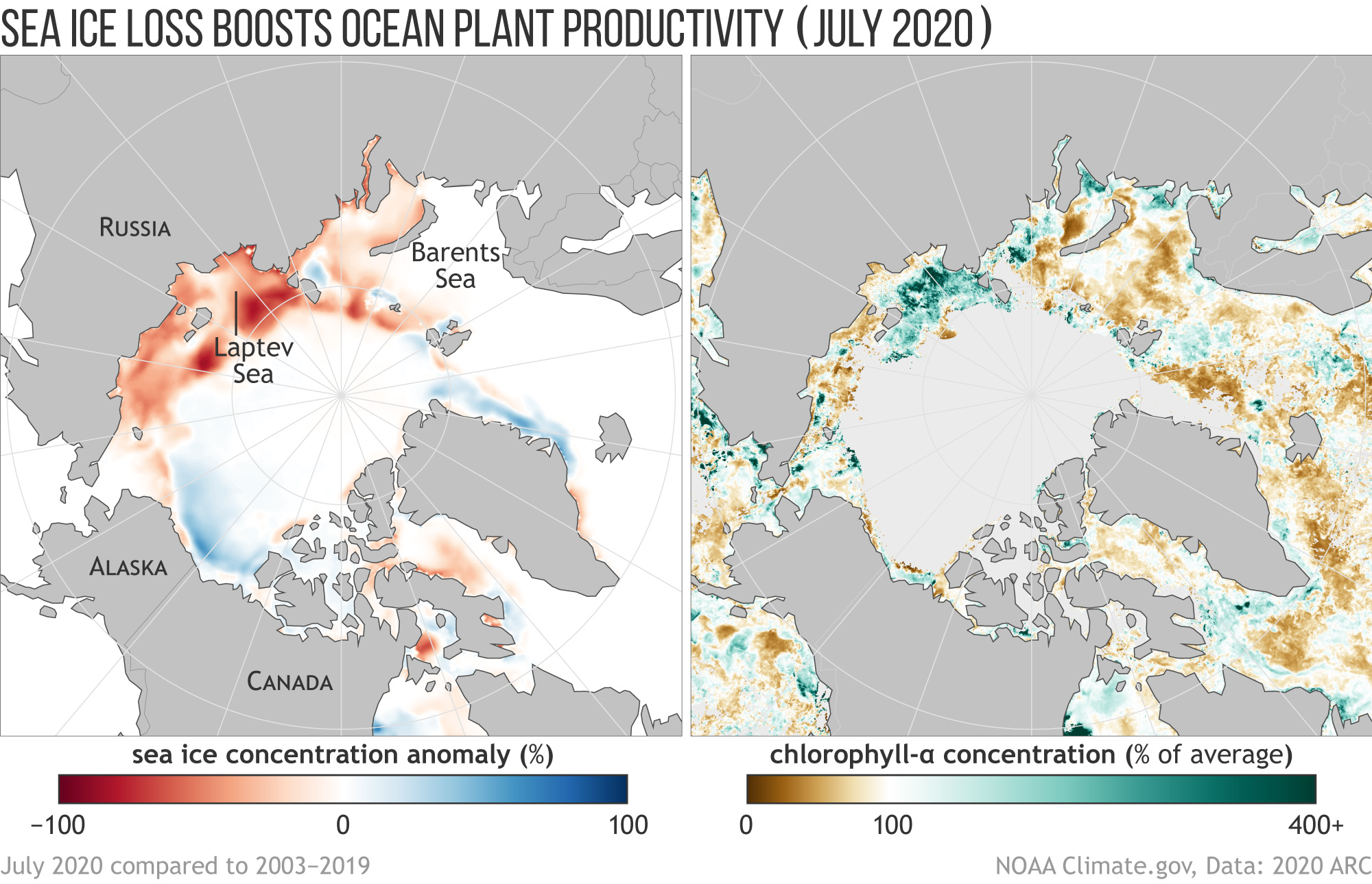
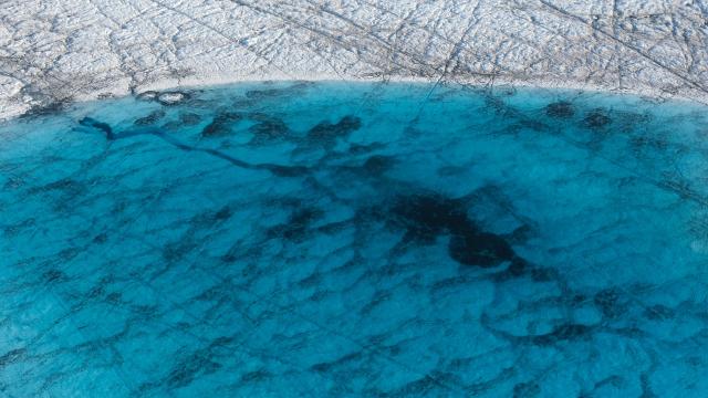
The loss of summer sea ice has increased the productivity of microscopic ocean plants in seven of the nine regions analysed by experts (the Sea of Okhotsk and Bering Sea showed lower than average values, although both still showed a positive increase over the 2003-2020 period). These include single-celled algae that live in sea ice, known as ice algae, and in the water column, which are phytoplankton. These algae are the base of the Arctic food chain and they rely on sunlight to survive. Scientists measure the activity of these plants by using satellite-based observations of chlorophyll, the photosynthetic green pigment phytoplankton use to capture sunlight and then turn it into chemical energy, as a proxy for phytoplankton productivity.
The graphic above from shows the connection between sea ice concentration and chlorophyll concentration. The key to understanding it is the following: Below-average sea ice generally correlates with above-average chlorophyll. Scientists have found that the early retreat of sea ice generally drives up primary productivity, the rate at which marine algae dissolve inorganic carbon into organic material, because it opens up the oceans to sunlight sooner.
But more plants might not necessarily be a good thing. Changes that are helpful for one species can be harmful to others. Research suggests, for example, that the increase in plant production has contributed to an increase in the bowhead whale population in the Pacific Arctic. At the same time, however, algae species that produce deadly neurotoxins are spreading poleward, per the Arctic Report Card.
The defining message of the Arctic Report Card is that what once was is no more. If we don’t drawdown emissions, those changes could occur even faster and put even more pressure on the ecosystems and people who call the fragile region home.