I’ve long complained about Apple’s Watch faces. These were an ugly mix of skeuomorphic (aka realistic) design melded with someone’s idea of what a fancy watch face might look like. Now, with WatchOS 7, they’re finally getting the hang of things.
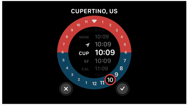
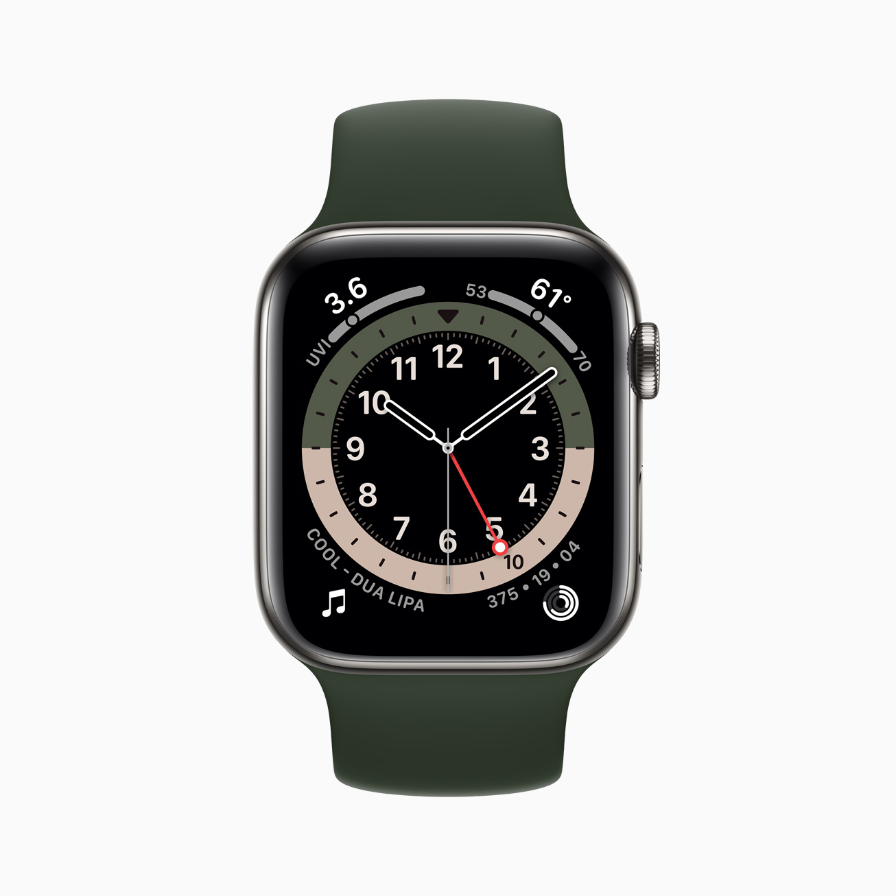
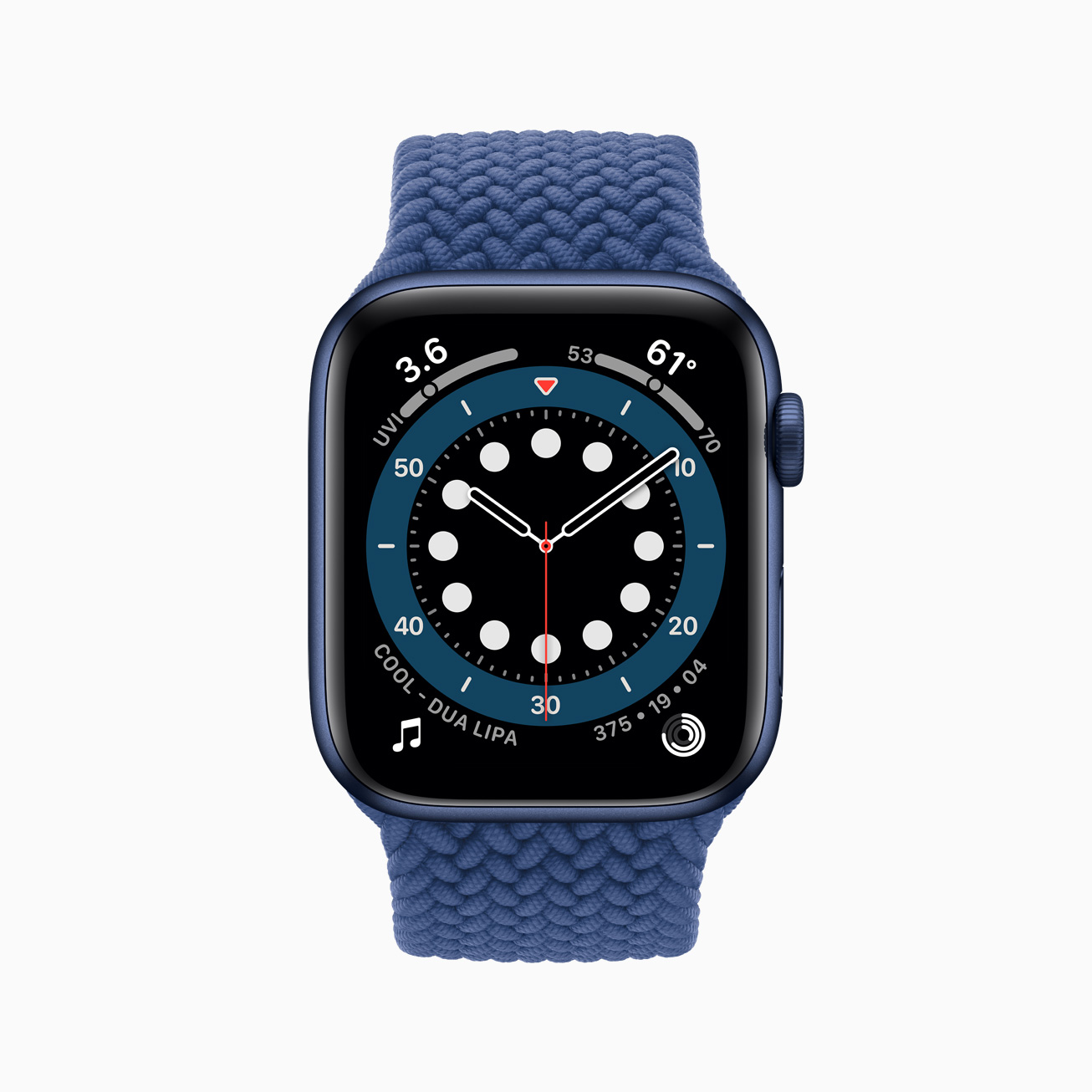
The new GMT face is the most interesting. It offers a Rolex-inspired split ring configuration that points to the current hour on a 24-hour track. The fact that it switches timezones automatically is great, and because of its absolute simplicity, you get more of what a GMT watch offers: easy-to-read timezone transitions on the road.
The countdown (aka Countup) display is similar in its readability and elegance. For those of us who mostly use the Apple Watch timing features to clock baking times or to give ourselves an extra five minutes of sleep, this face makes perfect sense. Further, it looks very similar to a standard timing bezel, allowing you to drag it around to set your desired elapsed time. A great addition.
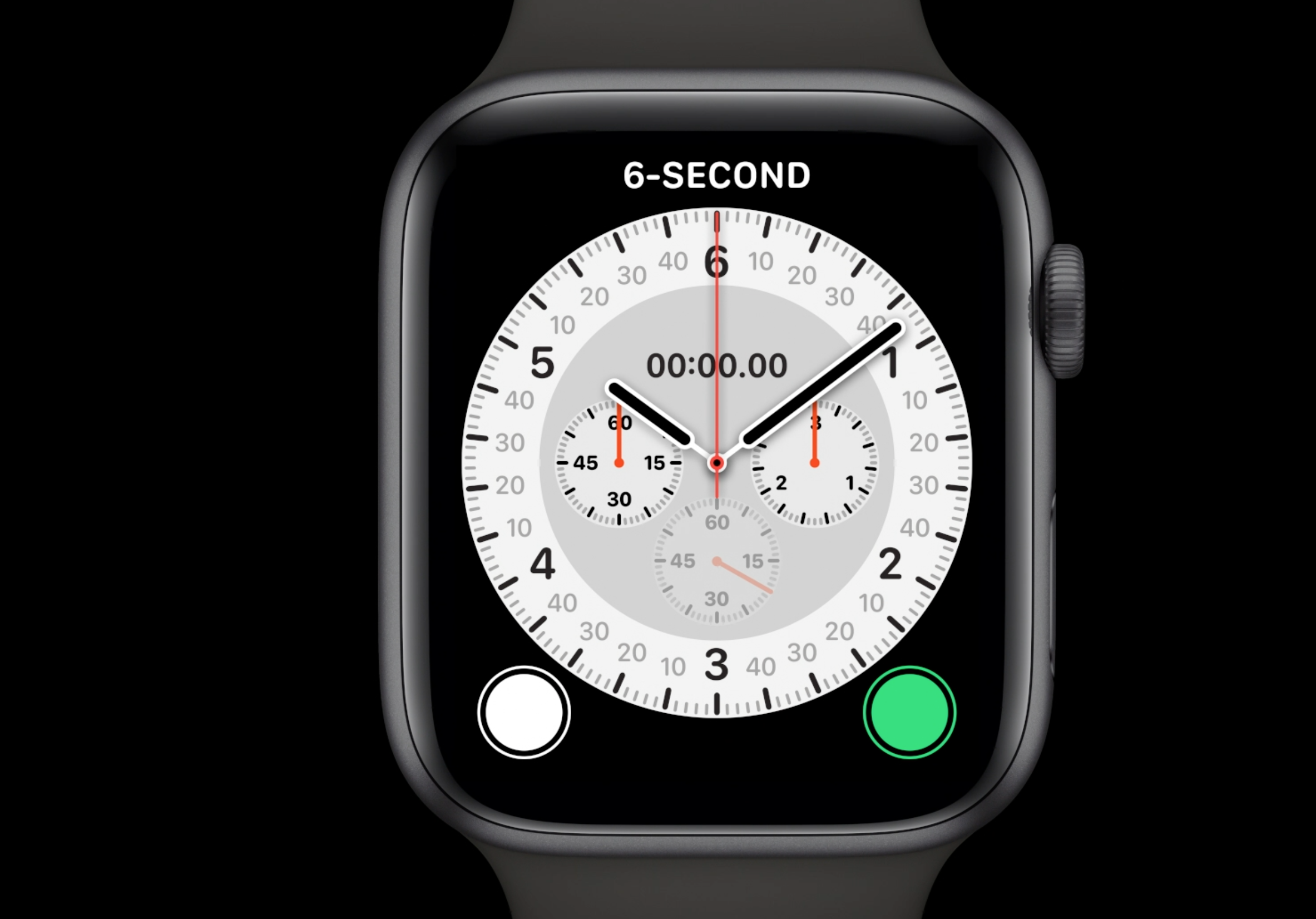
Sadly, the Chronograph face didn’t get the memo when it comes to readability. It has a certain Omega Speedmaster style to it, but it definitely doesn’t win any awards for simplicity.
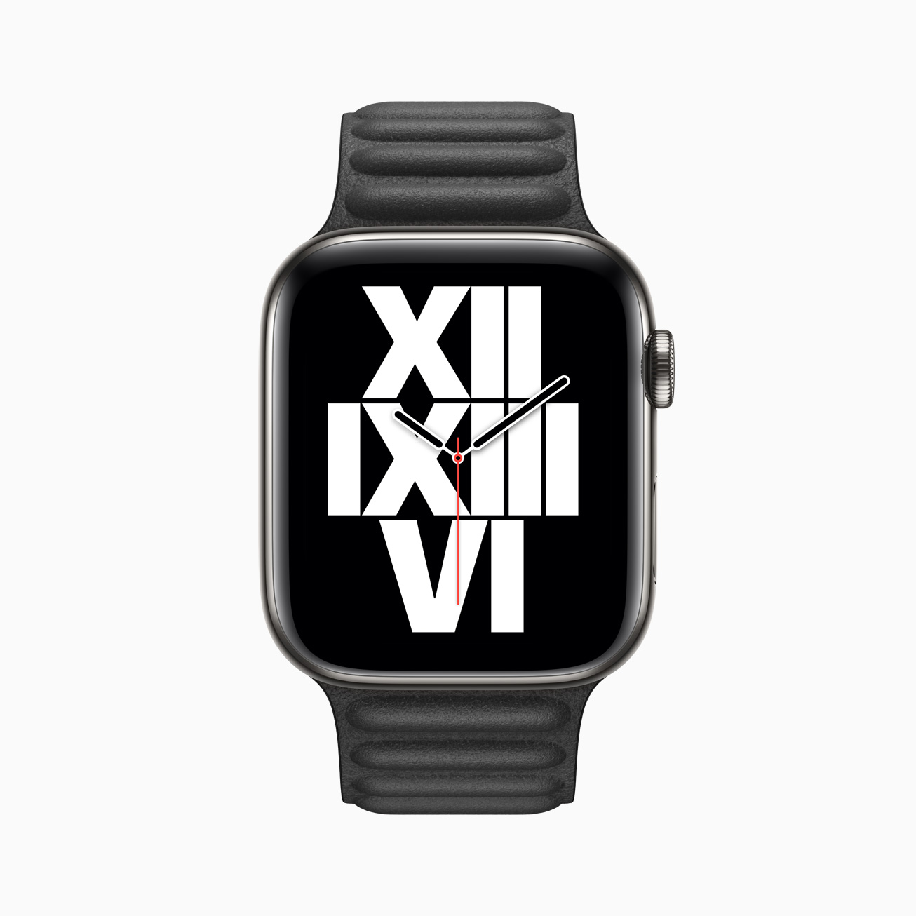
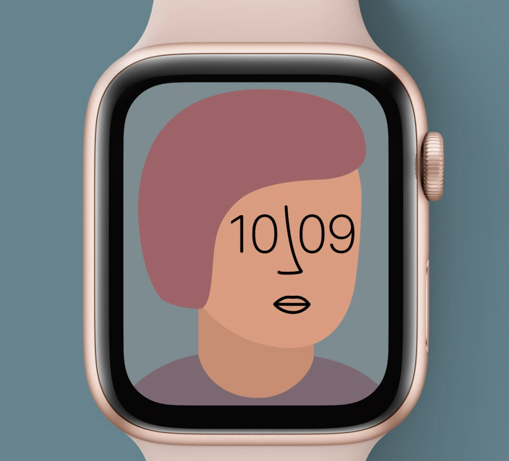
Finally, the clever Typographic display looks like something out of a 1980s Swatch line up — and that’s a good thing. It’s eminently readable and very unique. Even better, I think, is the wonderfully clever Artist face that is truly the only one that showcases everything the Apple Watch really is: a powerful computer with a great screen that can generate random faces in seconds.
Apple hasn’t done good watch faces for a long time. They’ve tried to perform tricks that mimic traditional horology in a way that doesn’t quite work. With these new faces — faces that only an Apple Watch (or similar wrist computer) could produce — finally makes the Watch make sense.