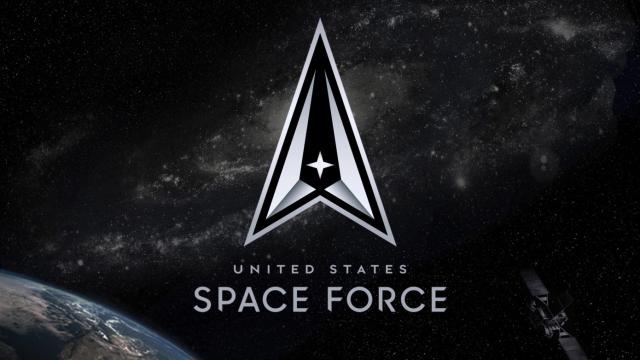
Now that we’re all totally ready to slip the surly bonds of Earth and aliens are real, it’s time for the United States Space Force to have a really badass logo to go with its mission.
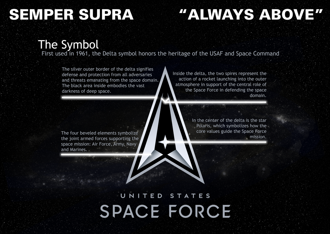
The new logo, unveiled this week, replaces the Star Trek-style logo that first hit the scene back in January. It is sharper, cleaner, and features the new Space Force motto, “Semper Supra”(“Always Above.”)
Staff Sgt. James Richardson designed the new Space Force graphic and the force writes that the symbol honours the “USAF and Space Command.” The centre star signifies the Polaris and the new logo also throws the Navy, Army, and Marines a bone by saying the beveled edges of the ends signify the “joint armed forces supporting the space mission.”
The bottom line is that the new logo doesn’t look like PowerPoint clip art so that is a definite plus. Whether or not it resembles the Pontiac logo is a question best answered by Space JAG, the new legal team the Space Force will need to adjudicate copyright infringement on Earth… or off.