As the global economy comes to a standstill amid the coronavirus, energy demand is set to drop a record amount.
The International Energy Agency released a report on Thursday that shows how this pandemic—which has killed at least 228,625 around the world—is affecting the energy sector. Due to lockdowns and the economic slump, IEA projects that energy demand will shrink by 6 per cent in 2020. That’s the largest year-over-year drop percentage-wise in 70 years. When looking at absolute energy demand, this year will see the biggest dip in human history.
The demand for all fossil fuels is going down, too. Thus, carbon emissions should likely to see an 8 per cent reduction, reaching levels last seen a decade ago. This would be the largest annual drop the world has ever seen—and it’s exactly the type of drop needed every year this decade if we’re going to succeed at limiting warming to 1.5 degrees Celsius.
It took us a whole lot of staying at home, shutting shit down, and death and chaos to “accomplish” this, though. That’s what’s so frightening about what’s happening. These are not the types of sustainable and equitable routes we should be pursuing to meet emission targets. The response to the coronavirus highlights just how much work remains to address the climate crisis.
The report runs 56 pages long, and it’s full of graphs that help illustrate this pivotal moment. Here are five of them that highlight how these dramatic changes fit into the historic context of energy and emissions in the world.
Half the world’s energy demand has been impacted
Energy demand didn’t drop out of the blue. It has mirrored the lockdowns that have swept the globe. A growing portion of the world’s population—and thus energy demand—has been affected by the lockdown. At the beginning of the year, only 5 per cent of energy demand was impacted by lockdowns, mostly in China. By but early April, a full 52 per cent of global energy demand was hit by full or partial lockdowns as the virus spread around the world.
Energy demand dropped—but there have been wider swings
The financial crisis of 2008 is the most recent shock to the globe’s energy markets, but it doesn’t begin to compare to what we are all facing today. Global energy demand drop this year is expected to be seven times larger than what we saw then. But the coronavirus drop in demand is small compared to war- and disease-induced drops in the 20th century. That being said, we’re not too far off from what occurred during the Great Depression, which says a lot about these unprecedented times. The chart also shows that demand could rebound big time once the pandemic passes.
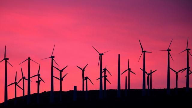
Not all fuels are affected equally
RIP coal and oil. These two dirty fossil fuels are projected to take the biggest hit by far. Coal’s decline has a lot to do with virus’ impact on China and India. These two nations are heavily dependent on coal power. As for oil, demand is expected to drop to 2012 levels as drivers stay their asses home. The good news here is that renewables are the only ones set to see an increase in demand. They’re becoming cheaper (the cheapest solar project in the world was auctioned off this week!), and new projects are still expected to come online this year.
The carbon emissions dip is historic…
It really is. The emissions’ reduction from the coronavirus is projected to be six times larger than the previous record drop in absolute emissions seen during the financial crisis in 2009. It’s also twice as large as all reductions since World War II.
But it’s a fraction of what’s needed
There’s more to the story than a one-year drop. Our emissions have been shooting up over the past century. The drop in energy-related carbon pollution we’re seeing in 2020 is the biggest ever. But it’s tiny compared to the past 120 years of growth. The circumstances are not the way to go about reducing emissions needed either. In short, there’s still more work to do.