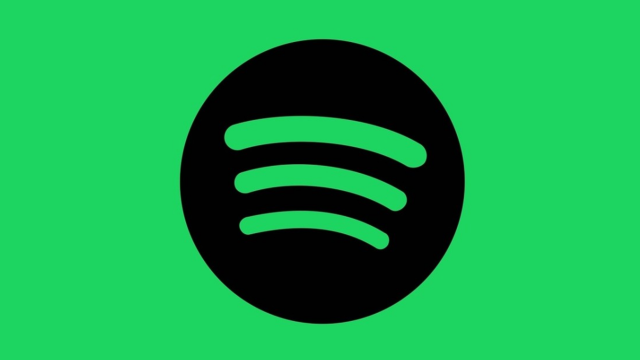
The Spotify logo is tilted. It took me entirely too long to know this for sure.
For at least three years, I’ve been tapping and clicking the app icon and watching the logo appear as the service loads. Looking at the lime-green circle with its black, curved lines, it just seemed a little off-kilter. But to my eyes, it also isn’t tilted enough to seem intentional. Surely this wasn’t a mistake made by Spotify’s designers, I figured. Maybe it was just an optical illusion. Or I was simply going nuts?
Regardless, it’s continued to drive me nuts over the last several months. I recently searched online for others who identified with this personal struggle, and thankfully I am far from alone. The Spotify logo has made numerous appearances on Reddit’s r/mildlyinfuriating subreddit. And at least hundreds of people have vented their frustration on Twitter:
BRUHHHHHHH WHY IS YOUR LOGO CROOKED NOW?!?!?!?????????????????@Spotify @SpotifyUSA pic.twitter.com/r4xOjS82dg
— Queen???? (@TheDragonQueenX) August 13, 2018
Me trying to enjoy some music but noticing the Spotify logo is slightly crooked when opening the app pic.twitter.com/s9NObURnjB
— cathal mc cahey (@cathal_m_c) August 10, 2018
The new @Spotify logo color made me realize it’s horrifyingly unsymmetrical.
Why? Why would you do this? WHY? pic.twitter.com/5jsyRy9BBx
— Micah Whipple (@micahwhipple) June 20, 2015
I have anxiety because I just realized that the @Spotify logo is crooked pic.twitter.com/neHon3Et9w
— Shawn Holcomb (@ShawnHolcomb15) December 13, 2017
Dear @Spotify
WHY IS YOUR LOGO CROOKED!?!?
Sincerely,
My OCD pic.twitter.com/TcxrcDEhBI— Corey Seffernick (@Captain_Seff) March 29, 2018
Spotify users have also reached out to the company directly, pleading for it to change the logo. Consider this comment from one person who posted on the company’s community page under the title “fix ur **bleep**ing logo”:
look i don’t know why y’all made the logo crooked but it’s pissing me off and i can’t stop thinking about it. maybe that was the goal i don’t know. all i know is that i’m mad and the logo needs to be fixed immediately.
However, when I raised the issue with the Gizmodo staff, I realised my colleagues did not share my grievance.
“huh never bothered me before,” one editor wrote on Slack, before mustering some sympathy: “but now i kinda see why it’d irk u.”
Some Gizmodo reporters humoured me and chimed in with their theories.
“leads your eye towards the type,” wrote one Gizmodo reporter, who is probably more level-headed than me. “if it was perfectly straight it would look flat imo.”
And that does makes sense. But the logo only bothers me when it is presented without the company name, floating on its own.
“i would guess they are doing it to avoid looking like the icon people use for wifi,” wrote another Gizmodo reporter, “because aside from being green, most people prolly couldn’t pick it out.”
Another colleague agreed that a straight-up icon would look like a Wi-Fi symbol. But adding more tilt would also be problematic. “If it were rotated more clockwise, it’d look too much like an RSS logo,” they wrote.
Spotify did not respond to a request for comment on this matter. Fortunately, Gizmodo gained some insight into the design in 2013, when then-staffer Peter Ha interviewed Spotify designers Christian Wilsson and Andreas Holmström about the brand redesign.
Gizmodo: What’s the deal with those waves or squiggles or whatever they are? In the redesign they’ve been moved off to the left.
CW: We noticed that people have been complaining on the Interwebs about them not being perfect. We had tried out the golden ratio on them but that made it look even more weird. This version is a little more organic and it’s not super perfect, which I think gives it more personality.
So it seems people have been complaining about the logo since the beginning.
As the article shows, in the original design, the “waves” were emanating out of the “o” in “Spotify”. But when the waves were moved away from the name and into their own icon, the asymmetry became a little more prominent.
In the interview, Ha was also able to shed some light on what those “waves” actually represent.
Gizmodo: Going back to the waves for a second. What are they?
CW: *laughing* I was the first guy to do the logo back in 2006 and we came up with the waves then. It’s basically illustrating streaming. Or at least that’s what the thought was back then and now. It’s supposed to be streaming.
AH: I’ve read some discussions on Twitter that it’s audio waves. But we think of it as streaming. It’s good that it could be both.
To me, the message is clear: Spotify’s vision of streaming is just a little crooked. Just crooked enough to annoy me, but not enough to stop me from using the service.
