I know what you’re thinking. What is this dummy trying to accomplish here? Of course, I know about stop signs. But maybe — maybe! — you didn’t know this: stop signs weren’t always red. We’ve talked about other red things before, and there’s a reason we ended up with red octagons telling you to STOP. I swear it’s interesting. Here’s why stop signs are red.
Photo: Getty
In the early 20th century, driving was a discombobulating mess. Streetcars shared the road with horses, cars, people. A form of traffic control was needed.
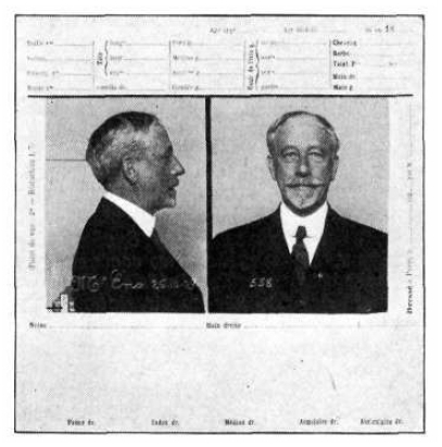
William Phelps Eno. Photo: Wikipedia.
One solution was offered by William Phelps Eno, a wealthy New England native, who conceived the stop sign in a 1900 article for Rider and Driver magazine titled “Reforming Our Street Traffic Urgently Needed.” According to the New York Times, Eno — whose name lives on in the form of the transit-oriented group Eno Center for Transportation — suggested placing stop signs at intersections.
But his advice wasn’t heeded until the following decade. The first stop sign was erected in Detroit, and though some accounts pin the historical moment to 1915, a story from the Detroit Free Press says it went up a year prior, at the corner of Cass and Clifford avenues. At the time, not everyone in town liked the idea.
“A silly waste of money,” one councilman said at the time, according to the 1954 Detroit Free Press account. “No driver is going to stop at a corner if there isn’t a policeman right there to halt them.”
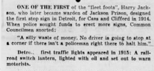
Detroit Free Press, 1954
Shape
Detroit’s first stop sign is oftentimes described as a 2′ by 2′ white square with black lettering. Unfortunately, I couldn’t track down an image of it, but the photo here was taken in 1915 at the corner of Woodward and Jefferson.
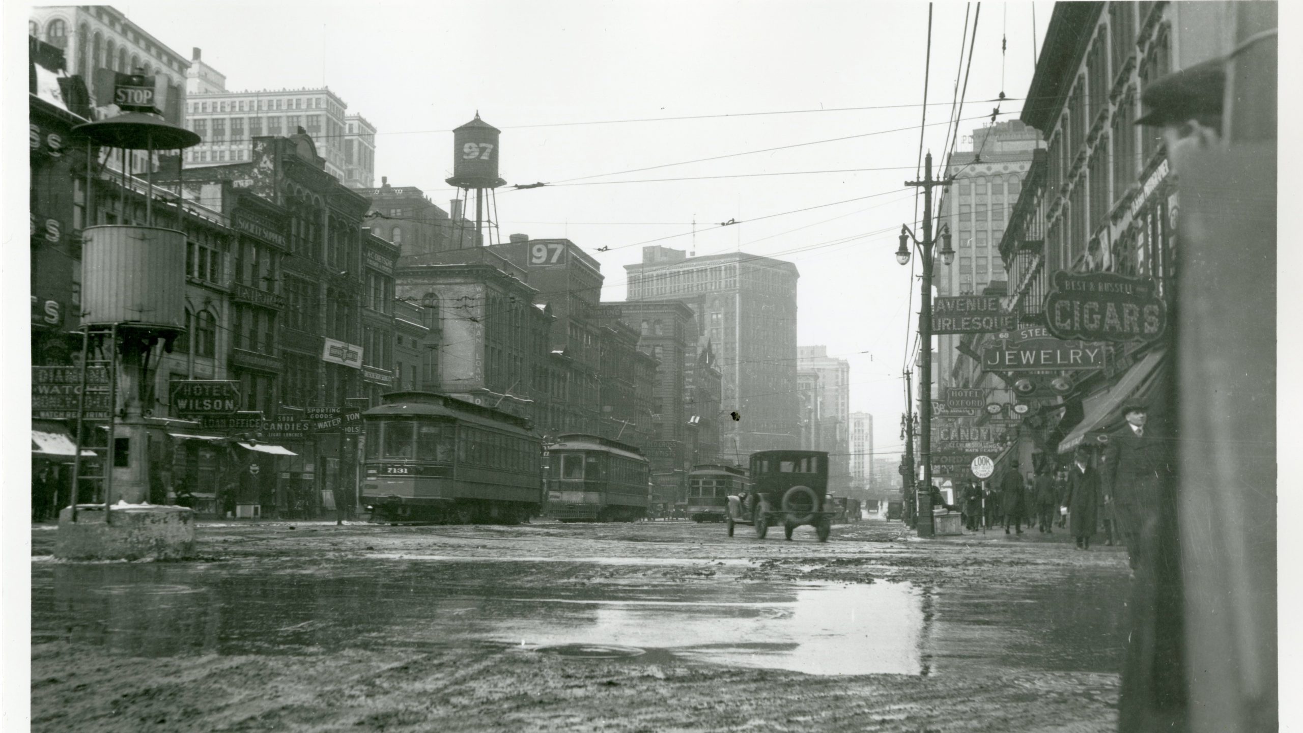
A downtown Detroit intersection in 1915, with a crow’s nest-style traffic stand that’s topped with a stop sign, via Detroit Historical Society
At the very least, it offers a glimpse of the first stop signs that were initially rolled out. Toward the left of the image, you’ll see the letters STOP situated above a crow’s nest-style traffic stand. It’s a far cry from the ubiquitous red octagons of today.
When it comes to the shape, the U.S. Department of Transportation’s Federal Highway Administration points to the Mississippi Valley Association of State Highway Departments. In January 1923, according to the FHA, the association convened a meeting in Chicago, where it adopted a plan to establish more uniform signage:
- Round: warnings at railroad crossings.
- Octagonal: STOP
- Diamond shaped: “slow” warnings”
- Square: caution or “attention” messages
- Rectangular: directional and regulatory information
The following year, the inaugural National Conference on Street and Highway Safety was held. A lengthy report with a litany of recommendations followed, including a sub-section on sign colours. As far as I can tell, the 1924 report marks the earliest date when red is recommended as an appropriate choice for STOP.
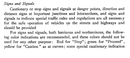
Photo: National Conference on Street and Highway Safety
Colour
But early on, most stop signs were yellow. In the 1930s, a committee of traffic engineers formed the Joint Committee on Uniform Traffic Control Devices, with the intent of producing a standard manual for street designs that could be replicated everywhere.
By 1935, the group produced the first Manual on Uniform Traffic Control Devices, a bluebook of sorts that has been updated and remains relevant to the present day. The inaugural edition called for regulatory signs to be black on white rectangles, except for stop signs, which would be shaped like octagons with black lettering on a yellow background, or yellow lettering on black.
Archive.org, the wonderful Internet repository for just about anything, has excerpts from the 1935 edition.
1935 edition of the Manual on Uniform Traffic Control Devices. Photo: Archive.org
Yellow seems like it’d achieve the same effect of catching someone’s attention. But the intention all along — as it was recommended by 1924 National Conference on Street and Highway Safety — was to eventually go red. The problem?
At the time, there just wasn’t decent material to make a red sign that could last, said Gene Hawkins, a professor of civil engineering at Texas A&M University, in an 2011 interview with the New York Times Sunday Magazine. (The Times, in its recap of the stop sign’s history, cited Hawkins as “the nation’s pre-eminent expert on the history of the stop sign.”)
Photo: Wikimedia Commons
The 1954 revision to the Manual on Uniform Traffic Control Devices offers additional insight, saying it’s generally understood that the original decision to use a yellow background for the stop sign was based “largely on the unavailability of red pigments that would not fade on exposure.”
“The standard design, therefore, has hitherto called for a yellow background with black letters, though various arrangements of a contrasting horizontal panel have also been used in an effort to improve legibility, especially in connection with reflectorization,” the document reads.
But a West Coast state known for playing a significant role in how vehicles are regulated today had a solution, the manual says.
California, having solved the problem of durability by resort to porcelain enamel, has used red for many years. The recent achievement of dependable red finishes available in competitive materials, has made the red sign practical, and the Joint Committee has recognised an apparent trend of opinion among highway departments by accepting the red sign as the sole standard, eliminating the yellow sign and its variants with contrasting panels.
And so the revised manual put forth a call to implement the design we know today: “The Stop sign shall be octagonal in shape, shall have red background, and shall carry the word STOP in white letters at least one-third the height of the sign.”
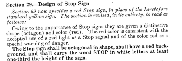
Photo: 1954 Revised Manual on Uniform Traffic Control Devices
But Why Red?
There’s probably a simple answer to this. Red stands out, right? Red won’t blend into the foreground. My eye doctor once told me I have a red-green deficiency (maybe that’s still true?), but I’ve never had a problem properly deciphering a stop sign.
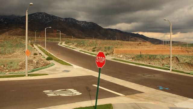
And I mean, look at that shot up top — a lovely, sweeping image. The red cuts through clearly. You could see that coming a mile away.
There might be more to it, though. The folks at BrainStuff dove into the issue a couple years ago, producing a cheerily informative stop sign clip, if you’re among the TL;DR crowd who hates what’s happening in this post.
The video’s host explains “some behavioural research findings that might point to the inherent power of the colour red to command our obedience.”
In particular, the clip highlights a 2011 study from Psychological Science that involved male rhesus macaques — a species of monkeys living in Puerto Rico — and how they responded to certain apple slices.
Here’s how it worked, via Psychological Science:
Two human experimenters, one male and one female, entered the monkeys’ colony and found isolated males to test. Both people knelt down, placed a Styrofoam tray in front of them, drew an apple slice from their backpacks, held the slice at chest level for the monkey to see, then placed the apple on the trays. Both stood up simultaneously and took two steps back.
…
The results were striking. The monkeys paid no mind to the sex of the experimenter. Green or blue made little difference to them either. But in the significant majority of cases, they steered clear of the red-clad humans and stole the food from the other tray.
One of the researchers suggested the findings could mean that “colour may have a deeper and wider-ranging influence on us than we have previously thought.”
It’s just one study, but who knows? Maybe we’re predisposed to respond fearfully of red. Or, maybe, after a half-century of responding to red stop signs, red traffic lights, and the blinking red lights of cop cruisers, it’s just too damn hard to ignore the colour when we drive.