The Power Rangers may remain on TV until the end of time, but there’s one thing that always changes: their uniforms. Some are stylish, some are understated, some are bonkers — and it’s high time that they were ranked. All of them.
Here is every single set of outfits worn by the various iterations of the Power Rangers since Mighty Morphin first debuted in 1993. We also took some time to run each one through the fashion police. Because when you think style, you think about two nerds who sit behind computers and blog all day. Our advice is perfect.
As we had 23 sets of uniforms to assess, this is merely the first instalment, ranking the very best of Power Ranger fashion. Parts Two and Three will run weekly, until we reveal the most horrible uniform ever worn by a teen with attitude.
1) Mighty Morphin’ Power Rangers
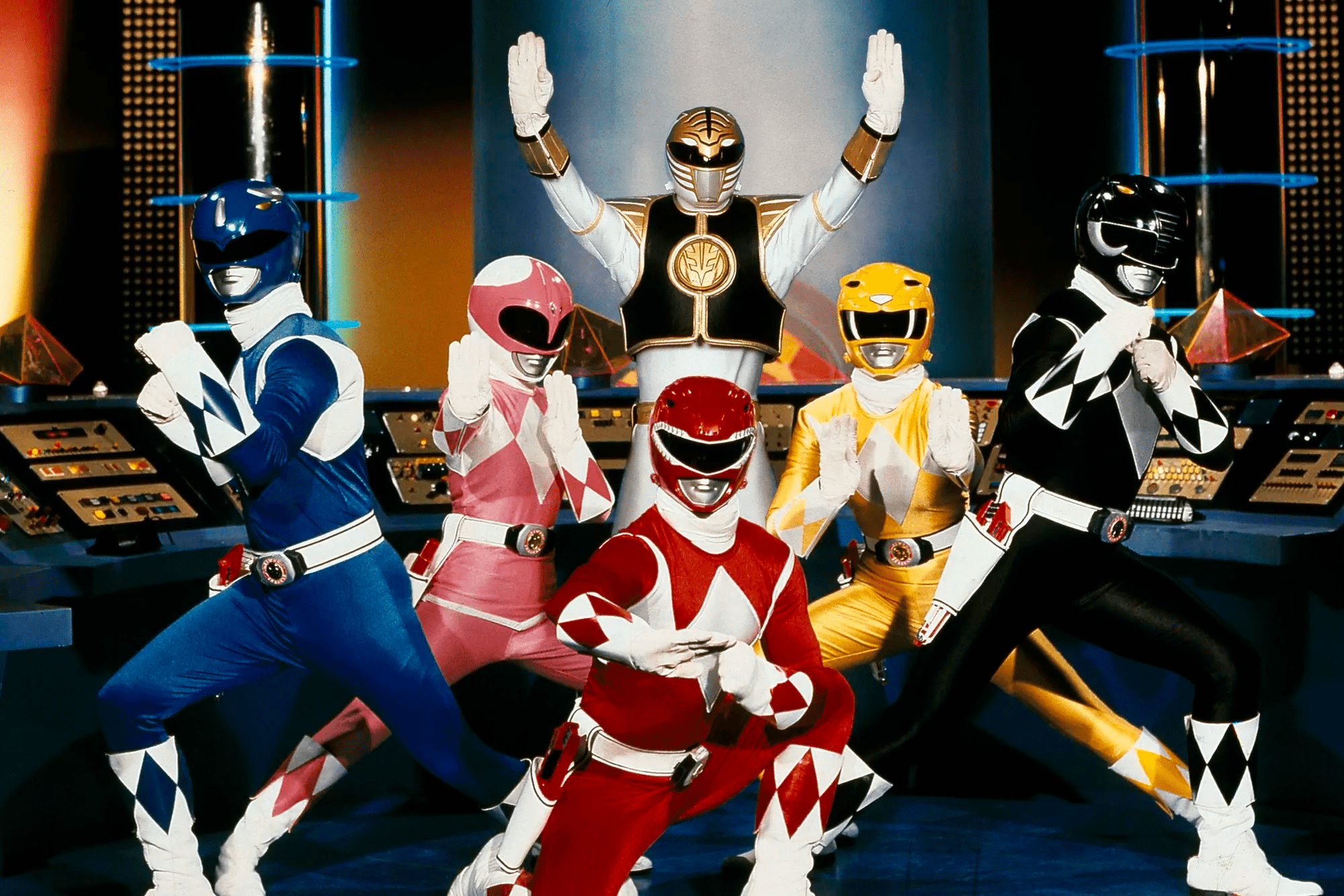
Katharine: It’s kind of hard to not rank these number one. They’re the standard that all the others are judged against.
James: It’s almost unfair, but sometimes you just can’t beat the classics. But they’re also REALLY great costumes!
Katharine: They really are. The helmets have simple but recognisable animals on them.
James: They do a great job of thematically tying in the animals without making them look ungainly. The suits are minimalist, but the diamond pattern does a lot to break up the colour on each suit.
Each one of those Rangers can look out of that helmet and have a decent field of vision… except maybe the Yellow Ranger with her sabertooth tiger teeth jutting down.
Katharine: If I had to nitpick, it would be that the diamond pattern has a bit of an old timey clown feel rather than a dinosaur one. This is the Power Ranger outfit Harley Quinn would wear.
James: Prehistoric harlequins HAS to be a theme at some point. Has to be, no matter how many times they have done dino Power Rangers.
James: My only nitpick with Mighty Morphin’ is the transition from the Green Ranger to the White. Obviously, in Japan, those suits are from two different shows, one of which never made it over as Power Rangers, so they don’t really fit anyway, but lets be real: the Green Ranger suit is just brilliant. Even his gold armour looks better than White Ranger’s puffed-up jacket.
Katharine: Yeah, it doesn’t fit. which they tried to explain, but Green was still better.
James: Long live Green Tommy.
Katharine: Anyway, not much to say: classic, functional, well-patterned.
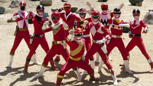
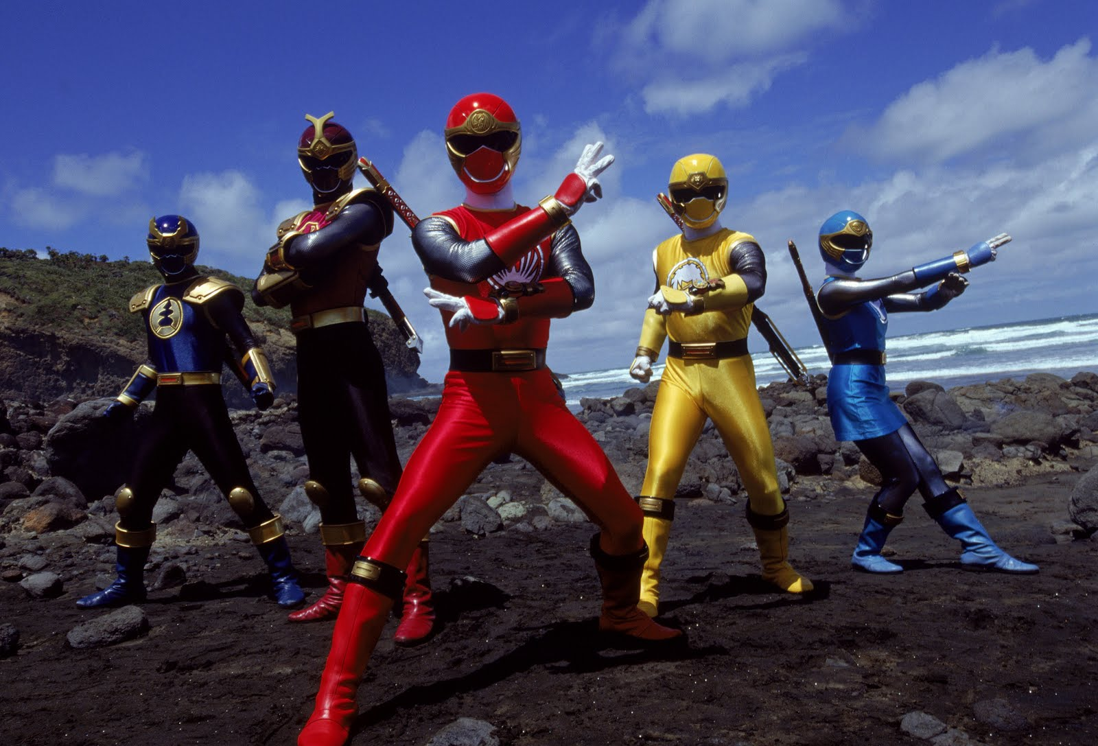
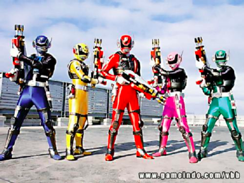
2) Wild Force
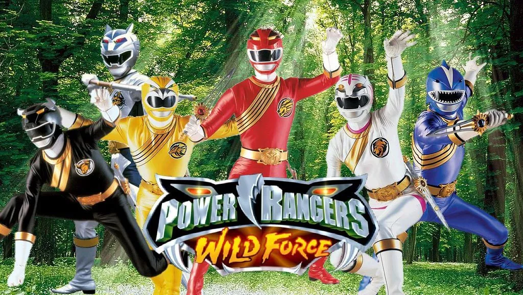
Katharine: I will admit straight up this ranks so high because I love that fucking shark helmet.
James: Animal helmets tend to be some of the best. They’re really easy to make a dynamic looking helmet shape out of, while still remaining “normal” as a helmet. I LOVE the black ranger helmet so much. His little horns!
Katharine: Also I love this version of the Pink Ranger skirt.
James: It’s always nice to see female rangers that aren’t just the Pink Ranger all the time, but I love the pink on the White Ranger’s outfit breaking up the plain look.
Wild Force is like Mighty Morphin’ in that way — the suits are minimalistic but they have got one unified design across all of them that breaks up the colour.
Katharine: This one also has uniform feel with a lot of unique touches. Like they all have the gold sash, but it’s slightly different for all of them.
James: The badges are a little *too* much though, I feel. Like, we can already tell which animal you represent guys!
Katharine: Yeah, I’m not a fan of having the badges AND the sashes.
James: ESPECIALLY when they’re running around shouting their names all the time anyway. It’s the Power Ranger equivalent of having a “Hi, My Name Is…” tag.
Katharine: We say that now, but then we get to eras where the theme is completely gone. I’d rather have them commit than lose it entirely.
James: At least the pose game gets better the newer you get. These guys are pretending to be vaguely animalistic!
Katharine: Well, James, you know how wolves are famous for their…sword fighting.
James: Correction; he’s a Power Ranger wolf. They can totally hold swords.
Katharine: True.
James: Or be, like, a giant robot.
3) Mystic Force
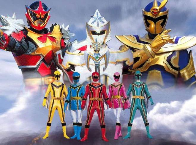
James (typing before the photo even loads): CAPES CAPES CAPES CAPES CAPES
Katharine: CAAAAAAAAAPES
James: Screw Edna Mode, capes make the Power Rangers better.
Katharine: These capes are so good that I barely notice the weird eyes on the helmets.
James: They just DO. They get to twirl around when they morph, they flap away in all the fight scenes.
Katharine: The weird spinning while morphing is given justification with these capes.
James: The capes honestly save these uniforms for me — especially when, like you say, this is when Power Ranger visors started to just be “Hey you’re a superhero, figure out looking through one of these things yourself!”
Katharine: I also like the black lines here. With the capes, there’s something very dynamic about these.
James: Also, once again, the female ranger suits here stand out as the best. Having the white leggings really breaks up the suits nicely.
Katharine: True.
James: The black lining is great but having it run all the way down the guys’ legs looks a bit weird. Also Mystic Force was on in what, 2006? And I only just got that the black lining on the torso looks like a fancy “M”.
Also, a shout-out to the special rangers in Mystic Force, who all had great costumes and basically look like people I have raided with in World of Warcraft.
Katharine: I would wear a cape and a stylised ‘i’ to the office. As long as I got to wear the cape.
James: Wolf Warrior literally looks like a dude in armour with WOLVES FOR SHOULDERS. He owns his theme.
Katharine: This is the year they nailed “actually good” and “so ridiculous it’s good.” At the same time.
James: Exactly! There’s something almost garish about them and over the top, but they completely work. Even though the special rangers are all way more elaborate, they still *feel* like they belong as Power Rangers heroes, and look badass while doing so.
Katharine: In conclusion: Capes
James: Definitely Capes. If we had to give these a rating, it would be Capes out of 10.
4) Dino Thunder
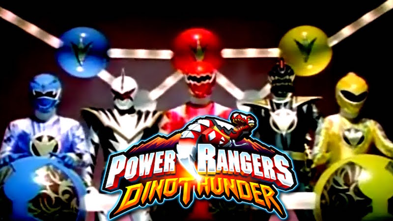
Katharine: Why won’t anyone let the Rangers see?
James: They would be even higher on this list if the helmets didn’t let the side down — and unlike mystic force, they don’t have an element like a cape that offsets that.
Katharine: Yeah, these are perfectly good costumes, hampered by some bad helmets.
James: The yellow ranger is the only one who can see more than what’s immediately ahead of her, and even then, not by much!
The Dinothunder team could be beaten if you crouched in front of them. You’d just be completely invisible to them.
Katharine: Yeah, the Ewoks would handily defeat them.
James: Man, Ewoks would be a great minion army design for a Power Rangers show. Like the putty patrol, but with more Yub Nub.
I will say though that I love the white diamonds on the arms and legs! They’re great, and not only feel like a thematic callback to Mighty Morphin’s suits, they look like scales!
Katharine: And the badge in the center is very simple and breaks up the colour.
James: Not scientifically accurate anymore, but still — they looked great when the Rangers went into super dino mode and they all flared up like spiky little scales. Great enhancement to the costumes.
Katharine: It’s true. We would have ranked this higher but for the failure to be scientifically accurate.
James: It is, after all, the goal of all Power Rangers teams to be as scientifically accurate as possible.
5) Ninja Storm
Katharine: Also fairly classic, if lacking some colour break up. The similarity to Mighty Morphin’ is what brings these guys up so high.
James: The Blue ninja storm ranger is the best of these. Honestly, most ranger suits look better when they add the little skirt! It almost turns them into brightly coloured tunics.
Katharine: This is true.
James: Speaking of the navy Ranger, the random helmet adornments really look weird on these suits.
Katharine: I swear, it’s a Beetleborg.
James: YES! And it’s so weird because not only has Power Rangers not done a “bug” theme, you don’t tend to think of bugs and ninjas going well together.
Both Navy and Crimson ranger helmets would look way nicer without them.
Katharine: And yet, they are still more functional than several helmets we’ll see.
James: I’d also like to add that that group photo does not include the Green Samurai Ranger. Who I’d like to add, in contrast to the Ninja Storm rangers, has a TERRIBLE costume.
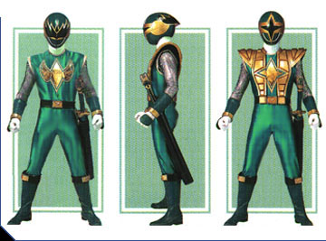
Katharine: Sight is so underrated by Power Rangers.
James: It’s like they took the original green ranger and then decided “how do we possibly make this worse?”
HIS SWORD LOOKS LIKE A BASEBALL BAT FOR CRYING OUT LOUD, HE’S MEANT TO BE A NINJA.
Or, ok, a Samurai ninja. But still!
I know the sixth Ranger is meant to stand out and be special, but he just does not gel with the rest of the team visually. And that reversible helmet just looks bad both ways.
Katharine: That is both true and false, because we know that the many peaks are at least more eye-space than the two diamonds. It starts out not great but fine and gets just so much worse.
James: “Look, Samurai Ninja man. You can either choose peripheral vision, or SICK FLAMES. All with the flip of a helmet!”
Katharine: Honestly, the way our elite fighting forces always look, I’m shocked Earth wasn’t invaded more often. No one could take us seriously.
James: The secret is to make the monsters laugh so hard, they don’t notice you getting in your giant robot to blow them up.
But yes, Ninja Storm is great in spite of the Green Ranger. His terribleness does not drag down an otherwise great theme.
6) SPD
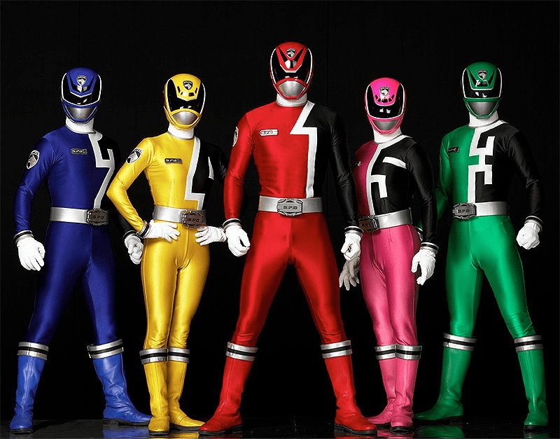
James: This might seem hypocritical considering we’ve mocked other helmets for silly visors, but I LOVE these ones.
Katharine: I don’t even think these are that bad. They’re exaggerated, but still look like they’d be functional.
James: They almost look like super exaggerated domino masks. And they can SEE out of them! Look Power Rangers, you can have stylish visors that still make practical sense!
Katharine: James, I don’t really know about the sentai footage, but, uh, how do the numbers fit in? because I kind of like how it’s worked in. But also: numbering people has a very sports jersey feel
James: Errr, they don’t really! In Dekaranger, they’re just a squad of space cops. They’re just numbers of the squad members.
Katharine: It’s just very hard to divine a theme from, “Numbers!”
James: Haha. I agree, though, they’re really nicely integrated into the suit designs — especially the way it runs all the way down one arm.
Katharine: Yeah. I almost wish there was a little bit more colour break up in these. It’s a little bland from chest down.
James: Also, surprising move for Sentai (less so for Power Rangers though, which had already done it in Mighty Morphin), but neither Female Ranger has a skirt on their uniform.
Katharine: It totally works for this one! Where the tunic skirt looks good in other years, it would not have fit the uniform look here at all.
James: For a space police uniform I guess it makes sense? If you ignore the fact they’re also a technicolor rainbow as well.
Katharine: Yeah, that is the hilarious part.
James: But yeah, these have great torso designs and helmets, that are let down a little by the boring plain trousers and boots.
Katharine: Every cop I know loves to wear colours so bright they can be easily picked out while chasing suspects. (Note: I do not actually know any cops)
James: The plain bottom halves work a lot better when they’re morphed into SWAT mode though and the Power Rangers suddenly decide having TONS OF POUCHES would make sense for people running around in skintight spandex:
James: The exo-armour does a lot to make the plain bottom halves more interesting.
Katharine: True. Although man does it now draw a lot of attention to the crotch area. Blue Ranger, what is happening?
James: Look, Blue Ranger is just very excited to be protecting the galaxy from monsters. VERY excited.
7) Ninja Steel
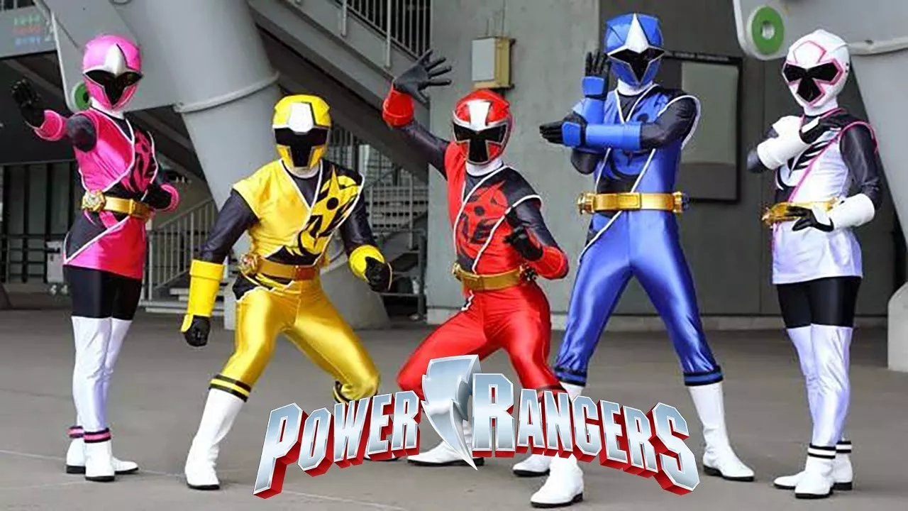
Katharine: This series isn’t technically out yet, but we know what the sentai it’s based on is.
James: Yup, these are coming next year — which is a surprising turn around, as Shurkien Sentai Ninninger only finished this past February.
But, as much as I did not enjoy this Sentai, I am VERY excited for them to become Power Rangers, as the suit designs are brilliant. Probably the best Ninja-theme they have done.
Katharine: Agreed. I like the cut of the uniforms, which is the ninja style without being absurdly over the top about it.
James: Yeah, it almost looks like a Karate Gi. I really like the sash as well being a physical part of the uniform, rather than a print. It brings a nice texture to the suits that they don’t always have.
The helmets are great too, lots of sharp angles, and the visors make them feel almost like an actual medieval-style helmet.
Katharine: Yeah, and the black undersuit breaks up the colour nicely.
James: And once again, the girls get the best design with the taller boots to break it all up a bit. It works the best on the White Ranger where it blends into the costume more, but it looks great on the Pink Ranger too.
Katharine: I swear, it’s not like the tunic look would be bad on the men. They’re all in spandex, and it always looks better.
James: It makes the silhouette look a little more interesting than “whelp, here are some legs!”
All this said ,though… they’re gonna have to explain this guy in Power Rangers next year, and it’s going to be one hell of a mindbender:
Katharine: There’s always one.
James: There is no other way for me to put this other than in all capitals: COWBOY STAR NINJA WITH A GODDAMN GUITAR SWORD.
Katharine: Look, when I’m doing a ninja-themed show, I always add a cowboy.
James: It’s so ridiculous. I feel like this would actually go with the rest of the team quite nicely until they turned his helmet into a cowboy hat. HE’S GOT A HELMET ON, HE DOESN’T NEED IT MERGED WITH A HAT.
Katharine: I swear to god, James, if wouldn’t know this was a cowboy unless you told me.
James: In Ninninger, he was born in America. How else would you be able to tell if he didn’t have a 38l hat/helmet and a guitar for a weapon!?
Suffice to say, I can’t wait to see how Ninja Steel adapts him.
Katharine: Can confirm, all Americans are cowboys.
8) Zeo

Image: Saban
Katharine: I like these a lot and I would have put this higher if not for the COMPLETELY INSANE HELMETS.
James: I have been looking forward to Zeo coming up, just for the helmets.
Specifically, the Yellow Rangers, because WHO USES AN EQUALS SIGN FOR A VISOR?!?!?
Katharine: Yellow and Red Rangers, I am so sorry. The Red Ranger’s eye line is most robust over his nose. But the Yellow Ranger is absolutely screwed.
James: I feel like Yellow Ranger was going to used Green Rangers design, but he got there first and she had to change it at the last minute. AND HAS REGRETTED IT EVER SINCE
Katharine: Every single fight, Yellow Ranger is stumbling around in the wrong direction.
James:Pink Ranger, on the other hand, went the completely opposite direction and went with a ginormous visor to ensure she could see EVERYTHING.
She saw everyone else’s visor and was like “Well, they’re gonna spend more time running into walls than they are kicking the shit out of monsters, I gotta step up.”
Katharine: Yeah, she saw Yellow Ranger’s problems and massively overcompensated.
And no peripheral vision for the Blue Ranger. Peripheral vision is for suckers.
James: Blue Ranger looks like he’s perpetually stern at everything.
Katharine: Green got off so easy.
The more I look at this, the more the yawning chasm of the Pink Ranger disconcerts me.
James: It’s like the precursor to the Dinothunder and Dino Charge helmets where they would use CGI to make them look like they’re roaring… except Pink Zeo Ranger needed no CGI.
It’s such a shame, because If it wasn’t for the helmets being so funky, these would otherwise be great costumes. The gold across all of their uniforms looks great, the chest/shoulder design is nice and bold, and it’s actually surprising how much a slightly different cut of skirt on the female rangers’ uniforms helps tie the overall look together.
Katharine: Yeah, these are actually great costumes. They have balanced the skirt/non-skirt costumes in a really great way. And the detailing is much more complicated than anything we’ve seen before. It really makes them look less cheap.
James: So close, and yet so far, Power Rangers Zeo.
Remember, check back on for Part Two!