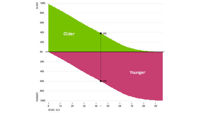
Feeling old? This simple chart will reveal the crushing truth of just how many people are younger than you.
Put together by Nathan Yau of Flowing Data, the interactive chart is incredibly simple. Choose to look at men, women or both, move the slider to your age and — boom — a shot of stark reality will tell you the percentage of people around you that are younger. If you’re in your mid-30s, you’ve hit that terrible tipping point where you’re outnumbered by youngsters.
The data comes from the five-year American Community Survey from 2014, so if all else fails you could try and convince yourself that the numbers are out-of-date, or that there are more older people in Australia.
