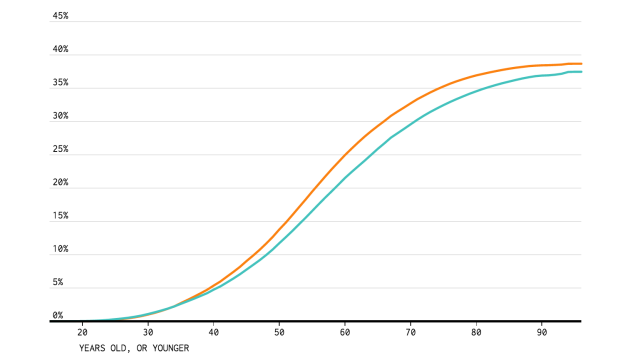
So, you made one of the biggest commitments of all and got married. Now, how likely is it to stand the test of time? Well, this interactive chart will show you how likely you are to divorce based on your employment status, education, race and gender.
Created by Nathan Yau from Flowing Data, the interactive chart is based on data from the American Community Survey between 2009 and 2014. By selecting from a series of filters you can see the cumulative rate of divorce for someone of your demographic. The green line is women, the orange line men. Simply toggle the filters then read across the age axis to find out the percentage of people like you who married at some point, then either divorced or remarried.
As Yau points out, it does a great job of busting the myth that half of all marriages end in divorce: The line never rises above 45 per cent for a single one of the demographics. So that’s something, right?
Go take a look at whether or not your marriage will crumble.
