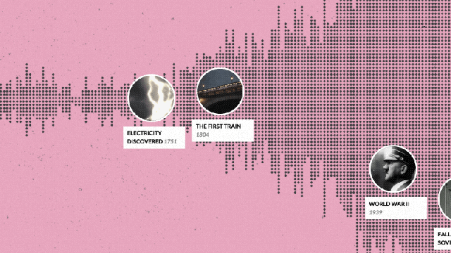
This amazing visualisation brings together the world’s history from Wikipedia into an interactive timeline stuffed with information and images. If only history lessons at school had been this much fun.
On the timeline, called Histography,, each dot represents an event and the position on the horizontal axis represents time. You can zoom in and out see anything from the Big Bang up until the present day, or jump to pre-selected time periods such as the Stone Age, Renaissance, and Industrial Age. You can also filter events by type, whether you want to learn about politics and riots or inventions and literature. As you navigate, the dots animate to reshuffle on the screen, along with the sounds of colliding balls.
It was put together by Matan Stauber as his final project at Bezalel Academy of Arts and Design. It’s totally compelling — go play around with it.
[Histography.io via Flowing Data]