Our plates are quite well-travelled these days, with foods from our backyards mingling with foods grown easily halfway around the world. Just how connected the food world has become is much clearer in these charts showing where every place in the world is getting (and sending) their food.
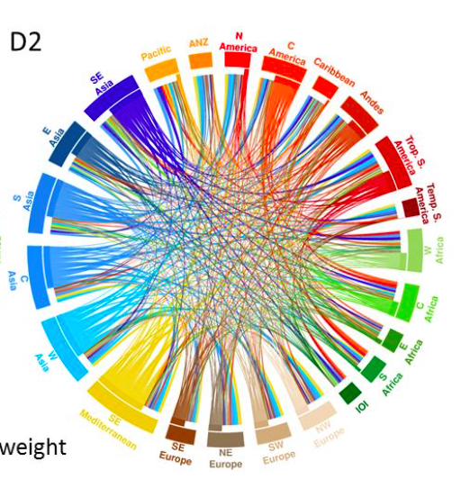
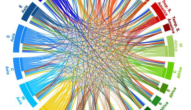
The International Center for Tropical Agriculture just completed a huge survey of where the world’s food was going, and they made these webs with the data. The top image you see is where each region’s calories are coming from — and where they’re sending theirs out to. But you can also measure the amount of food in weight, like in this accompanying web:

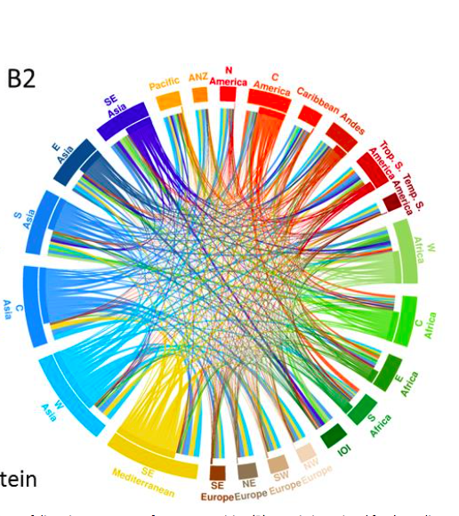
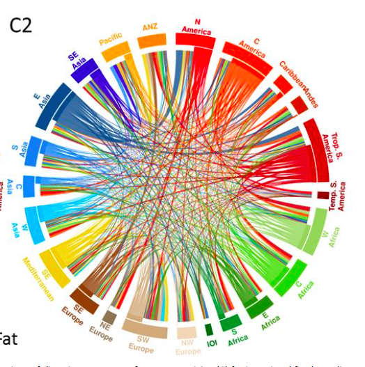
Alternately, you can break down the data further, by not just calories, but types of food, which the researchers did for both proteins or fats, to see even more concretely what kinds of foods are making the trip and which are left at home.
Protein:

Fat:

[Check out the interactive chart at the International Center for Tropical Agriculture]
