There is perhaps no single typographer whose work can be found in such a diverse range of applications. Adrian Frutiger, who died last week at age 87, created typefaces that make you feel at home in every single place you see it, from subway stations to your computer keyboard.
The Swiss typographer was born in 1928 and worked as a compositor at a printer while dabbling in calligraphy, drawing letterforms in his free time. Eventually Frutiger went to work at the Paris foundry Deberny Et Peignot. This was the time when Helvetica and Futura were all the rage, spurring an age of sans serif, Swiss-inspired type. Frutiger was told to build a typeface in this vein, and created Univers.
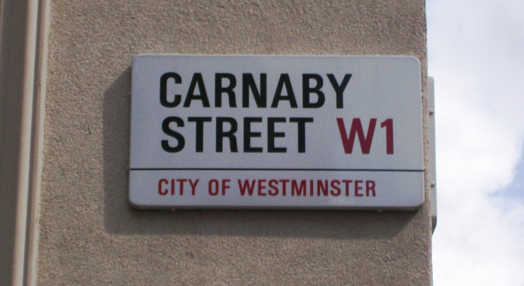
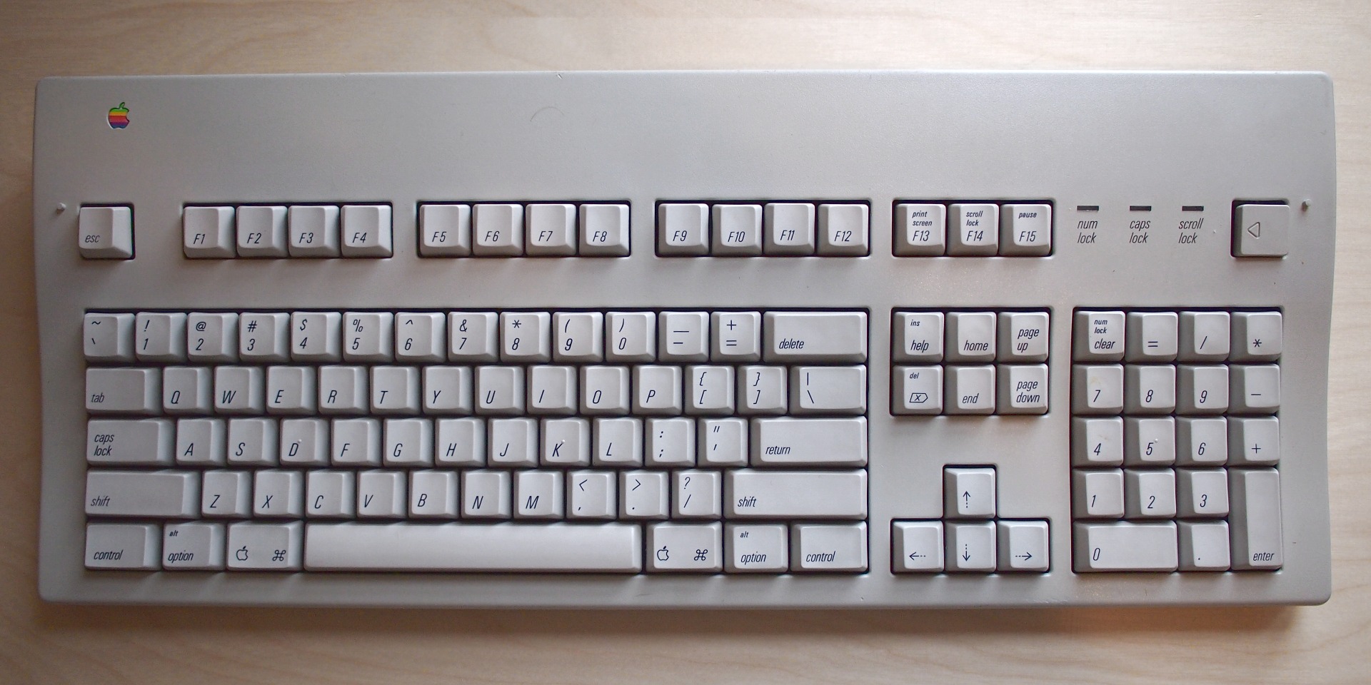
This slim, utilitarian typeface eventually made its way onto London’s iconic street signs, San Francisco’s BART system, and was a favourite for many corporate brands, including Apple, which even used it as the letters on its keyboards before switching to VAG.
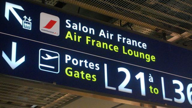
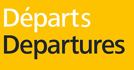
Frutiger then left an indelible mark on our cities with a typeface that ended up being named after him. A commission for Charles de Gaulle Airport in Paris gave Frutiger the chance to improve upon Univers by making the most confusing characters unmistakably readable, even at a distance and in less-than-ideal light.
The typeface, which was first called Roissy, for where the airport was located, is almost data-driven in its creation. Crisp readability was the only goal. I absolutely love this quote from Frutiger, on Frutiger: “What was important, was total clarity — I would even call it nudity — an absence of any kind of artistic addition.”
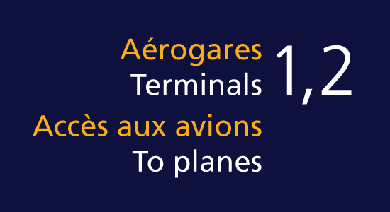
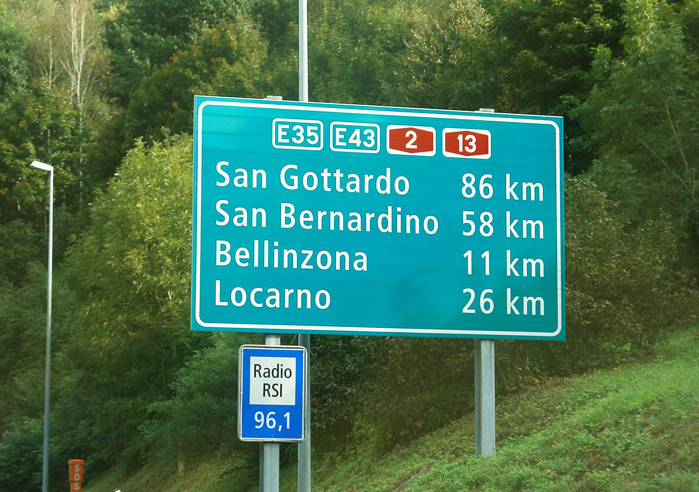
Officially released in 1976, Frutiger became a darling of highway signs (like the one below from Switzerland), public transit systems, and airport terminals. In fact, it’s such a solid type family that 75% of all airports in the world use one of three typefaces: Helvetica, Clearview, and Frutiger. In Europe, the airports are overwhelmingly Frutiger.
When we travel in different countries, we rely on typefaces more heavily — a quick read of a street sign is critical. But Frutiger is special because this type is efficient yet feels approachable. As type designer Erik Spiekermann told Dezeen, Frutiger was able to blend economy and emotion into a single typeface in such a way that makes it feel familiar. “I know of no other typeface designer who can put so much feeling into a systematic approach. Frutiger’s typefaces are always carefully planned, but they never look it.”
Interstate (the typeface created for the US interstate highway system) and its next-generation version, Clearview, are kind of the Americanized, next-generation versions of Frutiger. They’re unmistakably readable, but ultimately human.
Next time you’re sprinting to a flight or blazing by a highway sign at 100 kph, you likely have Frutiger to thank for getting you where you need to go.