NASA’s current logo dates back to 1959. It’s sort of a mess — a wonderful, retro-nostalgic mess — that’s hard to reproduce and doesn’t scale well. In fact, NASA even changed to a different logo that lasted almost 20 years before switching back. What happened?
The saga of the “lost” logo illustrates how humans naturally resist change — especially when it comes to design.
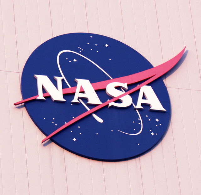
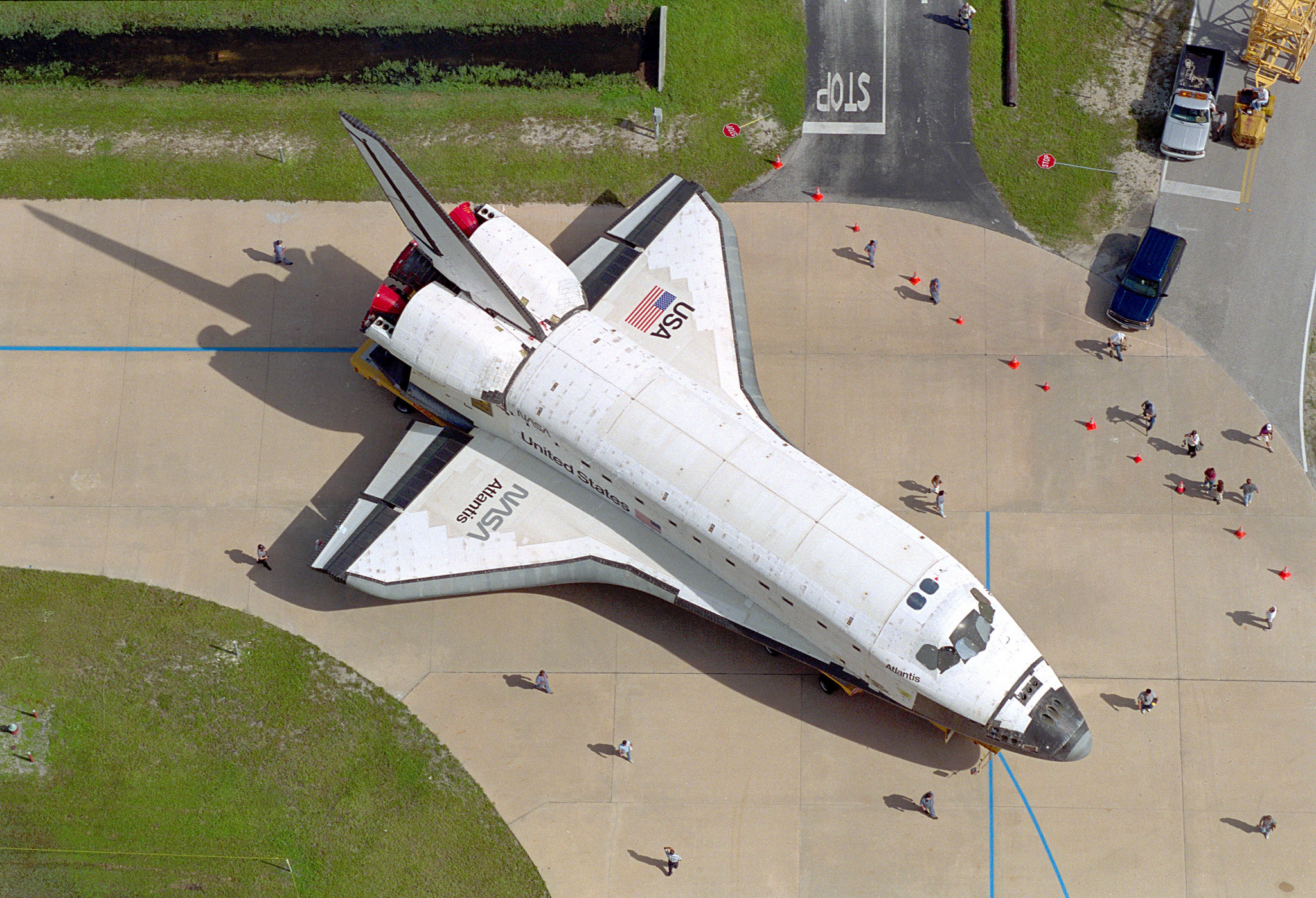
Today, NASA uses a logo that is often called “the meatball,” seen above. It’s a blue planet filled with twinkling stars, a sleek red craft moving beyond its confines, surrounded by an an airfoil that seems to audibly pop. It’s space-aged, a fragment of an era of design when patriotism mixed with aeronautics and awe at the sublime beauty of the natural world. It was adopted in 1959, and then again in the early 1990s.
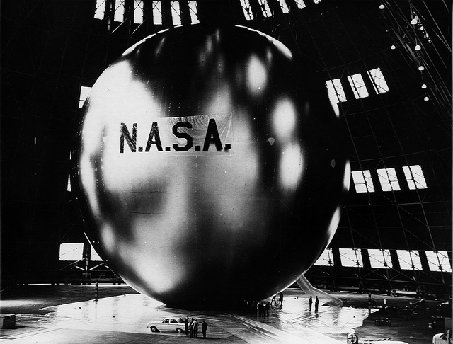
Echo, NASA’s first communications satellite, seen here the year after the meatball was adopted in 1959.
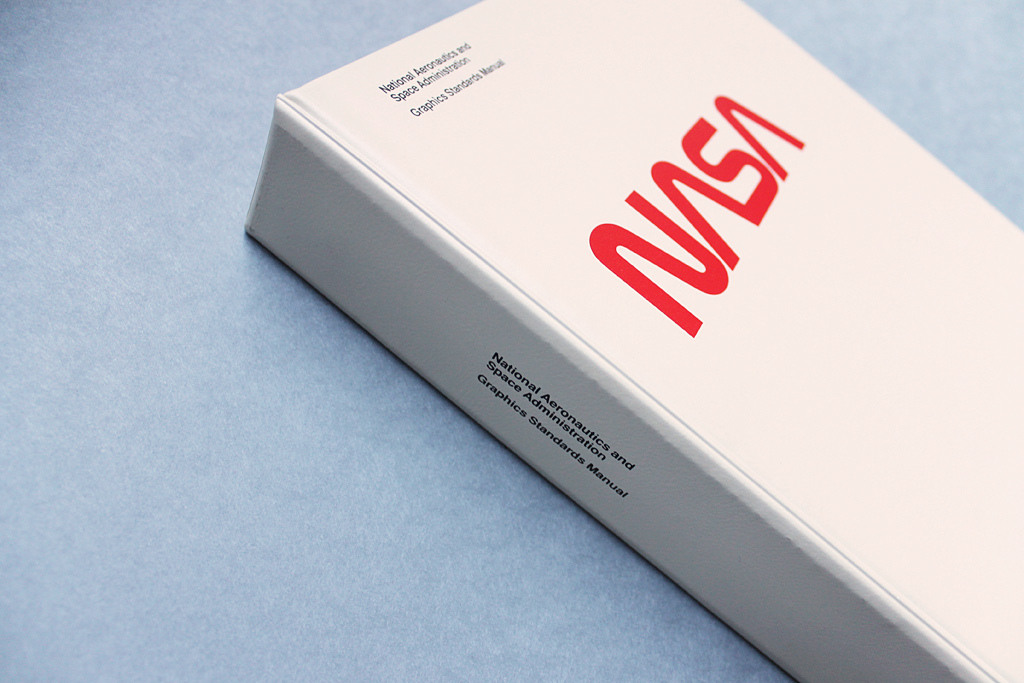
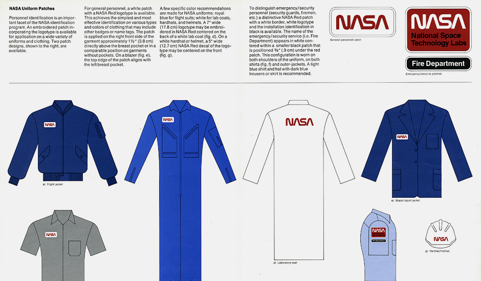
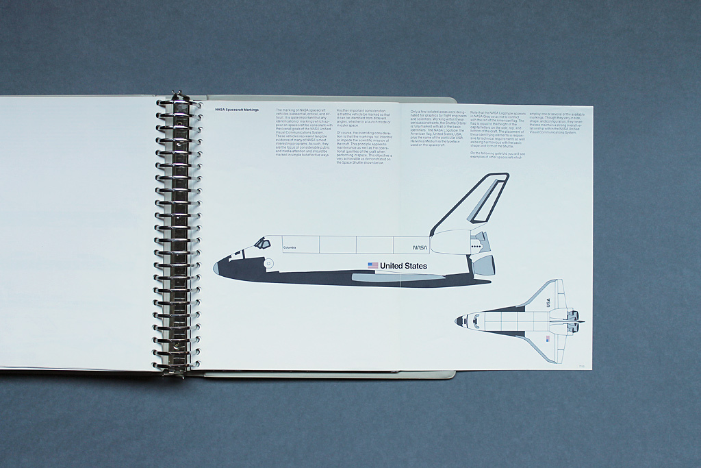
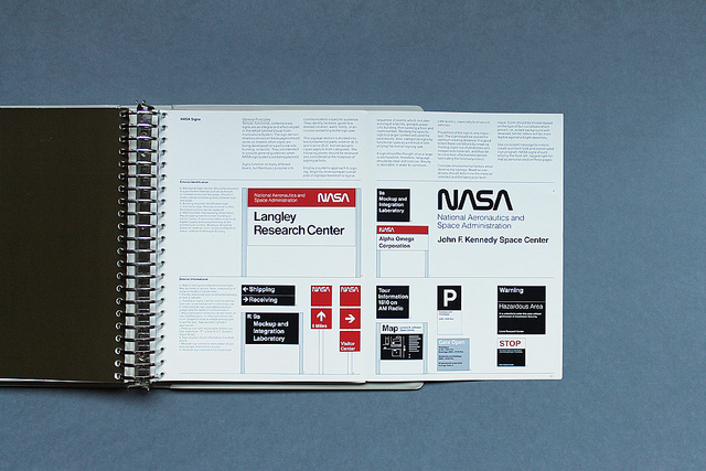
But in the interim, NASA used an alternate logo: The Worm. Created as part of a government-wide effort to improve graphics during the Nixon administration, the worm was the product of a pair of New York designers named Richard Danne and Bruce Blackburn. Together, they created a full design program for NASA that included specs on how to use the new identity and logo on everything from space shuttle livery to jumpsuits. One of their printed manuals has been preserved online, thankfully, by Display:
After which remains online at Display:
Those letterhead “gifts” coming out of Washington and sporting the new Logotype proceeded to detonate across the country … and all hell broke loose! Our firm wasn’t keen on introducing the whole Program in such a shallow and casual way… Too late, Headquarters realised they had made a mistake and needed a solution. What ensued was one of the most difficult assignments I’ve ever been involved in. A PR representative from Headquarters and I would travel around the country, from Center to Center, and give that same full design presentation … over and over to hostile audiences.
So the various agencies and centres under NASA were surprised — their beloved icon, a symbol of the most successful space program on Earth, thrown into the circular file and replaced with… some new stationary? After that, it was up to NASA and the designers to do damage control for months, trying to explain their decision retroactively.
The lunar lander with the meatball in the background in 1963.
It’s a classic avoidable screw-up that should sound familiar today. Dozens of companies and other organisations have made similar mistakes, spending months on a new identity or logo and failing to introduce it well — most recently, it was Spotify.
In NASA’s case, the poorly-planned announcement had effects that lasted for two decades. The change polarised factions within NASA, between “old timers” who missed the meatball and the youths who liked the almost digital look of the 1970s worm. Danne elaborates:
It took months to smooth ruffled feathers and build a base of trust with the Centres. Of course, the old guard was bitter and didn’t want to let go of their beloved Meatball. They continued to employ subterfuge, to undermine the redesign effort wherever possible. They coined the term “Worm” for our Logotype. It was meant to be derogatory but it also became one of endearment over time (not unlike the Meatball). Younger NASA employees strongly preferred the new graphics program and a schism developed inside the Agency: Old vs.Young.
A tale as old as time, as far as design goes.
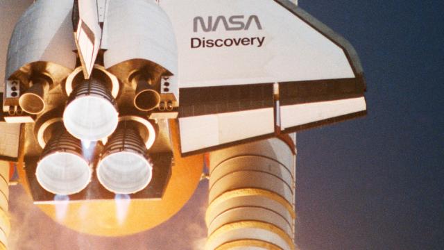
The worm on the wing of a space shuttle. NASA.
It’s fascinating, but maybe not surprising, that NASA’s logo inspired so much ire and so many life-long regrets. After all, these are the words and symbols that mark the spacecraft that leave our own planet — even travelling into deep space, in the case of some probes. It also raises an interesting question: As NASA embarks on its next phase of exploration, that of manned missions to Mars, will it dare to rebrand once more?
[Display; h/t Under Consideration and Boing Boing]
Contact the author at kelsey@Gizmodo.com.