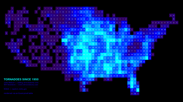
This geometric data visualisation shows the occurrence of tornadoes across the U.S. since 1950. It’s straightforward, good-looking and… made in Excel.
Created by John Nelson, the map looks like it could have been made something rather more design-focused. But given each of the cells is just a simple square, Excel can, it seems, do the job just fine. Nelson explains:
While pivoting data in Excel, it occurred to me that I could drag the latitude data into the row and the longitude data into the column. The result would be a 1980’s-Nintendo-looking chunky cell map (which, if I make the cells square, happens to be a pseudo-equirectangular projection).
And… it works! In fact, he’s put together a post that walks you through the process of creating such visualisations yourself, adding that “[o]nce you get the hang of it, you can crank these suckers out in about two minutes.” Perhaps not one for data visualisation purists, but neat nonetheless. [John Nelson via Flowing Data]