
When we think of the people who shaped early computing history, we think of inventors, engineers, CEOs. We might not think of Hermann Zapf, the German type designer who died this week at 96. But we should.
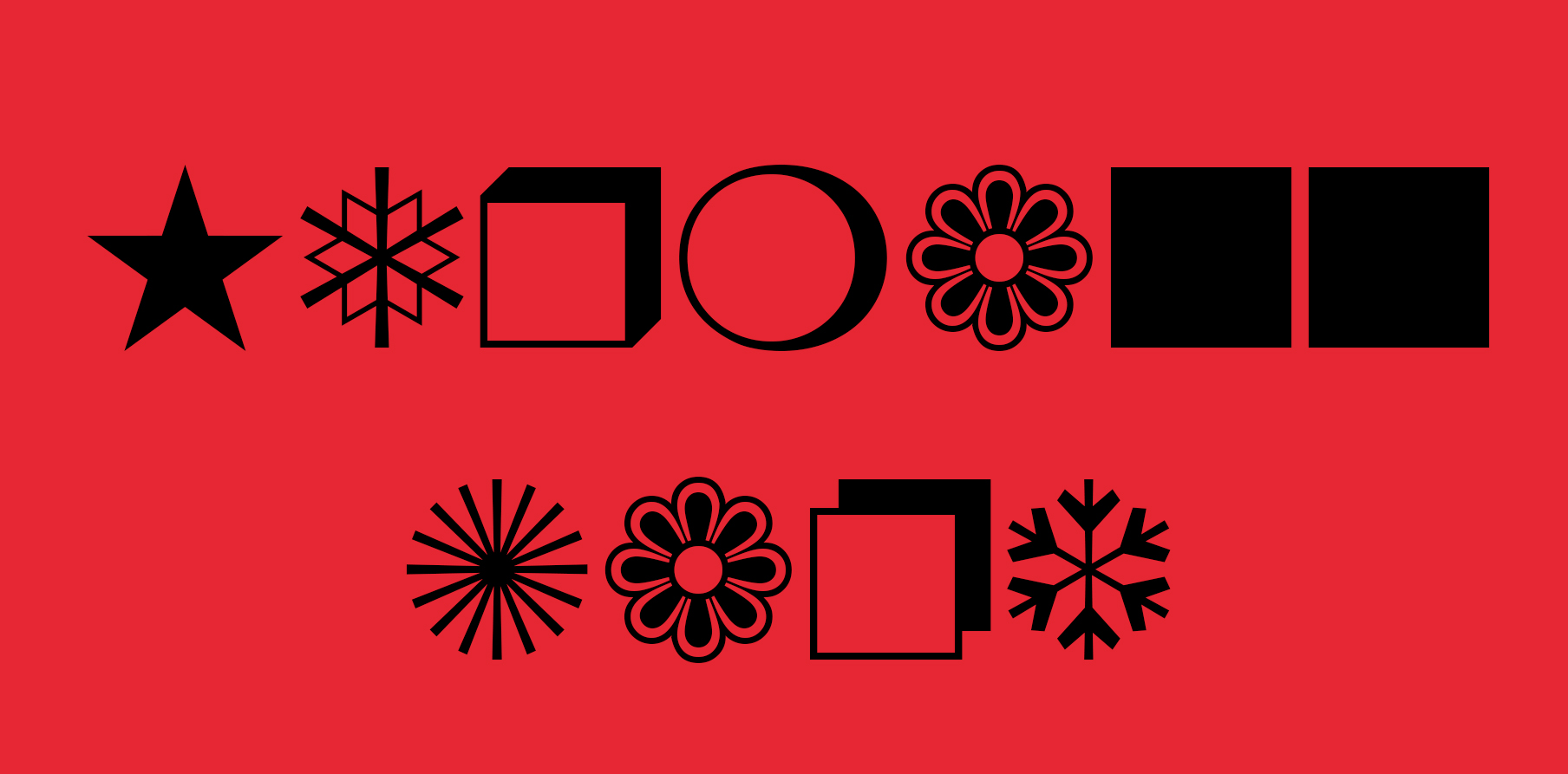
Zapf’s name might sound familiar to you. Maybe because it’s eponymous with several typefaces on your computer right now, like Zapfino and Zapf Dingbats, that familiar collection of symbols and icons from scissors to hearts. Zapf was one of the first type designers to take computers seriously and design fonts for them, and his work appeared in some of the earliest GUIs available. It was personally chosen by Steve Jobs, for example, and still comes pre-loaded on everything from Microsoft Word and OS X, to Adobe Reader.
But Zapf didn’t set out to change typography for the digital age, or play a role in early Apple history. In fact, in 1930s Germany, he was focused on being a calligrapher, designing his first font when he was just 20, according to a great, detailed biography published by Jürgen Siebert. “[He] was not able to cope physically with the gruelling work,” writes Siebert. Zapf was conscripted into the Reich Labour Service, and worked as a map maker during the war instead. After the war, he picked up where he had left off as a calligrapher.
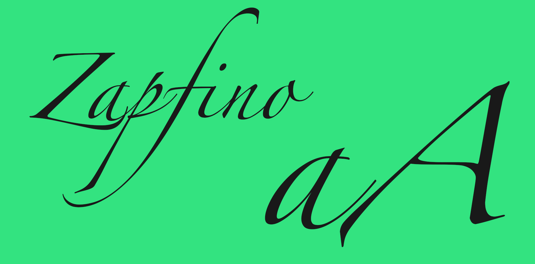
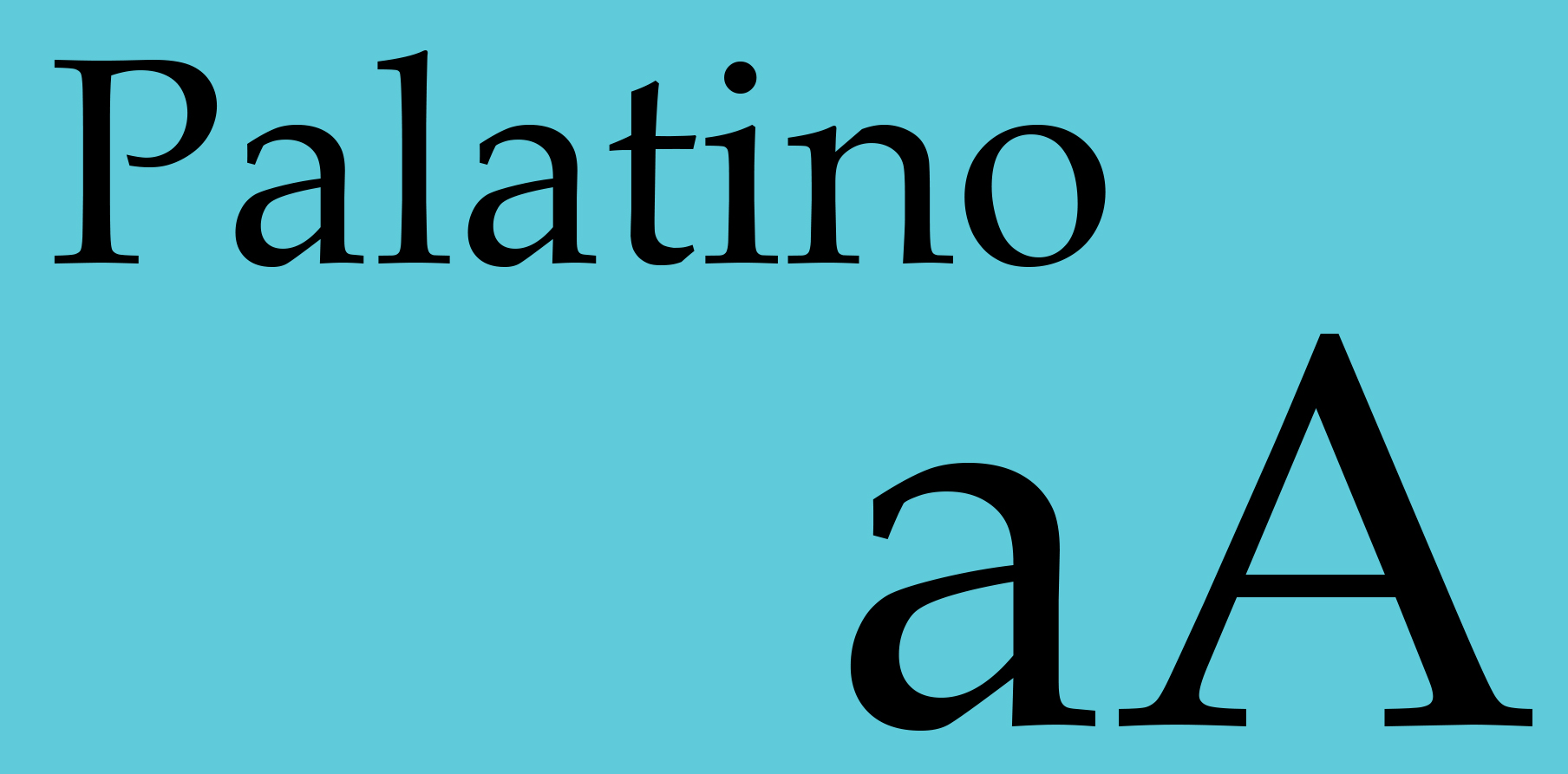
But the worlds of typography before and after World War II were radically different. New technology was coming to the design world, including a technique called phototypesetting, a new way of setting type that used light cast through photographic negatives. Zapf embraced it, all while designing calligraphic fonts that looked more like hand-lettering than anything technologically radical. Below, you can see two of his inventions: Zapfino and Palatino.
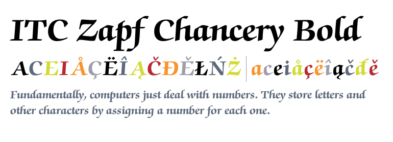
According to Siebert, in the 1970s Zapf got involved with a new foundry called International Typeface Corporation, or ITC, which sprang up in the milieu of the new digital age to offer non-traditional typefaces. This is where his path crossed with Steve Jobs, who was choosing the system fonts for the LaserWriter printer Macintosh was offering. Jobs chose Zapf’s typeface, Chancery, as the only traditional, calligraphic typeface for the entire system.
The company’s head of marketing from that era, Allan Haley, explains in this interview about the era:
Because that was the typeface that Steve Jobs liked. It was pretty much that simple. While not a typographer, Jobs appreciated the value of typographic communication and had a more than fair understanding of type and typography. Zapf Chancery was the only calligraphy-inspired typeface he selected.
A set of dingbats designed by Zapf in the late 1970s made the cut, too. Jobs’ endorsement was just the beginning: Zapf’s work was adopted by Microsoft, Adobe, and many other growing technology companies. Zapf Dingbats went on to become the foundation for Unicode’s symbols, and is probably the most commonly used set of dingbats today. They paved the way for emoji, too, many of which are based on Unicode symbols.
Why were the booming technology companies of the 1980s so interested in the relatively traditional work of someone like Zapf? The answer has to do with the foundations of human-computer interaction, and is still relevant to how graphical user interfaces are designed today.
Consumers of early computer tech weren’t used to the idea of stylising things they wrote on their computers — much less printing them. They missed the feeling of handcrafting their designs. Somehow, creating graphical art on a machine felt wrong.
But Zapf’s calligraphic fonts were a proving ground for how computers could replicate the elegance and richness of real-world handwriting in a digital space. In some ways, his typefaces are the earliest form of skeuomorphism, up there alongside the trashcan icon and the invention of the digital “desktop.” One of my earliest memories of using a PC was playing with the card-making software on a Microsoft desktop, adding borders and changing the font. It felt magical, and somehow captured the feeling of creating art by hand too.
Today, typefaces like Palatino or Chancery may have fallen out of such widespread use as our ideas about what digital type should look like have evolved. But they’re still there in your drop down menu, a reminder of a designer who understood that words could be as elegant on a screen as they could on a piece of paper — and who managed to bridge the divide between the old world by embracing both.