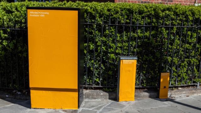
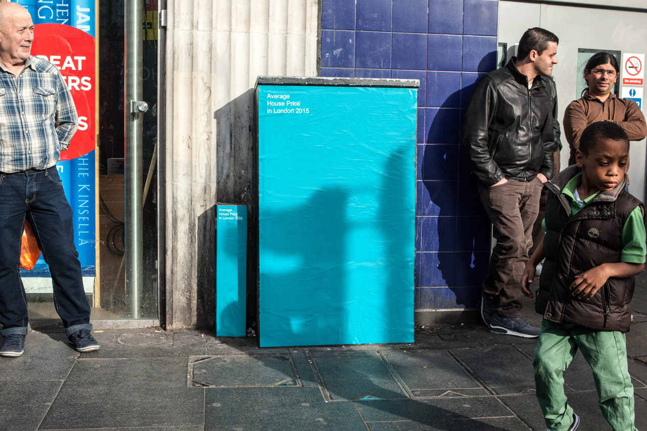
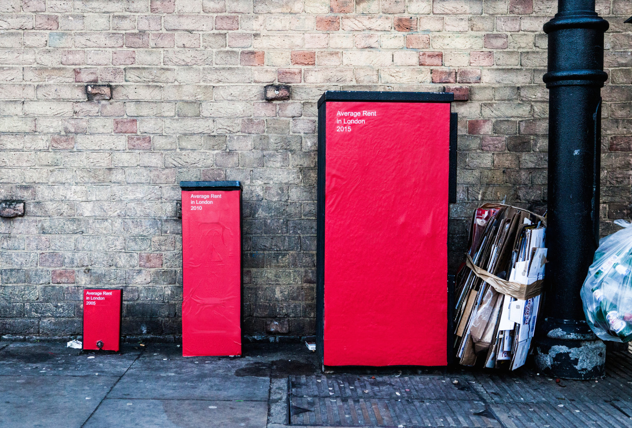
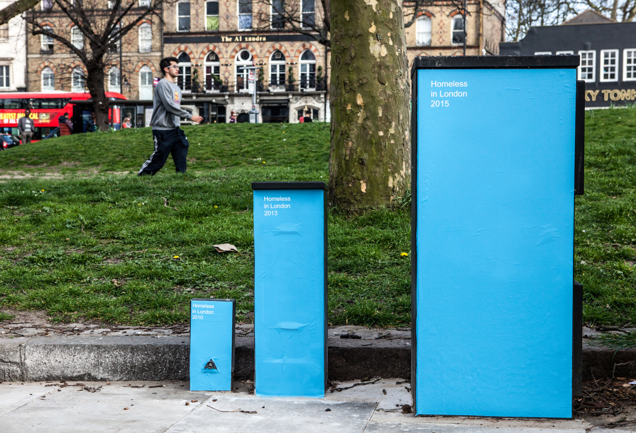
There’s been no shortage of street art trying to make a point about the inequality of cities. But here’s a clever idea that not only illustrates some horrifying facts, it also gives some real-world context that’s impossible to ignore: These infographics have been wheatpasted onto actual urban infrastructure right out on the streets.
Street Graphs is the project of an anonymous London designer who plastered utility boxes throughout the city with statistics about housing prices and wage gaps. Besides being out in public right next to the data they’re trying to illustrate, the stats also served as a good reminder to vote in London’s election yesterday.
Here are a few that struck me, but head on over to the Tumblr to see more.
Housing prices
Average rent
Homeless population
[Street Graphs via CityLab]