As part of I/O, Google is giving us a closer look at the fairly old-school tools and ideas behind Material Design — and for anyone with an appreciation for a good X-Acto knife, a colour wheel, or a crisp fold of paper, this is going to be deeply satisfying.
As yesterday’s keynote ended, Google released a crop of new videos and tutorials about Material Design, clearly meant to compliment to a number of I/O sessions that will focus on helping developers adapt to Google’s one-year-old design language. This isn’t really an update, but rather a clearer, more practical set of guidelines that explicitly explain how designers and developers can actually use Material Design — instead of trying to figure out what it is.
Those guidelines range from how to pick colour schemes to an interesting video about how real-world design experiments with paper and shadow led to the basic physics of the UI. Take a look.
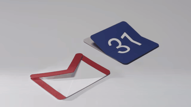
Paper Models
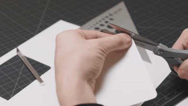
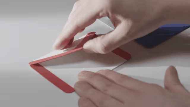
Last year we learned that Material Design is an operating system based on the real world: Gravity, texture, space, and shadow. The best tool for figuring out how to translate those real-world ideas into digital form? Some paper, an x-acto knife, and some glue.
“A computer is a Lite-Brite for bad ideas — once you put it on the computer it looks like the final product,” says Bethany Fong in one new tutorial video. The design team returned to making things in the real world before putting them into Illustrator — helping them figure out exactly how each UI element would act in digital space. In another, we hear about what Google calls “quantum paper,” or the imaginary paper that every UI element in Material Design is based on. It all began with a very simple question: “What is the material that our software is made of?”
Classic Book Design
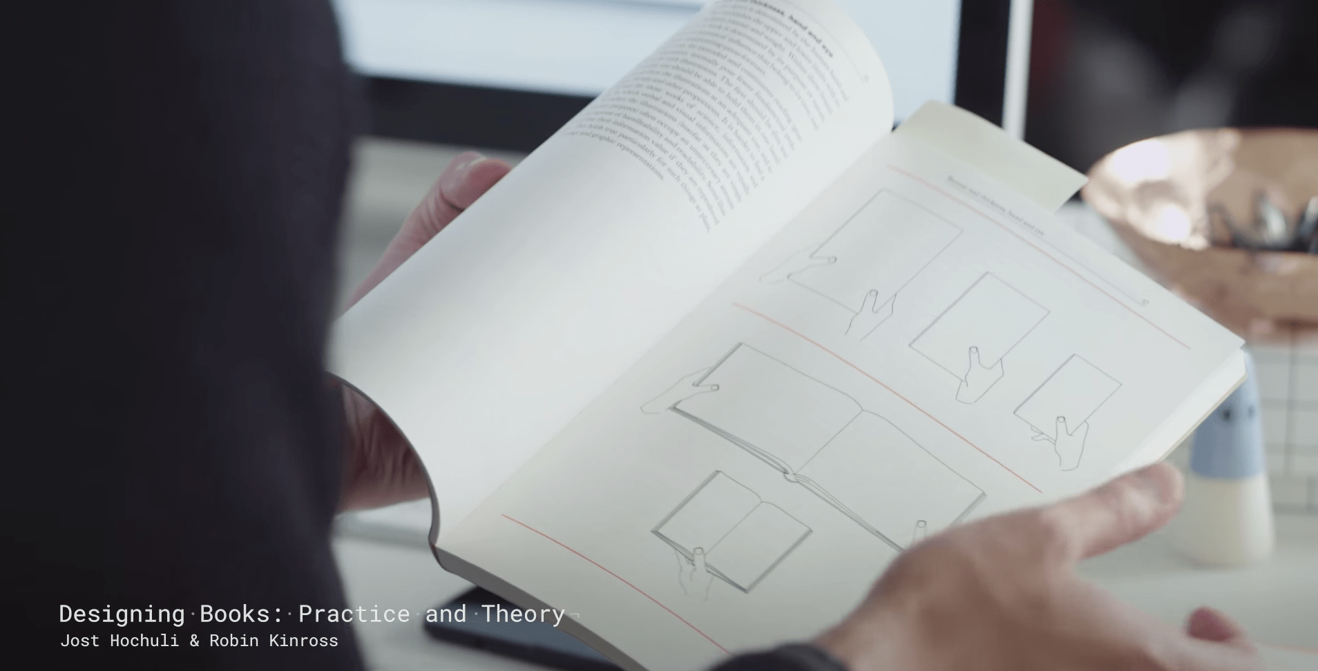
A real book makes a cameo in another video about the process of building the design language: Designing Books: Practice and Theory, a 1997 tome by the Swiss designer Jost Hochuli. Hochuli is known for his book design — not just the cover, but the physical experience of how a book is read, from symmetry of pages to sizing. “There’s a very, very clear parallel between the system of book design, and the way humans hold and use devices,” says Jonathan Lee.
Print Typography
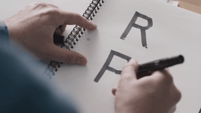
Google also posted an update on Roboto, its system typeface, and how it’s evolved over the past year. “We also wanted to add the typographic niceties we’re used to seeing in print,” says Christian Robertson. That meant refining not only the characters, but providing more weights, widths, and newly refined italics — drawing from traditional typography to add depth to a digital typeface. It’s “a living typeface,” he says, “a step beyond what we see with a lot of linotype systems.”
Shadow Modelling
In the same material tutorial, we see how Google’s designers used another old-school techniques: A lighting rig that let the team model different angles and intensities of light sources. This is more important than it sounds. Material Design is founded on a very basic idea, as articulated in the video by Bethany Fong: “Inside this device there is actually a little bit of space.”
Material Design’s UI is all about using a tiny amount of depth to trick our eyes into seeing forms and depth in the interface — getting exactly the right amount of depth? Bust out the lamp. “We realised it would be way more useful to actually look at things in real life,” says Christian Robertson.
Basic Colour Theory
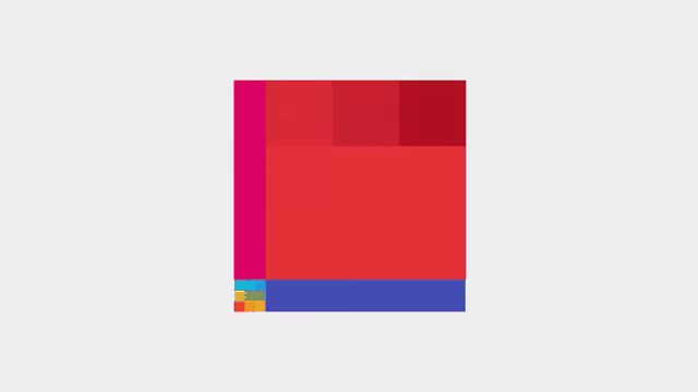
Choosing colour schemes sounds like one of the most simple aspects of adhering to Material Design — but it’s also the most vague. Another tutorial shows devs how to pick a winner, beginning with 500 value hues for dominant themes and toolbars, then using a different value of the same hue, like a 300 or 700, to compliment the main UI window.