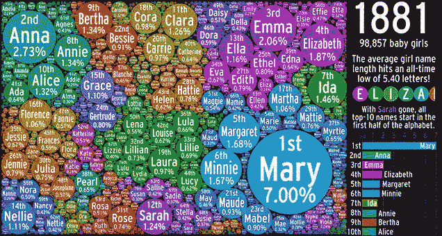
Why do people give their kids certain names at certain points in history? It’s not always clear — but at least we can amuse ourselves with data about it. Abacaba created this strangely captivating bubble chart that contracts and swells with the popularity of US girls names for every year since 1880.
Abacaba uses this 143 years of data, collected by US Social Security Administration, to draw up this amorphous, info-heavy creation. Each year comes with a few interesting facts — some just charting current events but others possibly having some connection to why a certain name becomes popular, like Babe Ruth joining the MLB or certain actresses starring in popular films.
It also isn’t the first time this data set has been used to make fancy infographics. Jezebel reported on other visualisations of this same data set that focused on the correlation between geography and certain names, whereas this five-minute video is concerned with how society and current events shape what we’re called.
One of my favourite realisations is that we’re not the only generation to stupidly name stuff after pop culture (see: Bella). Dorothy also became a popular name in the 1900s, most likely because of the book, the musical, and eventually the film The Wizard of Oz. Naming girls after pop culture heroines is a scenario that seems to repeat itself throughout decades.
As for boys, Abacaba says that another visualisation is incoming. But for now, boring lists will have to do. Spoiler: There’s probably going to be a crapload of Johns. [Reddit]