This year, we saw Google introduce a sweeping new design language to overhaul is long list of products. We saw independent designers building their own hardware. And more than anything, we saw experimentation on a huge scale — resulting in one of the most eventful and interesting years for UI and UX design in recent memory.
End-of-year reflection is tough: Our poor, fallible human brains aren’t so hot at longer time scales. So every year we take it upon ourselves to look back at all the design posts from the past twelve months and pull out a few threads that wind the entire way through the year — check ’em out below.
Buttons, Buttons Everywhere
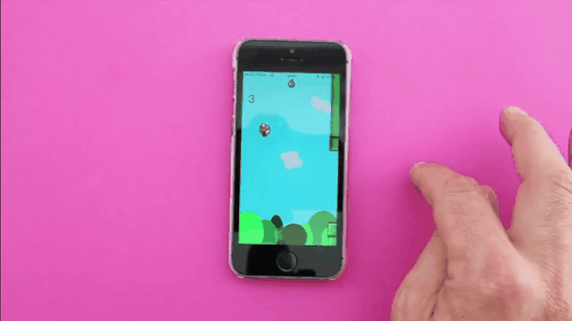
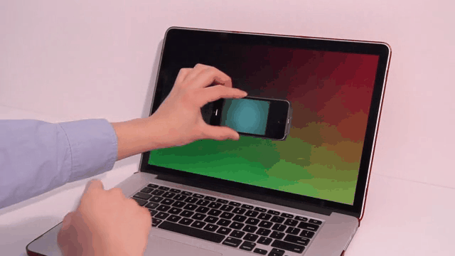
This year, the interactions once imprisoned inside of the bezels of your phone started to migrate outside of it. There was Fuffr, an iPhone case that turns the space around your phone into useable “screen,” like a tiny Leap Motion for your phone, by interpreting them with a motion sensor that communicates with Bluetooth LE.
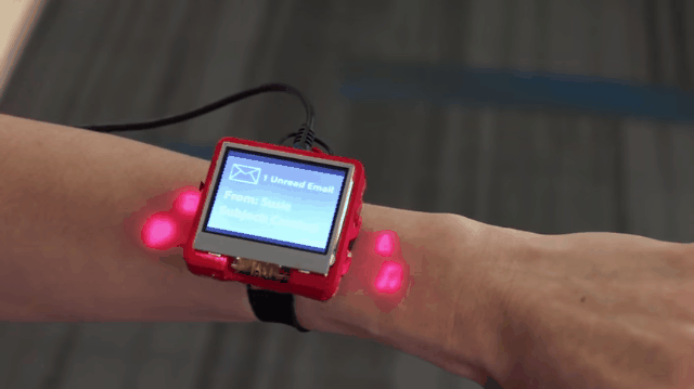
The same idea informed a project from Carnegie Mellon’s Future Interfaces Group called Skin Buttons. Designed in response to the conundrum of the smartwatch — how to control a complex, very small screen UI with our fat fingers? — the interface projects light beads onto the skin of the wrist when needed, acting as a secondary interface when a tiny screen just won’t do.
Make Your Own Interface
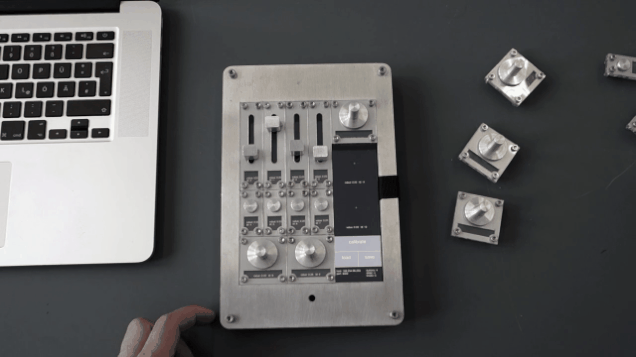
Beyond big-name programs developing modular devices like Google’s Ara, there were independent designers working towards easily-reconfigurable hardware. Florian Born, for example, designed a system around an iPad that created a cohesive set of controls including knobs, buttons, and sliders, all of which click together in new configurations. Depending on what he needs at the moment, Born can rearrange the set to suit it.
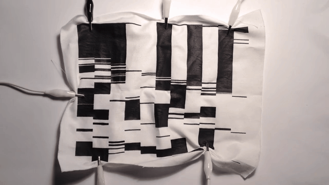
The same thread ran through other projects — especially musical ones — like a custom MIDI controller screenprinted in conductive ink onto a scrap of plain cotton, or Ototo, a tiny synthesiser that lets you turn virtually any object into a musical instrument.
Real-World Physics For Screens
One thing we saw again and again this year was the shedding of extra, unnecessary shadow and other brashly skeuomorphic details — once used to communicate depth and perspective in 2D screen space. We saw more subtle design affordances take the lead to teach users how to interact with an operating system.
In June, Google introduced us to its brand-new design standard, Material Design, which will govern how all of its numerous platforms, apps, and services will look — including how to show users what’s possible within a given interface. Rather than shadow or clutter, Material Design uses “consistent choreography,” like animation, layering, and realistic physical interactions between objects.”The fundamentals of light, surface, and movement are key to conveying how objects interact,” Google told us in its design manifesto. “Realistic lighting shows seams, divides space, and indicates moving parts.”
Touch Everything (or Nothing)
With an ongoing project that’s made our list two years in a row, MIT’s Tangible Media Group unveiled a new prototype of its morphing tangible interactive table called Transform. The system reads your gestures and reacts to them with physical, not optical, responses — these are very, very tangible bits. The idea is to develop a rough, larger-scale version of the kind of tangible interactivity that might one day be embedded in all sorts of static objects around us, from tables to walls to entire apartments.
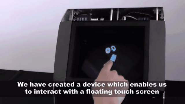
Similarly there was HaptoMime, a University of Tokyo prototype display that uses ultrasound to create a touchable “screen” in midair. Rather than poking at a piece of glass, users can “push” buttons and pull objects simply by feeling for them in midair while the device reads their gestures.
1,000 Ways To Use a Smartphone
Rather than a world unto itself, we saw developers using smartphones as mere pieces of broader ecosystems. Look at THAW, an MIT Media Lab software that turns your smartphone into a controller for a larger screen, for example. The idea isn’t just to make your phone into a glorified mouse, but to explore how the phone’s screen can actually interact with a larger screen as it moves across it. As more spaces are composed of bigger screens, this is an interaction we’ll be seeing more often.
Smarter, Safer Screens
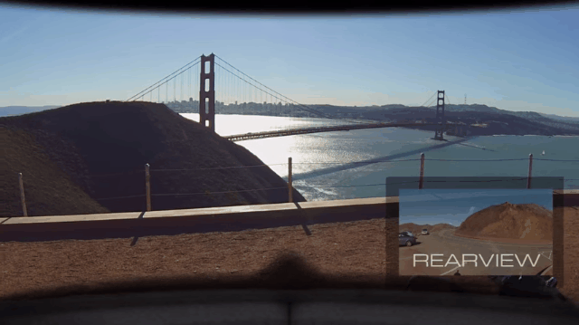
It’s been years since automakers and helmet-makers began trumpeting the safety benefits of heads-up displays on the road and slopes, but the technology still has yet to come into its own. Still, this year we saw it get much closer in an exclusive trial of the world’s first HUD helmet for motorcycles.
Likewise, we saw designers taking on the problem of in-car interactions in new ways. A designer named Matthaeus Krenn gave us perhaps the coolest: A UI that doesn’t require the driver to look away from the road, thanks to a complete lack of traditional grids and buttons. Rather, you just put your grubby meathooks on the screen and perform whatever interaction you’re looking for — regardless of where you touched down, or the scale of the gesture.
Better Fonts For Smaller Screens
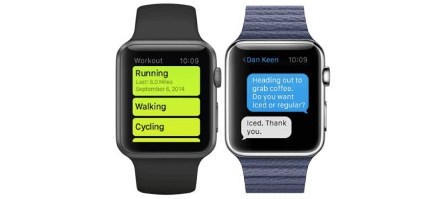
The arrival of San Francisco, Apple’s first new typeface in years, heralded a broader trend of more responsive type designs for smaller screens. San Francisco — which is free and is very easy to install as a system font if you hate Helvetica — was designed by the company specifically for use on the Apple Watch. It’s adaptive to context, so if you’re looking at a message with a small font size, San Francisco leaves more space between letters and bigger apertures.