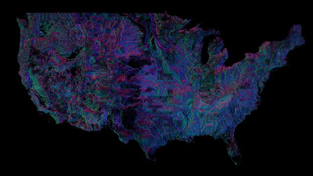
There are over 250,000 rivers in the US, some subtly serene, others tremendously tumultuous. But in this visualisation you can see them all — and the colour shows which way their waters flow.
Created by Andrew Hill from Vizzuality, it uses data from the US Geological Survey and the CartoDB software platform. Zoomed out, the thing admittedly looks a little blurry — but, usefully, New Scientist has a fully interactive version that you can explore. Zoom in, and you’ll notice how there are 18 distinct colours around the compass, which are used to visualise the direction of flow of each river.
It’s a neat step on from this visualisation of America’s rivers, which simply laid them out for us to see with no extra information squeezed into the viz. You can head about how it was mace on GitHub. [New Scientist, GitHub]