Apple recently debuted one of its first in-house fonts in nearly 20 years. The tech company’s most frequently-used typefaces now are Myriad, Lucida Grande, Avenir and Helvetica Neue, all brought in from third parties. But in its early days, graphic designers like Susan Kare helped Apple stand apart from competitors by designing original fonts.
Many of these fonts remain iconic. Others make Comic Sans look respectable, which, to my knowledge, is the most devastating diss you can give a font. Here, they are ranked:
18. Last Resort
You can only see this if you can’t see what you’re supposed to see, so last place goes to a font that works when something’s broken.
17. Fancy
Designed for the Apple Newton, Fancy is a Times New Roman ripoff that no one cares about. I couldn’t even find images of it.
16. Los Angeles
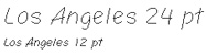
Even Susan Kare can’t save fonts styled to look like handwriting. If the Los Angeles font has any ideal use case, it’d probably be on a casual dinner party invitation for a soiree thrown by Hoda Kotb, though that honestly makes it sound cooler than it is.
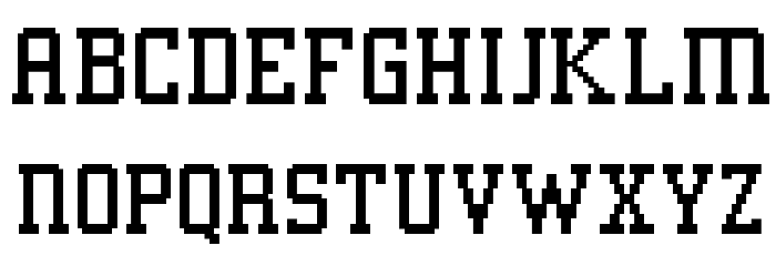
15. San Francisco (2014)
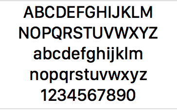
Eh. I’m glad Apple went for legibility for the custom font for its upcoming Apple Watch, but they couldn’t get much more boring than this if they put on some contemporary adult pop and ate a piece of unadorned slightly burnt toast while staring at a blank plywood wall. They didn’t even bother coming up with an original name.
14. San Francisco (1993)
This kooky-arse ransom note font would be unbearably annoying if people actually used it with regularity.
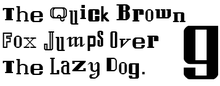
13. London
No one really wants a faux-old-timey font except really corny history teachers and Medieval LARPing newsletter publishers.
12. Toronto
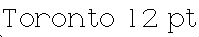
It’s a shame that this was one of the first fonts Apple ditched, because the rounded serif typeface, with its big O’s and curvy little t’s, is pleasantly quirky, but a little childish to use as a default.
11. Geneva
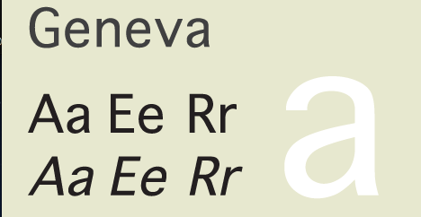
Serviceable but unexciting. Geneva is like the Chris Hemsworth of fonts. Attractive, sure, but in a generic, bland People magazine way.
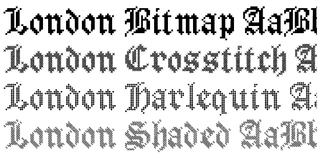
10. Venice
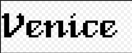
See London, although this calligraphic font has a little more originality.
9. Athens
I honestly can’t sum up any feelings on Athens one way or the other and it’s hard to find it in its original form — what you see above is a recreation — so it will go smack in the middle.
8. New York
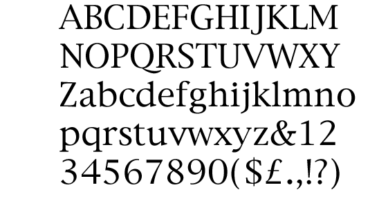
A pretty serif font, New York is easy on the eyes, but also too similar to Times New Roman to get worked up about. New York is probably downloaded most frequently now because you need it on your computer to play copies of Oregon Trail.
7. Monaco
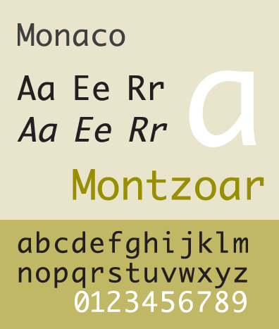
Monaco is clean, easy-to-read, and each character is distinct. I like how the parenthesis are so rounded. I don’t like the mono spacing but we can’t all be perfect. You’re doing OK, Monaco.
6. Menlo
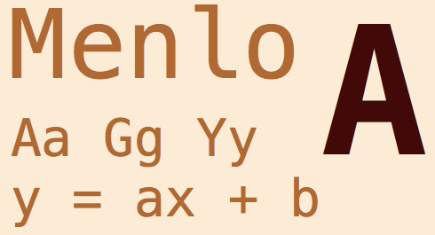
A Vera Sans knockoff, but a pretty Vera Sans knockoff. This font somehow conveys intelligence, which I know is an insane thing to say, but I feel like this font has at the least a graduate degree and has seriously considered pursuing a life in academia. Its parents are proud but sometimes after Daddy Menlo has too many Budweisers he’ll confess that he’s worried about how Menlo will support a family.
5. Espy Sans
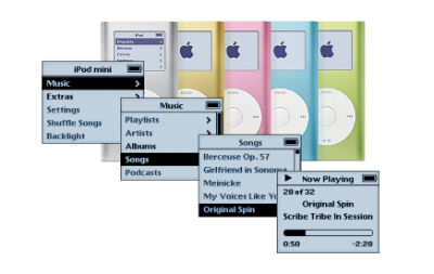
This bitmapped 1993 font will always remind me of the iPod Mini…because it was last frequently seen on the iPod Mini. The iPod Mini was superior to the Nano and the FOOLISH Shuffle, and like the iPod Mini, Apple has not been as kind to Espy Sans at it should have been. Yes, it’s a jagged bitmap font, but there’s something pleasing about it. It’s like a messier version of the Chicago font.
4. eWorld Tight
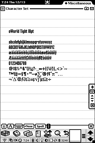
This is the best name for a font ever. The typeface itself was only used for titles in Apple’s eWorld but I don’t care.
I also like to imagine there’s a font called eWorld Loose out there and everybody just HATES it. “Get outta here, you loose piece of shit!” is what they all say on the rough streets of eWorld. Keep it tight baby.
Picture: Grant Hutchinson/Flickr
3. Cairo
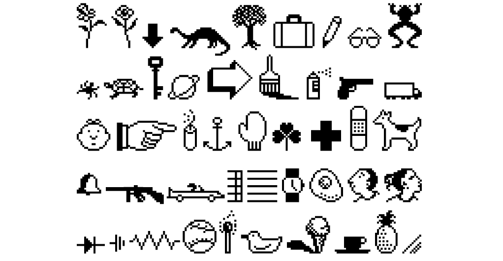
Susan Kare named most of her Apple fonts after world class cities, and she chose Cairo as the name for her set of glyphs, probably as a reference to the hieroglyphics used in ancient Egypt. Clever name, excellent font. A more sophisticated set of Wing Dings. Wing Dings were the emojis of the ’90s. Cairo is f**king awesome. Unfortunately, Apple ditched it way back in 1987, so many people only got to experience this set of quirky symbols if they used Kid Pix, the Mac’s old drawing program.
Dogcow forever.
2. Apple Garamond
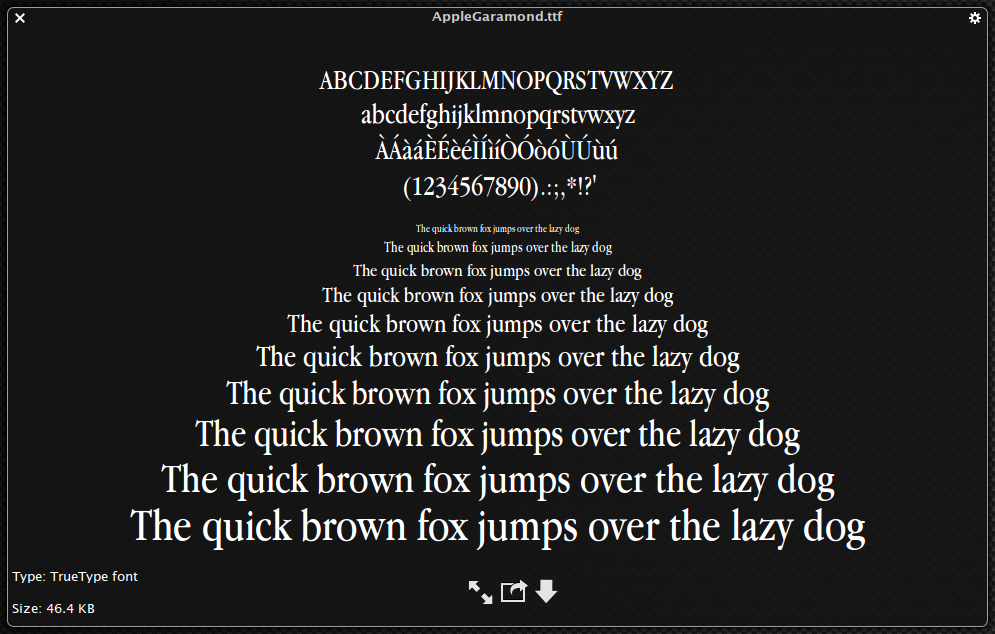
Barely an Apple font but for the custom size and hinting, but you know what? It’s far from the most original, but it’s a beautiful twist on a traditional typeface and I love it. Apple used Apple Garamond so aggressively in marketing campaigns that it became associated with the brand, even though the original version of Garamond is well over 400 years old. Android fans will be glad to know there’s evidence of Apple bogarting recognition for something someone else did first in the world of typography. Apple fans will be glad to know Apple’s take on the classic font is possibly its most elegant mutation.
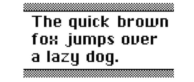
1. Chicago

The Chicago font is a most excellent font, as my coworker Alissa Walker has previously pointed out. The squat, proportionate typeface is friendly-looking and great for reading at low resolutions. Like Harrison Ford, it is old and a little jagged but possesses some inexorably reassuring quality. Especially now that it’s fashionably retro, Chicago is one of Apple’s most recognisable, legible typefaces.