The periodic table is perhaps the most iconic scientific visualisation in the world — but that doesn’t mean it can’t show more. Now, Google has amped up every scientist’s favourite to show how elements really get used in the real world.
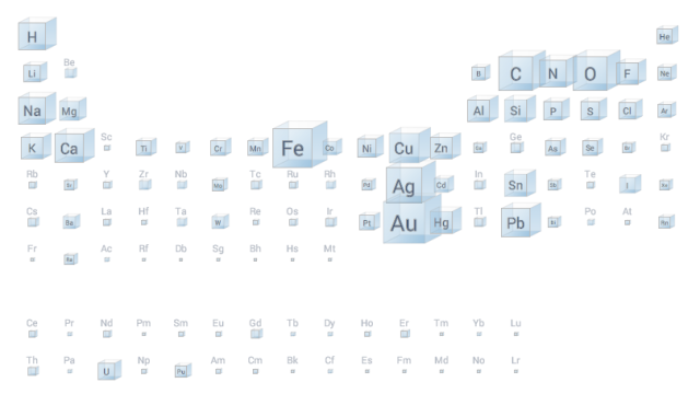
That means that the interactive visualisation allows you to see where the elements crop up: in the Earth’s crust, the Sun, the sea — and even the human body. And it also uses the power of Google’s Ngram Viewer to shows which elements get mentioned most in books too, shown above. (It’s interesting to compare it to the way we Google elements.)
What’s striking is just how pervasive a handful of elements are, compared to the way we talk about them. So while silver and gold obviously get plenty of name-checks, it’s humble old hydrogen, oxygen and carbon that perhaps really ought get a little more of the press. [Google Research via Flowing Data]