The modern logo is actually surprisingly old: The first trademarked logo dates all the way back to the 18th century. But it wasn’t until the 20th — the era of instant and ubiquitous communication — that identity design really bloomed.
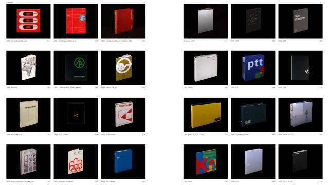
A few moths ago we wrote about Manuals 1, a book of great corporate logo design, from NASA to ABC. It turns out the book was so popular, it’s already sold out — and the UK-based publishers, Unit Editions, are putting out a follow up called Manuals 2: Design and Identity Guidelines.
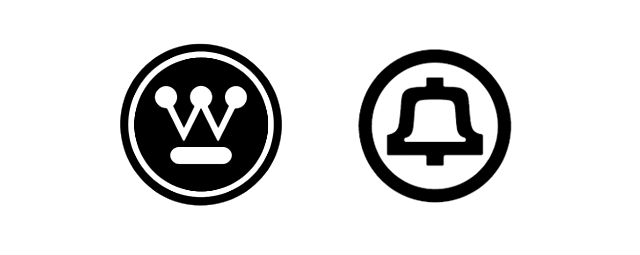
Like the first version, it looks at 20 design manuals from the same golden age of identity design. There’s IBM, whose Paul Rand-designed logo came to define the early days of consumer computing. Or Rand’s Westinghouse’s iconic three-pronged W, designed in 1961. Or Saul Bass’ classic Bell System logo, which came to personify Ma Bell before she met her fate at the hands of the U.S. Department of Justice.
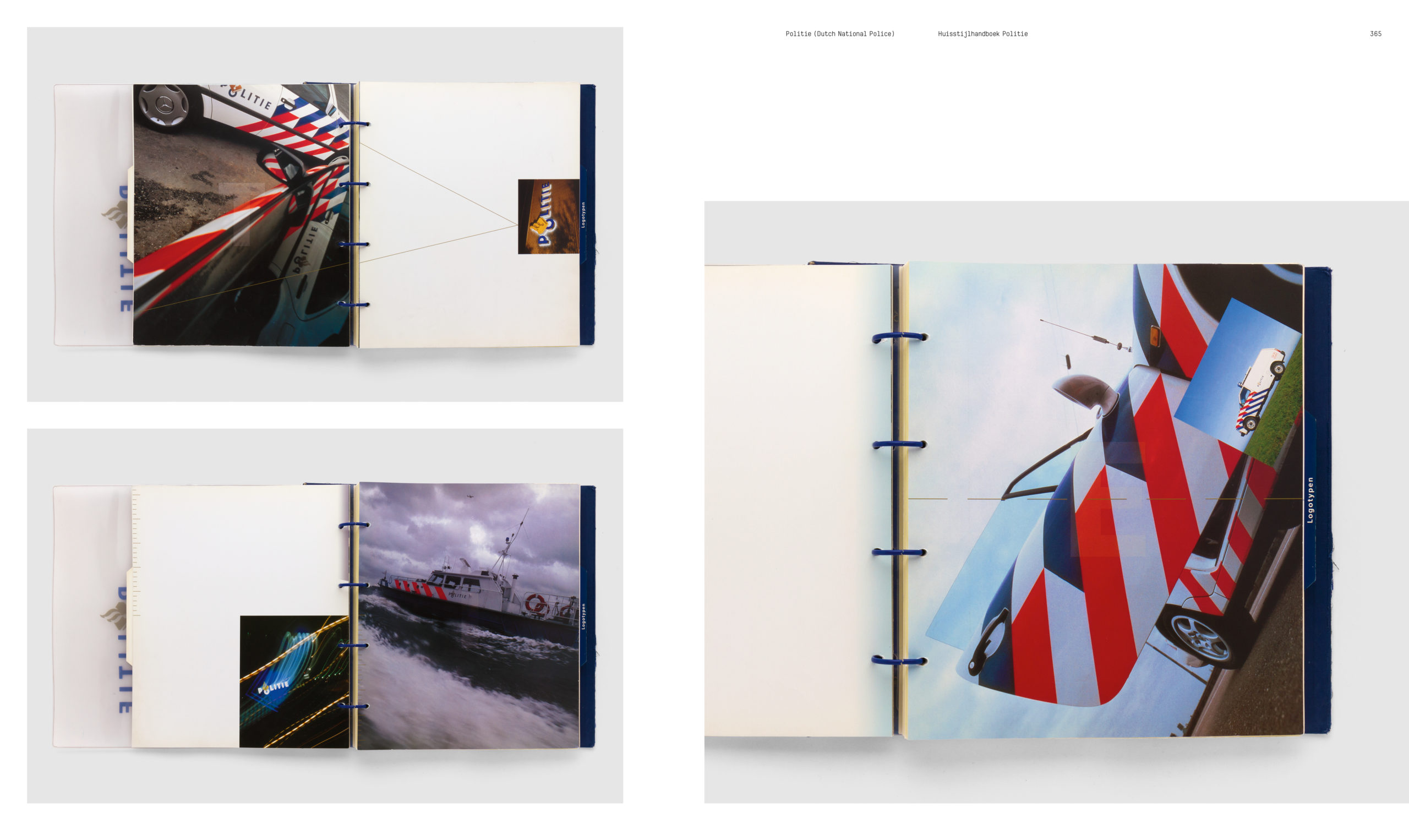
Then there are more surprising — or at least less familiar — inclusions, like the distinctive neon stripes of the Dutch National Police’s emergency vehicles, designed in 1993 by Studio Dumbar:
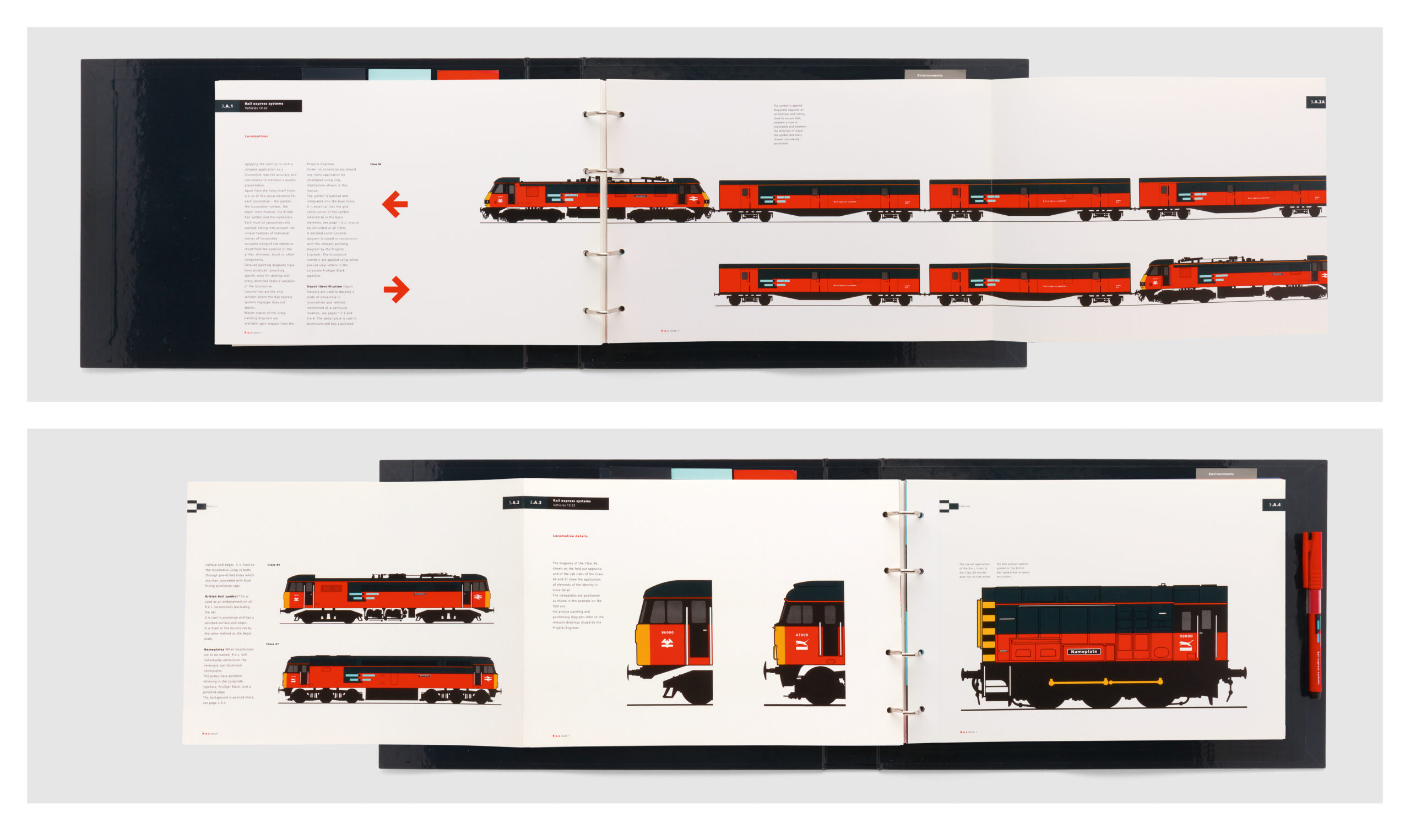
Or the design for Canadian National Railways, right down to the pain job, designed in 1965 by Allan Fleming:
It’s a great look at how these designers shaped identities that spanned from tiny logos to massive vehicles, and a glimpse into an era before Illustrator and file sharing. Check it out here.