The internet changes fast, but The Guardian‘s website hasn’t budged in seven (!) years. Today, it sheds the old cluttered look for a badly needed design refresh that will make its front page easier to read across mobile devices and your desktop.
Last month, The Guardian surpassed The New York Times as the second most trafficked english language newspaper website, according to comScore. (The Daily Mail reigns supreme.) The team behind the new redesign told me that The Guardian got there on the strength of its reputation and reporting — despite its old cluttered design.
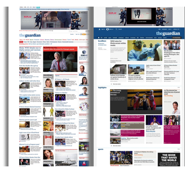
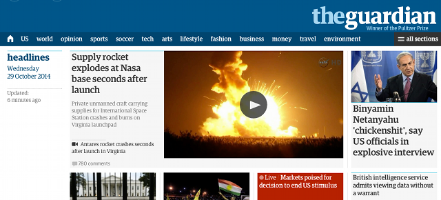
Scanning the new website (right) should be easier than on the old one.
The new website launches today in the US. The UK and Australia will follow in the coming months. It’s a dramatic shift that tries to look less like a newspaper and more like a scrollable, scannable collection of stories.
The design is built around containers organised into different zones. When you land on the front page, the first thing you see is a full-width row of headline news; scroll down a bit and you’ll see highlights of content exclusive to The Guardian, followed by in-depth stories, and then opinion. As you move further down the page, the profundity of the stories increases. You’ll notice the columns are gone. Now there are just big rows you can consume in scoll-sized gulps.
The container-based structure is built to be easily customisable so that the different boxes can be arranged and resized to billboard content as needed. It’s also responsive so that the same design scales easily depending on the size of your browser window as well as whether you’re on your tiny phone or a big ‘ole desktop.
For readers — you! — this will hopefully mean a page that’s easier to check-in on at a glance. According to The Guardian‘s director of digital strategy Wolfgang Blau, the goal is to increase the frequency of visits by loyal visitors who check in on the site every three hours or so.
Article pages will also see a redesign, though some of the most important facets won’t be immediately apparent. For example, they’re hoping to increase the relevance of related content suggestions, and editors will also have access to a new tool that lets them embed user comments prominently on pages when they’re relevant to a developing story.
In all, The Guardian‘s new design is notable because it looks so much like the web we know now. The previously cluttered design reflects an effort to get the site’s 500 daily stories in front of users all at once. The new design is more patient, trusting users will find their way to what they want even if it’s not the first thing they see. [The Guardian]