When the news broke yesterday of Google’s new Inbox app, my initial reaction was sceptical. How many times has an app tried to “solve” email? Inbox is Google’s way of helping you organise the typhoon of greetings, promos, invoices, and discussions that beg for your attention. And after using it for a while, I can see the potential, but I’m still wary of handing over my email-life.
Firing up Inbox and connecting your Gmail account is simple and familiar, yet what you are confronted with in place of the usual endless list of subject lines and senders can be quite a jolt to the system. Gone are the conventional (essential?) organizational cues such as specific date and time. Instead, emails in Inbox are presented more casually with Today, Yesterday, and This Month, followed by preceding months.
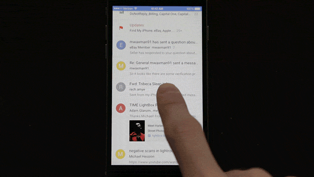
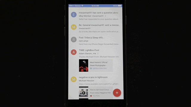
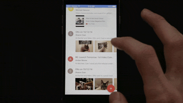
Emails appear in list form just like before, but scattered throughout are Bundles — folders that wrangle common types of messages together. These are similar to the tabs that Gmail rolled out last year.
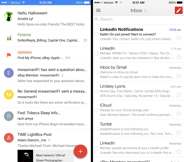
Here’s a comparison of Inbox vs the Gmail app’s inbox view:
Bundles — a core tenet of Inbox — is one of the things that leaves a sour taste in my mouth, at least so far. You have to really trust Google’s automation to be confident that it will sort your mail correctly without leaving anything behind. It would be great to have a bundle of all the stupid social network notifications I don’t care to read, but if I have to delve into the stack to make sure it didn’t accidentally snatch an email from my Mum, it’s not quite useful. Even if Inbox never actually does anything stupid like that, my fear that it might still a barrier to entry. But if you have a distrust of robots like I do, you can just de-bundle your bundles as you come across them. Problem solved.
Another way Inbox tries to make email easier is by incorporating gestures, one of the great features of Mailbox. Swipe an email to the right to mark it as “done”, swipe to the left to “snooze” it. And having used Mailbox for about six months before giving up on it, I can say that Inbox’s gestures are superior. There are fewer variations to remember, accidental swipes are less common. I also love how Inbox takes deleting emails completely out of the equation. There isn’t even an option for sending something to the trash. It’s all a project of reducing superfluous decision-making.
But Inbox also adds some new decisions you can make about your messages. You can “snooze” an email and have it pop up at a selected date, time, or place. You can “pin” an email, which flags it as something annoying you have to deal with. I like the ambiguous terminology that Google went with here. Your task isn’t pigeonholed as a “to-do” or a “respond to…”, it’s simply a pin — something you want to revisit. Maybe it’s just something nice you want to remember! Although let’s face it: Probably not.
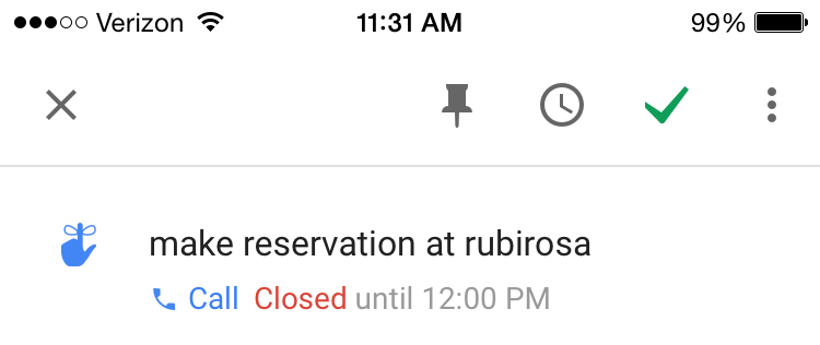
There are many other productivity tools embedded in Inbox. You can create a reminder completely independent of an email. If you type in “make a reservation at Rubirosa” it will automatically look up the phone number and give you the option to call. It will also give the restaurant’s hours. It’s very Google Now-y, and you can feel how that service is destined to slowly leak out into the rest of Google’s services. That’s pretty great if you’re into letting Google see all of your data all the time!
A major selling point of Inbox is its design. Google has been eager to show off the delicious look of its new Material Design paradigm. But as sleek and sharp as Inbox looks, its way of displaying information is kind of muddled. Gazing at your list of emails, its difficult to intuitively grasp what you’re looking at, because there is very little in the way of typeface differentiation.
For example, the sender and subject line of an email look almost identical. And the first thing that consistently grabs my eye is the colourful user icons on the left. Most people who send me emails don’t have custom icons set up, so I’m just left with big coloured circles that give me no more information than the first letter of a first name. It’s quite distracting.
Inbox also tries to display too much at once. My Inbox is littered with Bundles, photos, reminders, documents, and receipts. It’s nice to have instant access to that stuff, but it makes for a cluttered layout. I wish Inbox would prioritise the information it surfaces more. The most relevant information, who is this email from and when did they send it, should take center stage.
It all makes me wonder whether email actually needs fixing. Smart email apps are all attempting to simplify something that overwhelms us, but they way they do it comes off as an overreach. Inbox is no different, from what little I’ve used it so far.
Of course, since email is a day-to-day activity, figuring out whether Inbox really works will require more than 24 hours of use. So far I’m sceptical, but it’s easy to see the potential here, hiding behind some of the design issues and my general fear of letting an algorithm take a hatchet to the chronological email list I’ve come to know. I’ll keep using it, and I really hope that Inbox doesn’t end up where Mailbox did for me, in the trash bin.