Microsoft debuted Windows 10 today and it has a solid Start Menu. Good job, Windows! But before getting Windows 10 on point, the Start Menu went through more than one reinvention. Some went better than others.
Windows 95
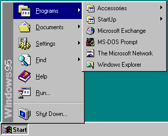
This is where it all started. Looking at this I can pretty much hear the “OOOOEEHHHAAAU UUHHHGGGHHEEUURHHH” AOL dial-up noise. Windows 95 couldn’t be more 90s if it was a pog.
The Start Menu didn’t exist before Windows 95. Prior to that, people just used Program Manager like schmucks.
Image via Wikimedia Commons
So the bar was set pretty low with 95. And at the time, that was fine! The original Start Menu made it far easier to pull up programs, and it represented Microsoft’s forward thinking. Getting to Minesweeper was a snap and life was simple.
Microsoft treated the basic Windows 95 Start Menu with the “if it ain’t broke, don’t fix it” attitude for a while. It went largely unchanged on Windows NT 4.x, Windows 98, Windows 98 SE, Windows Me, and Windows 2000.
Windows XP
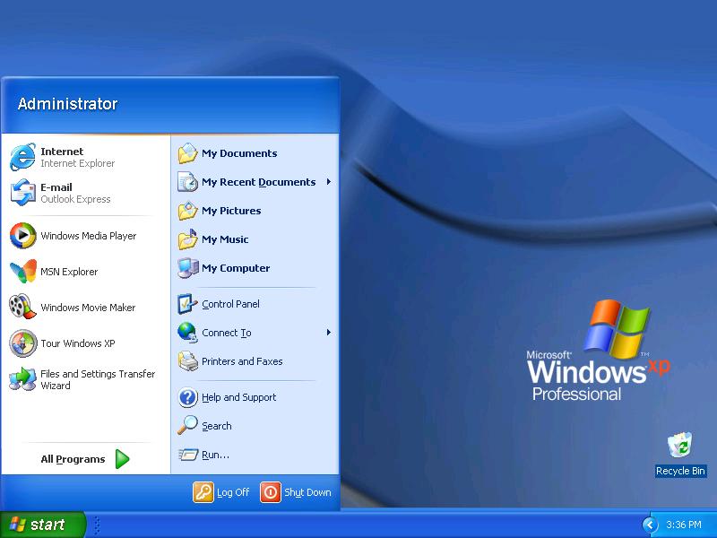
Image via microsoftwindowstechs.com
By the time Windows XP debuted, the Start Menu was in need of a makeover, in looks if nothing else. Microsoft substantially revamped it, providing two columns and more customisation options. One huge improvement: Quick access to documents, pictures, and other personal files.
Windows Vista
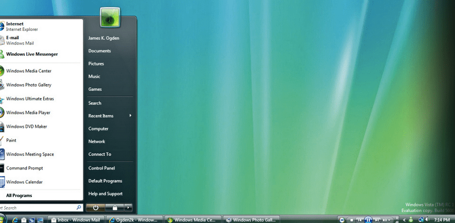
Image via www.techiehq.net
For Vista, Microsoft made mostly small adjustments to the two-column template introduced by Windows XP. The Start Menu in vista wasn’t bad, but it didn’t offer much of anything new. The biggest change during this period was that the Start Menu now expanded depending on what you clicked without obscuring the original options.
Windows 7
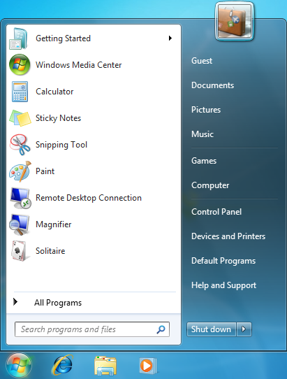
While Windows 7 successfully fixed some of the problems plaguing Windows Vista. it didn’t do much for the Start Menu, which hardly changed.
One of the only big differences was that you were no longer able to convert back to the classic Start Menu on Windows 7, so that sucked.
At this point, Microsoft was deep in the Ballmer Years, but the CEO’s flamboyance didn’t influence the stale Start Menu design.
Image via Wikimedia Commons
Windows 8
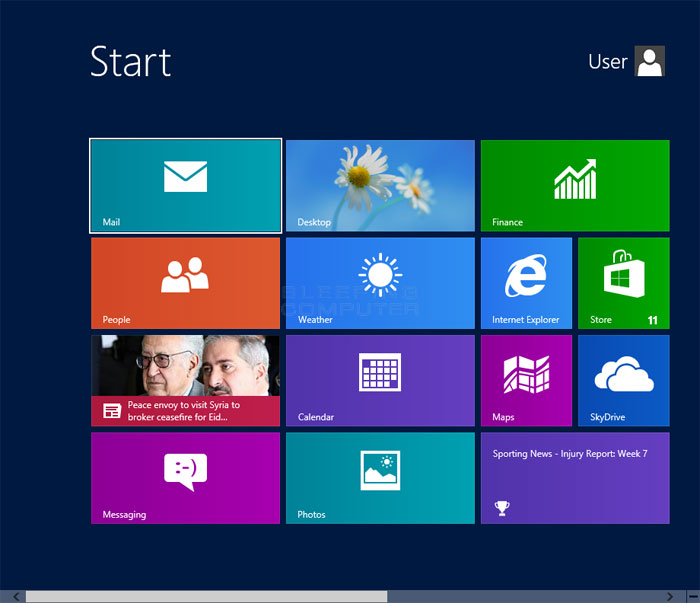
Image via www.bleepingcomputer.com
When Windows 8 came along with its grand dreams of unifying tablets and desktops, the Start Menu got its most radical (and controversial) adjustment; it went fullscreen.
The Start Menu became the “Start Screen,” and used live tiles instead of familiar little bars. It’s not like these tiles didn’t work on the desktop, but they were so different from the Start Menu people were used to that it caused everything sort of mass hysteria. The recent programs list was relegated to search and power settings got shunted to the infamous Charms bar Settings. It was kind of a mess.
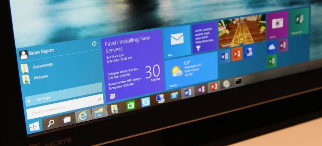
Windows 10
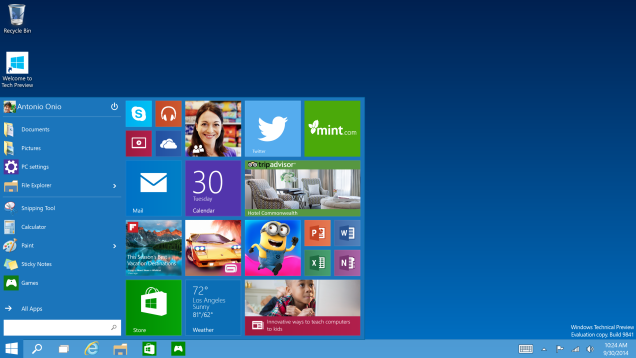
And now here we are. Back to a proper Start Menu and lovin’ it. Windows 10’s Start Menu combines the basic efficiency that made everyone lose their shit for the Windows 95 Start Menu, but it also incorporates the live tiles in a way that makes sense without being offensive. You can go fullscreen if you want to, but it’s not required. It’s the best of both worlds, and what we wanted all along.
Welcome back buddy. You never went anywhere, but we missed you all the same.