Yesterday, a new logo appeared on fencing around World Trade Center construction site. To design it, developers hired one of the world’s top agencies to try to create branding that’s never going to be sufficient. The very expensive and almost impossible task of creating a symbol to represent a space that will always be haunted by horrific terror.
The New York Times reports that the logo is part of a $US3.57 million branding and signage effort lead by Landor Associates, the firm responsible for iconic messaging for everyone from FedEx to Old Spice. The firm also did the lovely minimalist design of the 9/11 Memorial’s logo back in 2009.
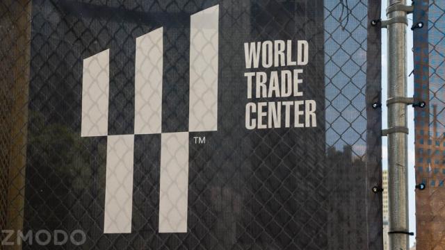
It’s packed with the kind of intelligent symbolism that marks the better efforts to represent the site and the tragedy of September 11, 2001. The graphic is a “W” composed of five towers, representing each of the buildings in the new complex. The bottom two, of course, are stand-ins for the original towers that were toppled in 2001. The top three are the beams that remained standing after the dust settled The meaning of the angle at which the top three columns are clipped: 17.76 degrees, which corresponds to the height of the 540m WTC 1. And, duh, that’s the year of the United States’ independence. Like other New York City signage, the words are set in a Helvetica type face. (It’s Helvetica Ultra Compressed for all you font nerds.)
It’s got all the right ingredients. It’s reverent, yet minimal. It’s considerate. But somehow it’s still feels strange. Any fresh new logo for the site of such a disaster is going to be uncanny. Not even an unlimited budget can tackle that challenge
The logo is strikingly reserved compared to the pre-9/11 logo, with its futuristic flare. And it’s got none of the panache of the One World Trace Center logo. And this makes sense. The old logo was supposed to convey awe at one of the largest buildings in the world. Meanwhile, the 1 WTC logo’s stately Gotham font emphasises the building’s singular status as the largest in the western hemisphere.
The WTC logo is indeed elegant and packed with meaning without coming close the gaucherie of total failures like the WTC gift shop. That it still feels a little unsatisfying is no fault of the designers or even the design itself. Slapping a brand on the site of terrorist attack is necessary — it’s going to be a business, after all — but unlike a product or a service, there’s no way to adequately represent the World Trade Center. It’s a site of such trauma, that any representation will feel hollow by comparison with the memories and emotions it invokes. But in another strange way that’s a success; it pays tribute to the past and the future without trying to tell people how to feel.
Picture: Nick Stango