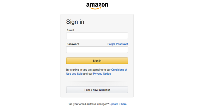
Amazon has built its brand around consistency — it rarely follows popular user interface trends, and its design mission has always been ruthless pragmatism. But now, for the first time in many, many years, it’s given its login page an overhaul. It’s the end of an era, and it could signal broader, site-wide changes.
The new page, which was pointed out on Twitter by Luke Wroblewski, is clearly geared towards mobile users: It’s thinner, has much larger buttons, and cuts out much of the extra noise that few of us ever actually click on, like “sign in help,” and also nixes the mention of its “Secure Server” (ominous!).
Amazon’s iconic Sign In page redesigned after 20 years. pic.twitter.com/la6YYsbC8O
— Luke Wroblewski (@lukew) August 28, 2014
The most indicative change — if spinning yarns out of minutia is your thing — is that Amazon has done away with one little UX eccentricity that made it unique: The form in which it asks whether you even have an Amazon password. Back in the 1990s, that may have made sense. But it’s Amazon’s world now, and apparently, its designers would rather not waste those extra pixels on a question they already know they answer to. [Luke Wroblewski; Co.Design]