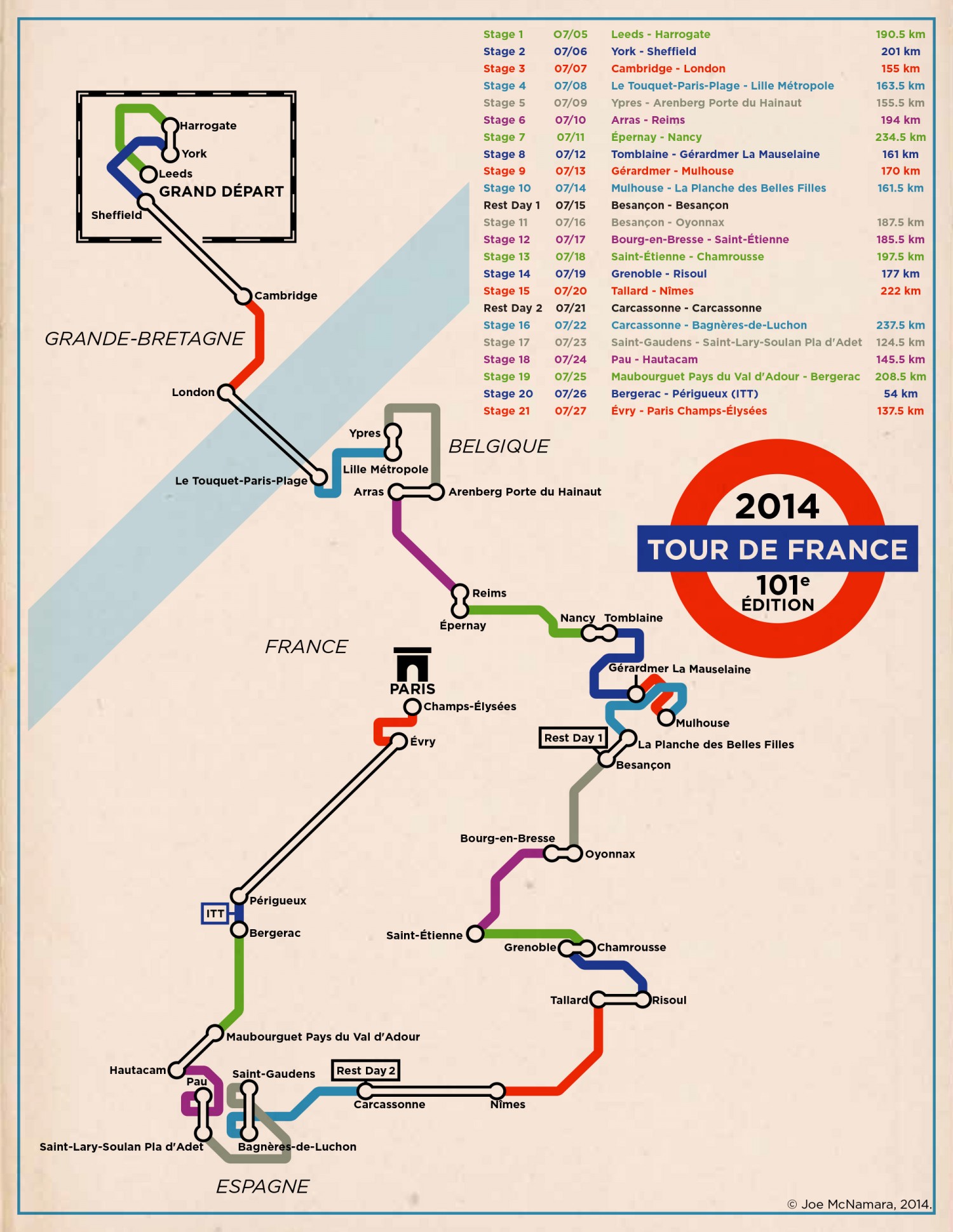
This weekend, the Tour de France kicked off in Yorkshire, England, and today it will pass through London too. So this train-style chart, drawn in the style of the classic London Underground map, is a particularly apt celebration of the iconic cycle tour.
In this maps, colours of stages are purely cyclical, but rider movements not performed on a bicycles — like, err, cross the channel — are in black and white. Over the course of 21 stages — with only two rest days — the riders will cover over 3600km. And they will probably do it faster than they ever could on public transport. [Visual.ly]