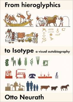
Before the twin girls dancing, the smiling moon, the steaming pile of poo, there was a whole other visual language we used to help guide us through the world. Before emoji, there was isotype, the influential pictorial language invented in the 1920s. And it continues to influence our lives today.
Isotype stands for International System of Typographic Picture Education, an accessible visual language created to share ideas across language and literacy barriers. These “pictorial statistics” ended up having an incredible impact on infographics, public space, and wayfinding, according to the book Isotype: Design and Contexts, 1925-1971, but there is an incredible backstory behind the way we use design to communicate without words.
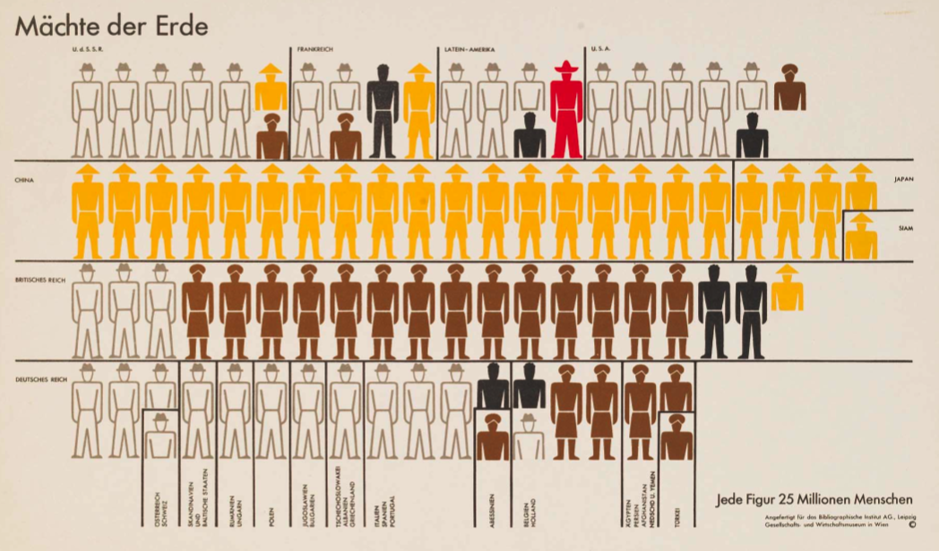
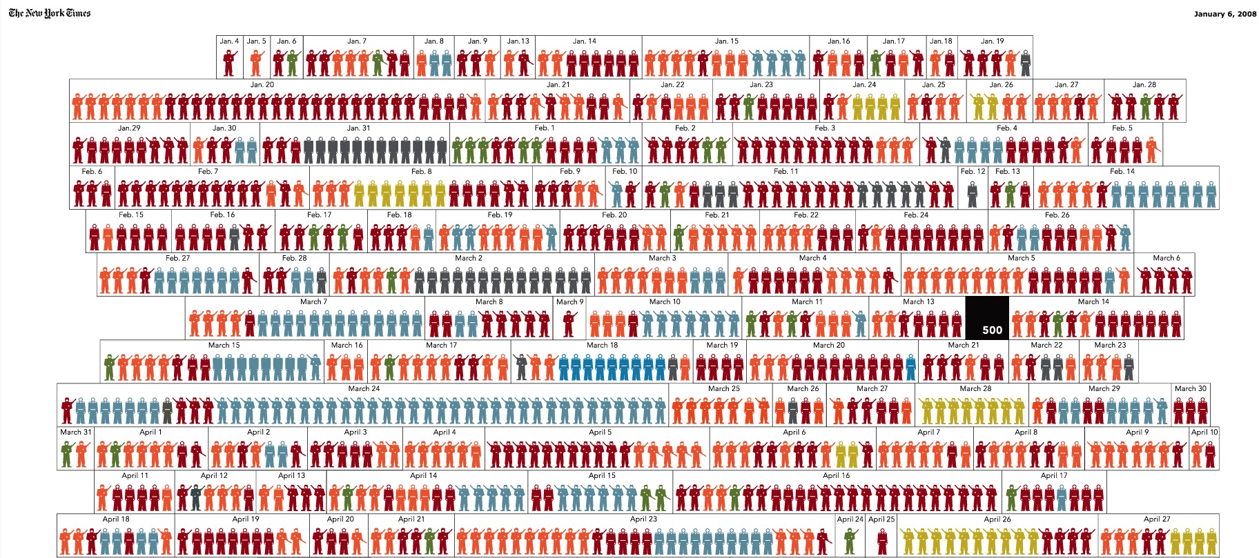
To illustrate the influence of isotype: A world population “map” by Otto Neurath; a 2008 New York Times infographic showing deaths in Iraq
“Isotype remains the foremost influence on data visualisation, but many of today’s designers may not realise that there was a humanitarian, utopian ethos underlying the language’s creation,” says Steven Heller in a piece about isotype in The Atlantic.
In the early 1920s Viennese philosopher Otto Neurath (and later his wife Marie) founded the Isotype Institute, recruiting designers who worked to create this graphic language that could be universally understood. They worked on maps, charts, and other visualizations which interpreted and explained complex ideas about Austrian civic life, industry, and science. And they also created contemporary icons, the simple graphic elements that could represent a bigger idea in a few marks of the pen (in this case). The resulting concepts were simple enough to be understood by schoolchildren.
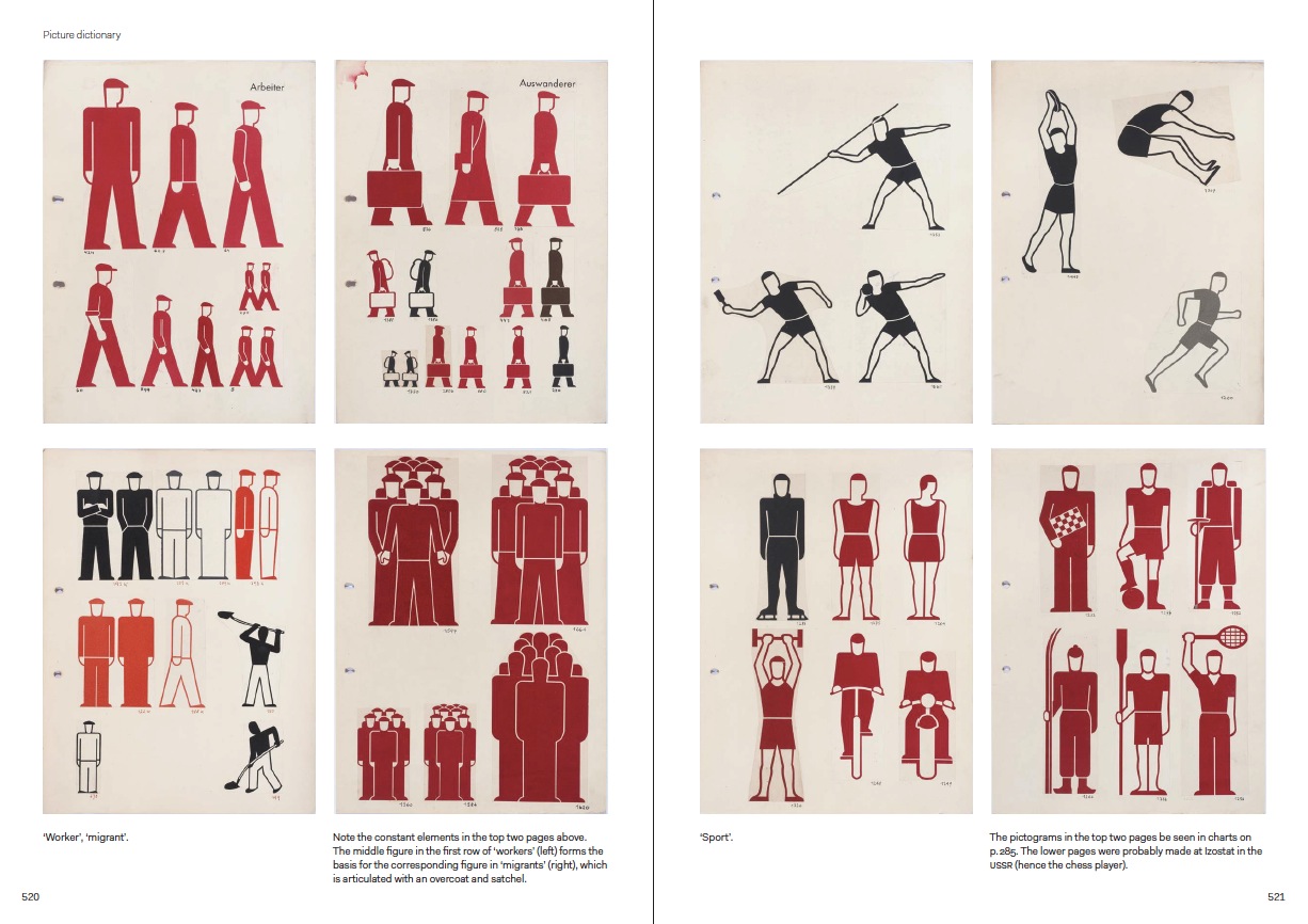
A spread from the book Isotype: Design and Contexts, 1925-1971
But the goal was not to help people find bathrooms in foreign countries — at least not yet — Neurath’s idealism was rooted in socialism, with the intentions of improving healthcare, working conditions, and daily life for his fellow Austrians.
Due to political developments in a pre-World War I Austria, Neurath was forced to move the institute, first to the Netherlands and then again due to Nazi encroachment to England, where it existed until 1971. Although he can’t have foreseen the need to locate the institute in three different countries, the symbolism is so fitting — what was meant to be a universal language was developed in three different cultures.
What was so incredible about isotype is that it spread to other countries, as designers hoped to contribute their own takes on this project. Soviet Russia (where it was called IZOSTAT/ИЗОСТАТ), the U.S., and Africa all had their own isotype movements.
In the US, the Department of Transportation worked with AIGA, the national organisation of graphic designers, in the 1970s to create standardised icons that could be used for everything from airports to highway signage.
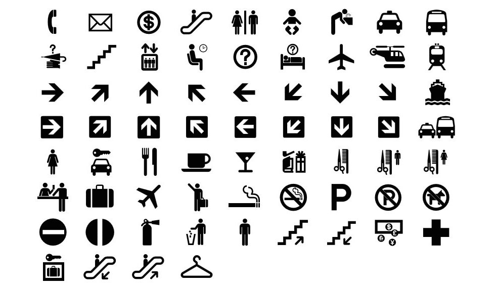
Some of the “Symbol Signs” created by the AIGA in partnership with USDOT
Not all designers are fans of isotype. Infographic guru Edward Tufte, who might be seen as the next-generation embodiment of Neurath’s philosophy, has actually criticised isotype — he thinks it lacks data richness. But there’s actually no reason for isotype to be particularly sophisticated. Tufte might have taken the previously yawn-inducing field data visualisation to a new level and made it beautiful, but that differs from the original isotype intention.
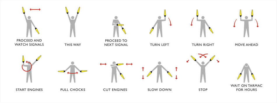
Tufte’s elegant visualisation of airport signaling language
Tufte’s work might explain complex ideas beautifully, but there’s another, more direct descendent of isotype. The Noun Project is currently working on updating the language of iconography, holding themed hackathons where designers work to create icons for new ideas that don’t yet have visual representation, like solar panels and gay marriage.
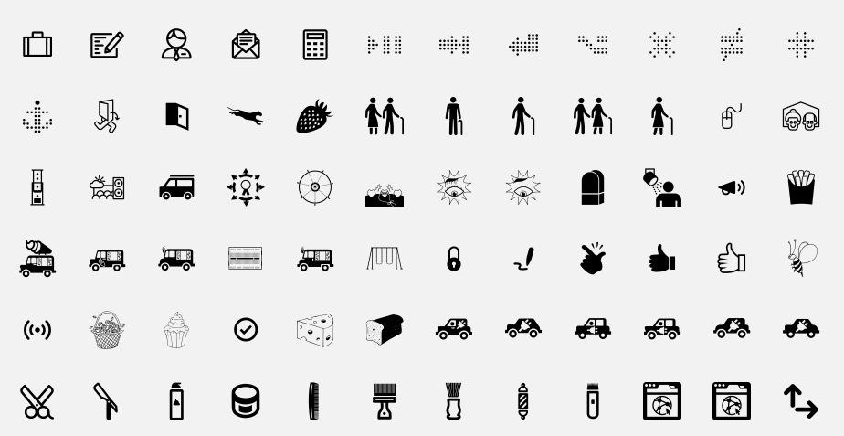
Icons created as part of the Noun Project
It’s incredibly fun to poke around on the Noun Project’s site looking at the icons for electric car charging and farmers market, but it also proves the power and relevance of simple graphic design. Here, designers are visualising new ideas which can bring about social change — I would say that’s directly in line with the original isotype vibe.
Not that emoji, in its own adorable way, can’t be seen as a distant cousin of isotype, of course. And once our vocabulary is expanded with the 240 new symbols that were announced this week, who’s to say we won’t be able to express ourselves and share ideas ever more eloquently without any words at all?
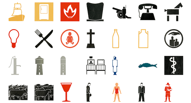
Picture: Isotype icons by Gerd Arntz