
The brand new OS X Yosemite is perhaps the most dramatic redesign of Apple’s operating system to date. After some time using the biggest features in the new OS in a developer preview, I think Apple’s on to something.
At this stage in the game, it’s not fair or appropriate to give the new (very beta!) version of OS X a real evaluation. Some of the features aren’t fully-formed, while others — ahem, iCloud Drive — seem barely present at all, at least not in the final form we were expecting.
But even so, some of the most obvious changes you’ll notice in OS X Yosemite are very present. Here they are.
Design

At the very least, OS X Yosemite is all about aesthetics. It’s manages to look both vastly different yet not entirely unfamiliar. Every button, font, and app icon looks different. To be more precise, the button and icon design has been “flattened” so that there are no false contours or shadows to make everything look like it’s from the real world. The operating systems’ font has been changed for the first time in forever, this time to a Helvetica variant that’s a little easier on the eyes as you can see in the new calendar…
And Safari…
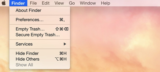
It all looks cleaner. Even if the trashcan and finder icons look ultra dopey.
Notifications
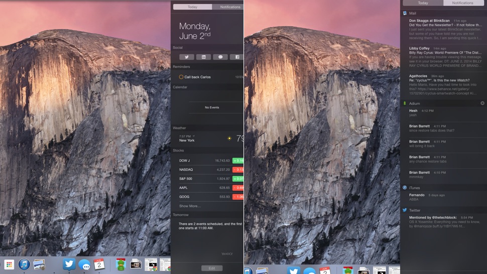
Notification Center has been updated with a new look that borrows its black transparent design from iOS’s pull down notification pane.
Last year, Mavericks added fully-featured notification Center and with Yosemite, Apple made it way more useful. Though the Mavericks Notifications worked very well as popups, I never found myself peering behind the pane very often to check my notifications. Now, Apple has divided its Notification Center into two different categories. One shows notifications as we were used to them before, the other shows a “Today” view shows a combination of upcoming events, reminders, current weather, and stocks. In addition to replicating some of the functionality of automatic assistants like Google Now, it also signals that Apple might be phasing out widgets even more than it already has.
Still, the overall concept of the notification center doesn’t feel like it does enough yet for me to be looking at it all the time.
Spotlight
The new Spotlight search, and file browsing in general, have been greatly improved in OS X Yosemite. The first thing I noticed made me giggle with glee: Previews of animated GIFs now automatically animate in the preview pane. Hurray! But don’t worry, this change goes much deeper.
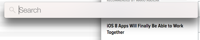
If you’re like me, Spotlight is your default application and file launcher. Just hit Command + Space to pull up the search bar and peck out your query, rather than navigating through windows hunting for the exact location of the file you’re using. In Yosemite, when you go through this motion, the search pops up in a small pane directly at the center of your screen, which when you actually see it pop up makes so much more sense than the old search bar in the top right of your screen.
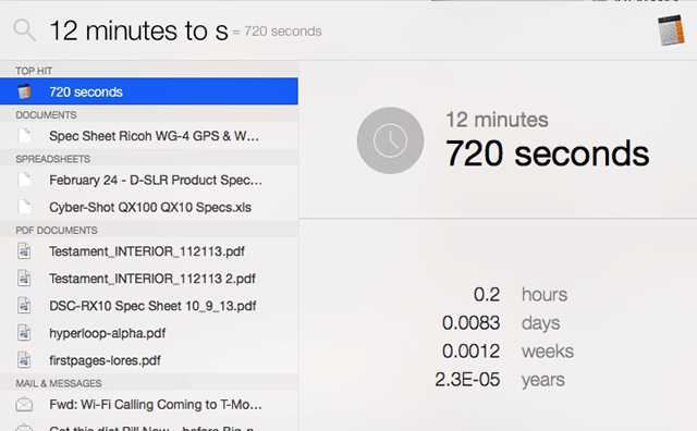
The new update isn’t just conveniently situated; it could turn Spotlight into your default way of searching for information that you’d ordinarily go to a browser for, like for example…
…doing a number conversion…
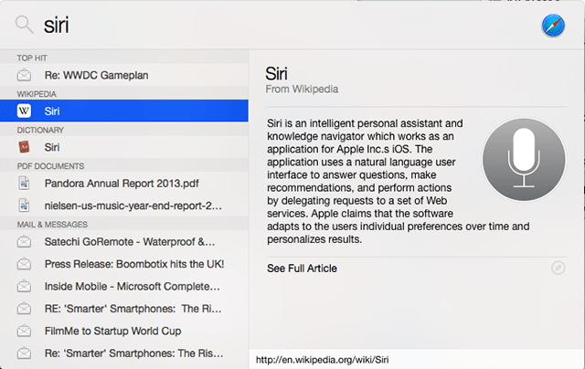
…looking something up on Wikipedia….
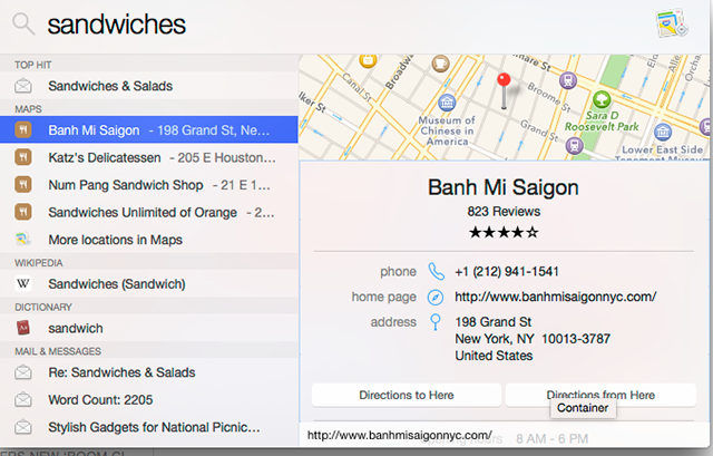
…finding delicious food nearby…
I suppose what’s sort of weird about Apple’s strategy here is that it’s using what you’ve entered to predict where you want to search for something. Sometimes Spotlight guesses sort of wrong and I wish I’d searched in a browser instead. But powerful universal search of the web and you local computer and your emails is the future, so it’s nice to see Apple firmly heading in the at direction.

aimed directly at Apple’s competition.
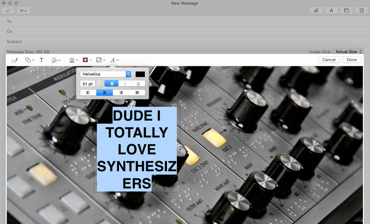
The first, is Markup (above), which works a lot like Evrenote’s Skitch annotation tool, except that it’s stuck in the Mail application. It works more or less as you would expect: you to easily add markup to an image, and you can also add it to documents. Additionally, you can add a little scribble signature to sign stuff. Very handy. It’s not as powerful as Skitch, but it shows at least, that Apple’s trying to be where its users are.

The other slick new feature, or in theory anyway, is Mail Drop, which allows you to bypass attachment size constraints by uploading files that are too big and sending the recipient a link. Honestly, I couldn’t get this to work and kept getting the message that the file was too big for my mail server. Which seems like exactly the type of problem that this feature is designed to fix? I haven’t had a lot of time to play with it, so it’s possible I’m doing it wrong. And again, Yosemite is very very beta.
Bottom line: It’s all coming together
So as I said before, OS X Yosemite definitely isn’t finished, and we haven’t even had the chance to investigate some of the operating system’s most significant features like Hand Off, which allows you to pass your work between your iPhone and your iMac (for example) without missing a beat. We’re also looking forward to the deeper iCloud integration, which at the time of this writing didn’t seem quite ready for prime time.
But even if all the newly announced features work exactly as advertised, we’ve got a long way to go before the desktop and mobile platforms are truly, and to use Apple’s parlance, “continuously” integrated. Maybe Apple doesn’t want to go all the way, but it seems that the half-way approach leaves us with a product that’s almost cluttered with a mixture of old and new. For all its merits, Yosemite only gets us part of the way to where we need to be.
What’s certain is that what we’re looking at here reflects Apple’s biggest ideas in recent memory about what the desktop OS can be. It’s more than a pretty face — it’s facing in the right direction.