
To modern eyes, they’re as intuitive as the alphabet: the bubbly cloud, the circle and its simplistic rays of sunshine. But our weather icons are actually pretty new inventions. Up until the 1970s, meteorologists used an enigmatic system of symbols to forecast the weather — until a design student came along and changed everything.
Picture: Sputanski/Shutterstock
In The New York Times, Daniel Engber takes a fascinating look at who created the icons that seem universal to us today. According to Engber, the first commercial weather map was put out by the US Weather Bureau in 1910. Back then, the symbols for weather events were much more obtuse: Clouds were communicated with “empty and filled circles” and “the wind with tiny arrows”.
A look at the Weather Bureau’s own report reveals that this first map — the urmap, you might say — was published in the Minneapolis Journal on March 1. But just four months later, it had spread to 65 different papers in 45 cities. Popular meteorology had come of age. The explosion of weather maps meant that more and more people were reading them, and so it wasn’t long before the iconography of the weather had started to change.
But it wasn’t until the 1970s that the icons we know so well today emerged. In fact, according to MTP Studio, the icons used by the BBC still looked pretty much inscrutable by 1969:
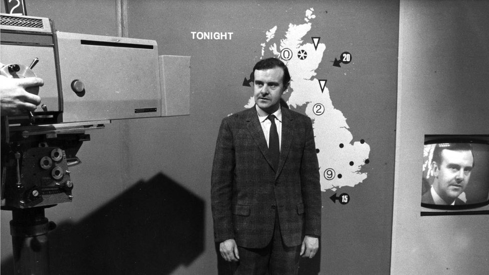
Picture: the BBC
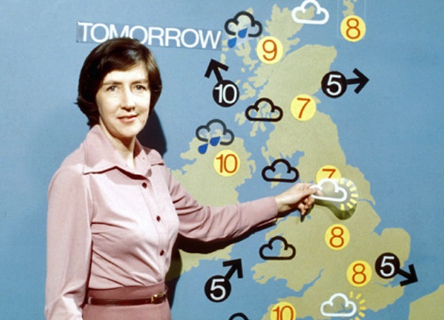
But just a few years later, a young British art student named Mark Allen created a revamped set of weather pictograms as his final project at Norwich School of Art. Those icons would become, well, iconic:
“The main vehicle was the cloud, and I hung everything off that,” he says. The BBC adopted Allen’s iconography in 1975, in exchange for 200 pounds and a small percentage of licence fees. His drawings stayed on the air for 30 years.
Not surprisingly, Allen was inspired by the grandfather of pictogram design, Otl Aicher, who designed the 1972 Munich Olympic icons and inspired a veritable revolution in visual communication. Here’s a broadcaster using Allen’s designs in 1975:
Allen’s icons had a long run at the BBC, and inspired a multitude of variations at broadcasting companies and newspapers all over the world.
In 2011, the BBC decided to retire Allen’s iconic pictograms. The designers behind the revamp explained the change: “The weather site consists of a lot of facts and figures and we wanted to balance this out by adding a rich, atmospheric welcome.” That meant plenty replacing static icons with Javascript animation, beautiful wide-screen images, and a whole lot of ambience.
Why were they retired? We might look to recent weather app designs for an explanation. iOS’s distinctive way of communicating the weather was a huge hit amongst users — as was HTC’s version of animated weather, which some commenters point out predate Apple’s. Rather than a pictogram, we get an animated, ambient look at conditions that are rendered to be downright romantic.
The BBC’s new weather site definitely takes inspiration from the trend — as do countless other weather websites and apps. But it’s nice to know that even if Allen’s original icons are no longer the preferred modus operandi of meteorologists, even iOS 7 still uses them here and there. [The New York Times]