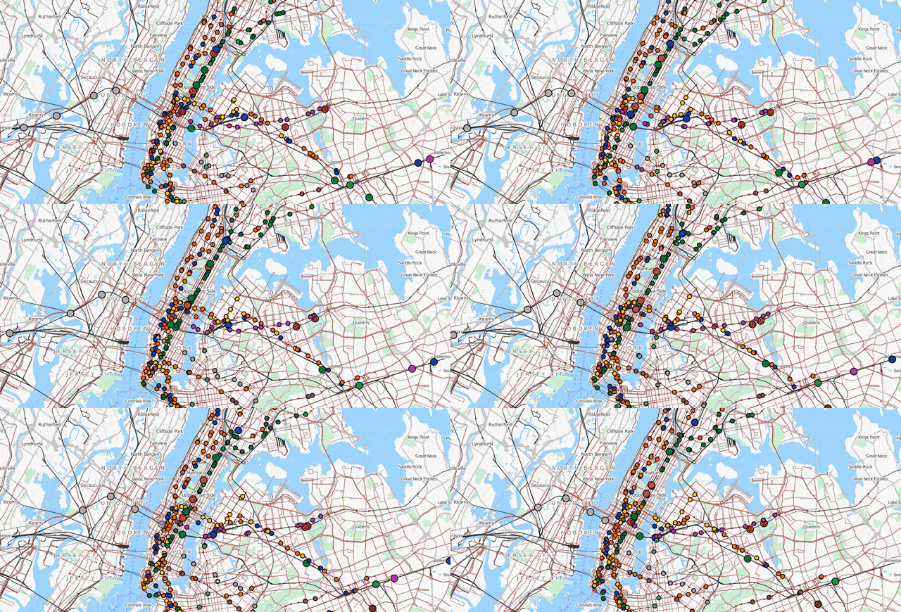
If you take public transport in a big city, you know the stresses of train delays. But in a perfect world, the flow of transportation is actually an elegantly coordinated system. A visualisation called Travic, a collaboration between Geops and the University of Freiburg, lets you look down on the idealised patterns of public transport systems worldwide.
The map uses schedule data to plot the theoretical movement of the trains and buses. The site specifies that real time data is incorporated “when possible”, but by and large you are looking at a representation of a world without train traffic problems, system malfunctions and jerks holding the doors open. That is to say, paradise.
To really see things buzz around like an ant colony, speed up the visualisation to up to 60x real-time.
Such efficient movement is a city planner’s dream come true. Head over to the map to check it out. [Geops via Reddit]
