Whatsapp has been one of the most talked about startup giants in recent memory. Building upon the most basic of mobile services, messaging WhatsApp has managed to monetise and evolve the service through cross platform integration and making it free (among many other things). Following the $US16 billion acquisition of WhatsApp by Facebook I thought that this is a good as time as any to look at what this means for WhatsApp and what changes both aesthetic and functional might be implemented by it.
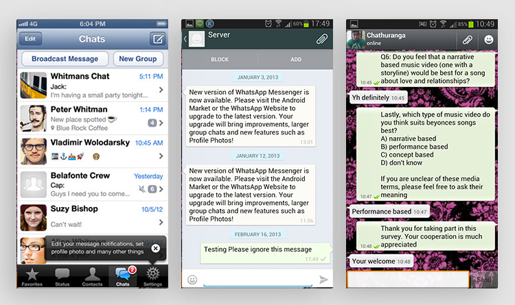
To begin with, I wanted to take the current Whatsapp apart and really look at what it is that sets it apart from its competitors. Visually theres nothing special about it. Very much function over form. The little things I noticed though were how whilst in conversation you could tell the conversations apart not only by the formatting but by colour differentiation and how many little options were available, all of which were hidden behind numerous CTA’s. It was also evidently obvious that status’ were almost never used, media is extremely hard to locate and user profiles are pretty much redundant. The visuals themselves are dated. They almost border on ‘lazy’ minimalism, with colour only being used where necessary. It’s very much an app you ‘have’ to use rather than one you ‘want’ to.
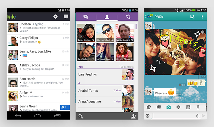
Moving on I looked at applications that function in the same area as Whatsapp. The likes of Kik, Viber and Kakao all look very similar — only branding sets them apart. Almost all in-chat conversations look identical, using the same hover styling that we know Whatsapp for. The funny thing is a lot of these apps do things a lot better than Whatsapp but they don’t have Zuckerberg bank-rolling them. For example Viber actually has a gallery implemented, whilst Mo’Money lets you actually transfer money using it (hardly a requirement for a messaging app but cool nonetheless). My biggest takeaway from research into these applications is how similar they all are from an aesthetic standpoint — being able to evolve the current design trends these apps are in would be, not only cause a stir (in a good sense), but also the possibilities that come with Facebook integration could result in some great little interactions.
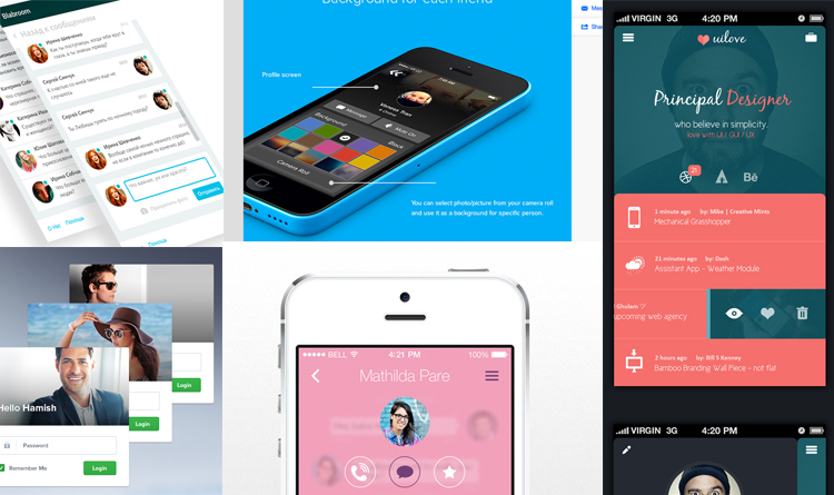
Visually I was inspired by everything from minimalist flat designs, geometry and high contrast to alcohol packaging. Having found numerous great bits of design inspiration I started to see patterns emerging. Strong uses of colour, quirky interactions, hovers, big image, tonal simplicity, clean iconography are some of the main things I picked out.
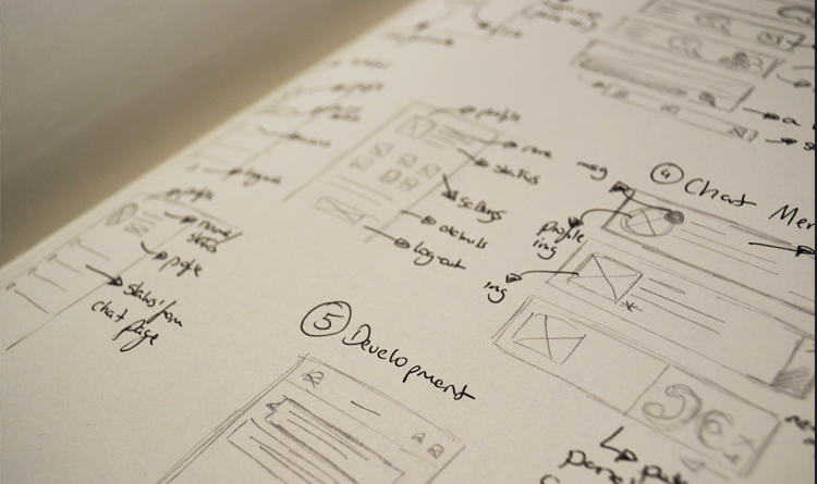
Having done my fair share of research it was time to get stuck in and do some sketching. Right off the bat I knew I wanted to concentrate on 4 screens in particular, those being: Chat Home, In Chat, Profile & Media. Through my sketches I hoped indulging in multiple styles and elements would allow me to be influenced by my own quirky ideas sporadically resulting in evolving design.
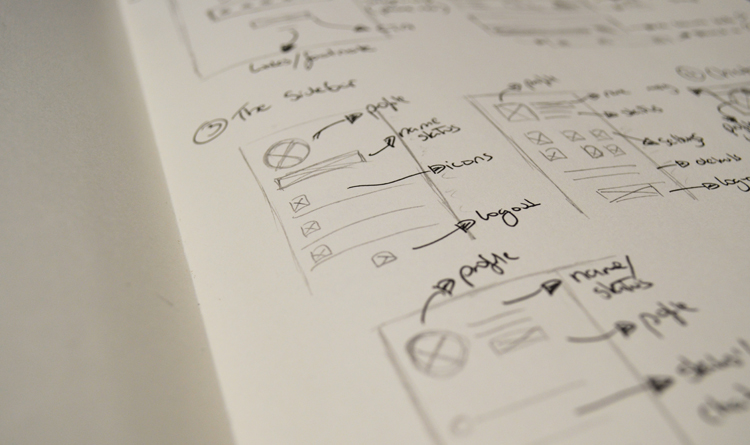
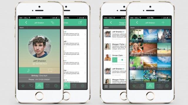
Early on I decided to start from the top and work my way down. Initially focusing on the navigation and trying out numerous layouts (top nav vs side nav), how the iconography might sit on it and how shadow might be implemented within the navigation to separate it from everything else. With numerous navigation designs ready I went on to focus on the central ‘zones’ for each of the 4 screens. Never going beyond simply wireframes I worked through 3/4 versions for each screen and then followed them up with slightly more detailed work to give me a stronger understanding of how everything might click together visually. As seen in the screens above, I also begun thinking about where exactly everything might be placed content wise and where certain aspects of Facebook might best be served (Whatsapp / Facebook status’ becoming one etc.). Lastly I designed numerous takes on the lower navigation that would be visible throughout. The bottom navigation (just like in the current Whatsapp) would allow you to switch between main screens (such as your profile, settings and so on).
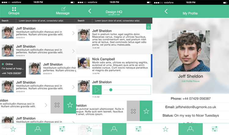
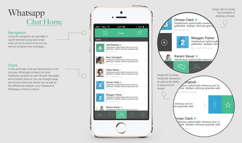
Having done my fair share of analogue work I then moved into digital concepts. Starting with the Chat Home screen i wanted to make sure this particular screen was as easy to navigate and use as possible. The first thing I went ahead and did, was to make sure it was possible to switch between group and single chats at the touch of an icon — something that I felt is missing in the current iteration of Whatsapp. From there I begun working on the chat zones, for every contact, figuring out how to best display the information. In the end settling on a somewhat functional aesthetically pleasing look of profile image, name, message blurb and time and date.
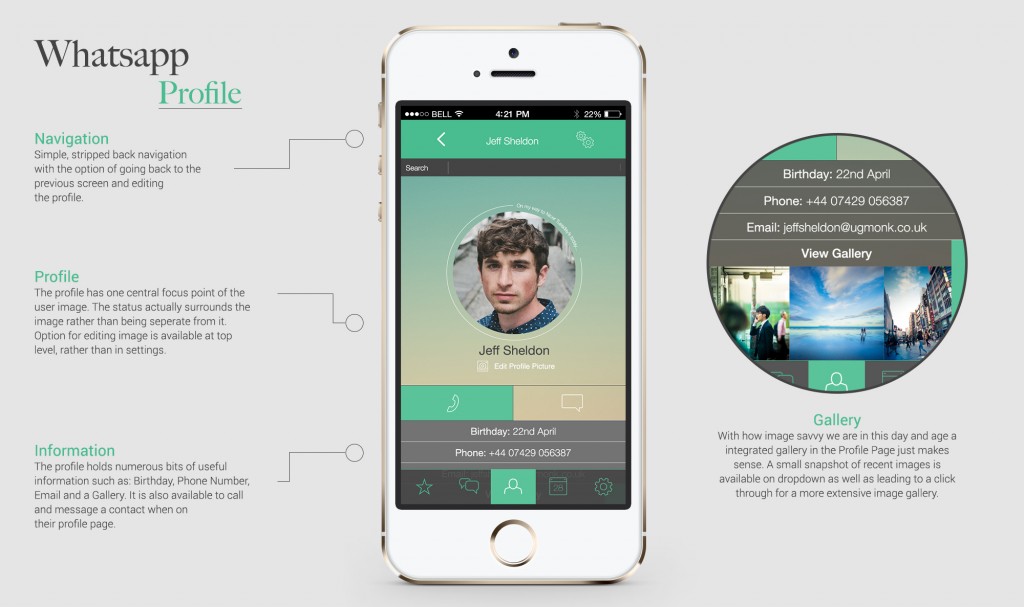
The same process was gone through for the rest of the screens. On the profile screen I wanted to make use of big imagery — getting inspiration from the updated Facebook and Twitter interfaces. For the actual information I wanted something simple and sleek that the user could interact with and find familiar.
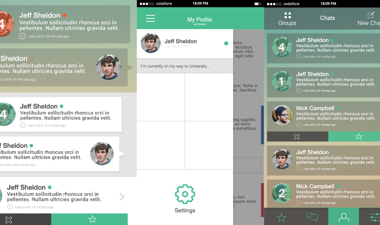
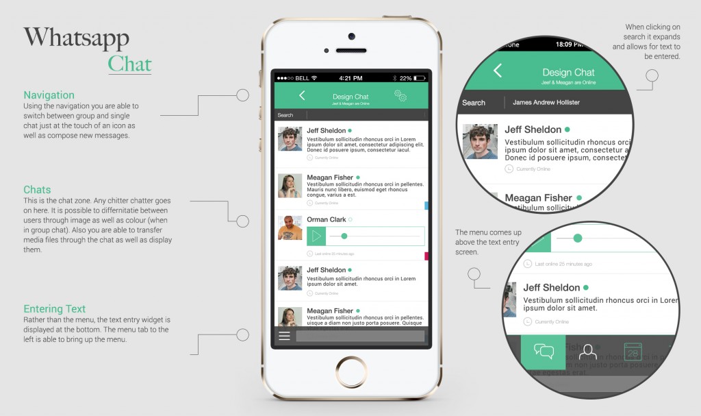
Working on the In Chat interface I wanted to make sure some form of colour differentiation was visible throughout, especially since I wanted to move away from the ‘bubble’ type and move it towards a more sleek looking menu interface. The ability to favourite, delete and pin messages was some functionality that I felt had either not been implemented correctly or was missing entirely.
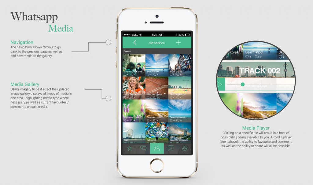
The last screen I began to work with was the Media Hub. This was something entirely missing from Whatsapp at this moment in time and something I felt would make total sense to have especially following the Facebook takeover. With this the fundamental thing I wanted to put through is big imagery and a home for where all of the different media types could be displayed and played.
With initial digital mock-ups done I began experimenting with variants of specific zones on each screen as well as styles — to help me broaden the scope and aesthetics of what I was doing. I looked at different forms of chat boxes that felt familiar to the current iteration of Whatsapp but fit in with the style I had going for me. Things such as navigation styles, implementing status’ and making it obvious that you had not read certain messages was looked at. Stylistically I decided to experiment with opacity and layers as a polar opposite to by initial designs to see how little changes in colour and tone could really push the boundaries of the app itself .
The Final Outcome
Below we have the four screens in all their glory. Having taken inspiration from all of my design iterations and sketches along the way, I feel these designs best represent my vision for Whatsapp’s future. It has to be remembered though this redesign is fundamentally from an aesthetic, not UX stand-point. Any UX changes are only hints at what the Facebook merger might have in store for Whatsapp rather than an entire UX overhaul.
Hopefully the above boards give an indication to what a revised Whatsapp might look at and the endless possibilities the Facebook merger results in.
This post originally appeared on Entropii’s blog and was republished with permission. You can find Entropii on Facebook here or Twitter here. To see more work from Entropii’s design team, you can find them on Pinterest here. London residents can get a first hand taste at the type of UX design Entropii offers at their upcoming User Journey Masterclass.