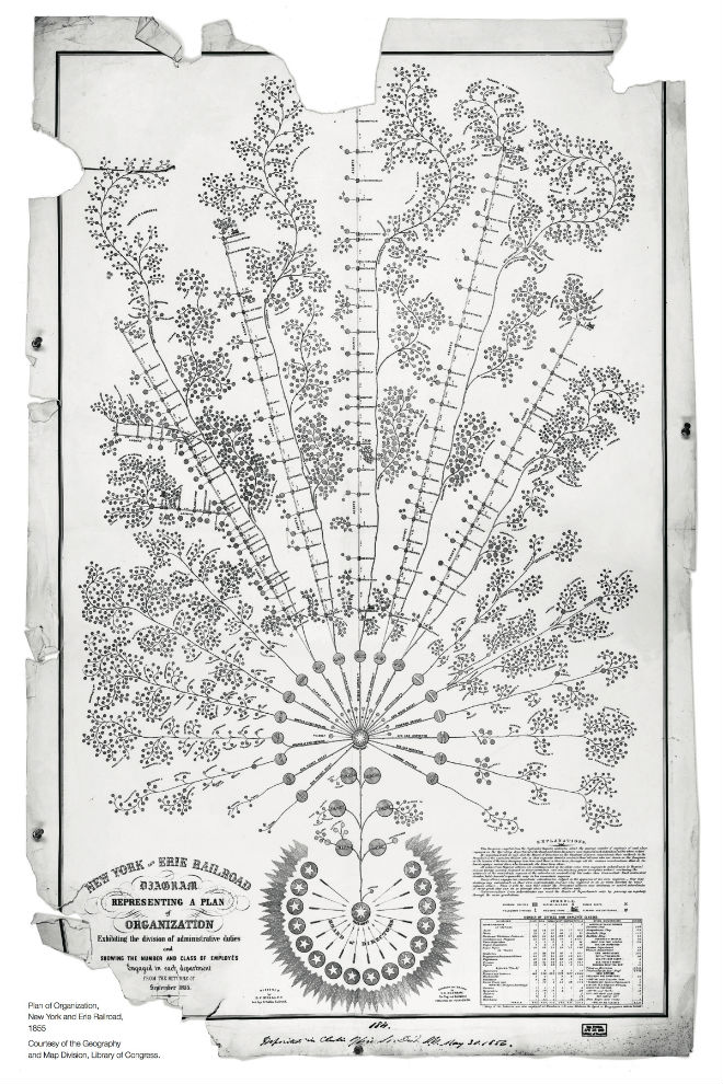
The words ‘organisation chart’ are usually enough to make anyone’s eyes glaze over — but this, the first modern example of such a visualisation, is actually incredibly pretty.
The flowery chart was created by Daniel McCallum for the Erie Railway way back in 1855. One of the largest rail organisations of the time with 500 miles of track, it was thriving — but struggled to stay organised. So this chart, unearthed by McKinsey & Company and shown in full below, showed for the first time the power structure within the company to help things run more smoothly.
Instead of the top-down charts we’re used to, this chart shows a board of directors at the center, with more junior staff fanning out from the middle. Much of the day-to-day responsibility over the tracks was allocated to lower-level superintendents: they were, after all, better placed to manage problems as they arose, being closer to the action.
Of course, a lot’s changed since the mid 19th century — and, fortunately, data viz tends to be far less cluttered and rather more to the point. But regardless, it’s interesting to see the precursor to what has now become a widely accepted form of presentation. [McKinsey & Company via WIRED]
Image by Library of Congress/McKinsey & Company