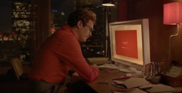
Not even those who worked on the Oscar-nominated film Her are sure exactly how near we are to the near-future depicted in the movie. “I think the idea of the near-future is that you can’t predict the pace of technology,” says graphic designer Geoff McFetridge, who designed the interfaces for the film.
Credited as Her’s “graphical futurist designer,” McFetridge was charged with imagining how we might interact with our devices in that near-future (which he estimates is anywhere from next week to 15 years from now).
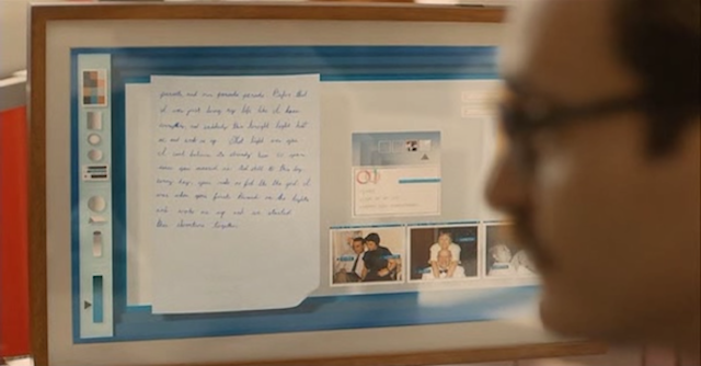
His graphics and interfaces play a large role in the film, from the hand-writing application Theodore Twombly uses at his job at Beautiful Hand-Written Letters, to the fictional L.A. subway map he walks by, to the logos and packaging for the OS 1 device that changes his life, to the iPhone-esque interface itself which we come to know as the character “Samantha.”
“This is a movie that’s very much about design,” says McFetridge, who I talked to about his process in a conversation featured on this week’s episode of KCRW’s DnA: Design and Architecture. “There are all these screens in this film: the operating system, then there’s a video editing suite, there’s this program he uses at this office, there’s buttons in the elevator — all these interfaces. But the movie is about design in the sense that design is transparent.” He knew from the script that the OS device was a physical object; something that a character could hold and interact with, he says. “Everything below that was a question mark.”
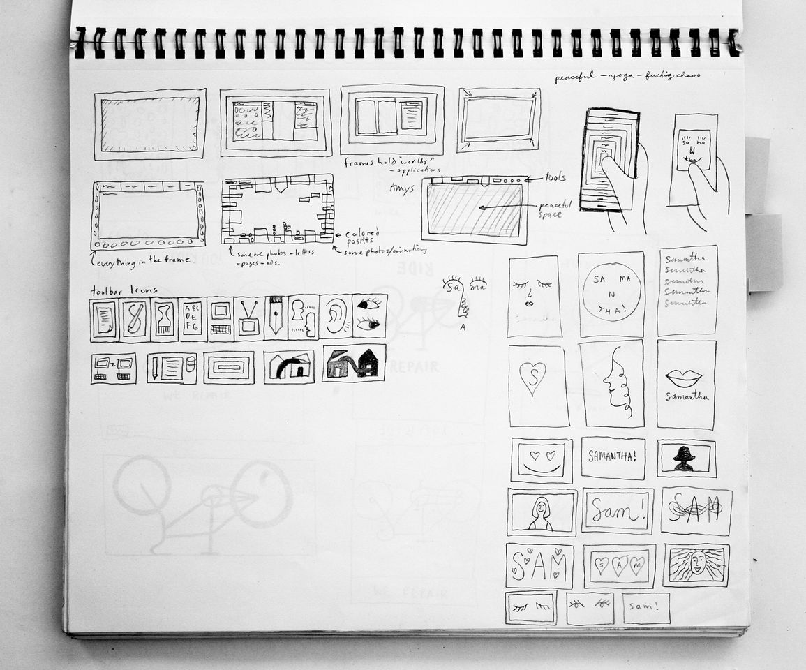
I met McFetridge at his studio in the Atwater Village neighbourhood of L.A. where his tables were stacked high with notebooks full of sketches from the film. A frequent collaborator with Jonze, McFetridge works as a graphic designer and illustrator for clients like Nike, Patagonia, and Pepsi, and is also a visual artist.
Although his design for the film was not altogether a departure from his other projects, seeing as he often designs logos and icons for clients, his style definitely skews towards the hand-drawn — not the typical operating system aesthetic.
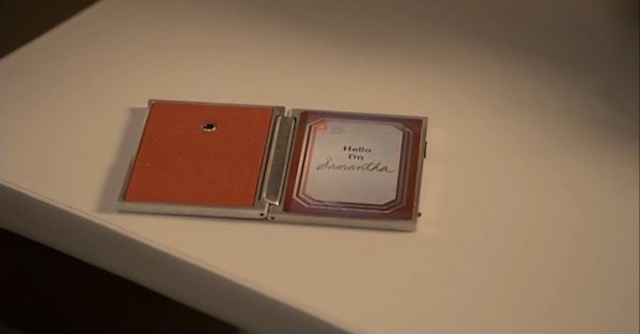
However, his style did align with the overall goals for the film’s look. Before production began, McFetridge worked closely with production designer KK Barrett (who is up for an Oscar tomorrow), as he was building a highly tactile near-future, with wood-grain monitors and textured walls, according to the overarching mandates laid down by Jonze.
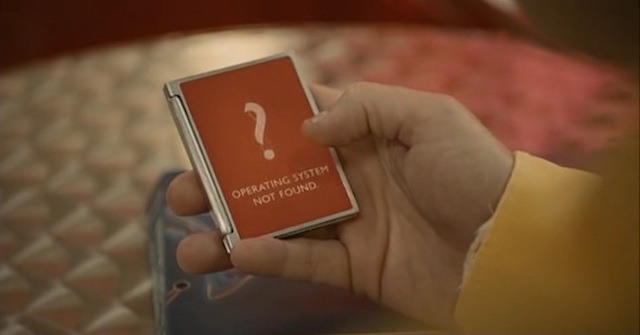
The OS device itself is actually a vintage cigarette case picked up at a flea market, and for its home screen, Jonze passed along images of old calling cards as inspiration. “Something Spike said once is that it should be like getting a box of Japanese candy, with all these ribbons and bows,” says McFetridge. “That was great to me because he was talking about experience. It’s not decorative.”
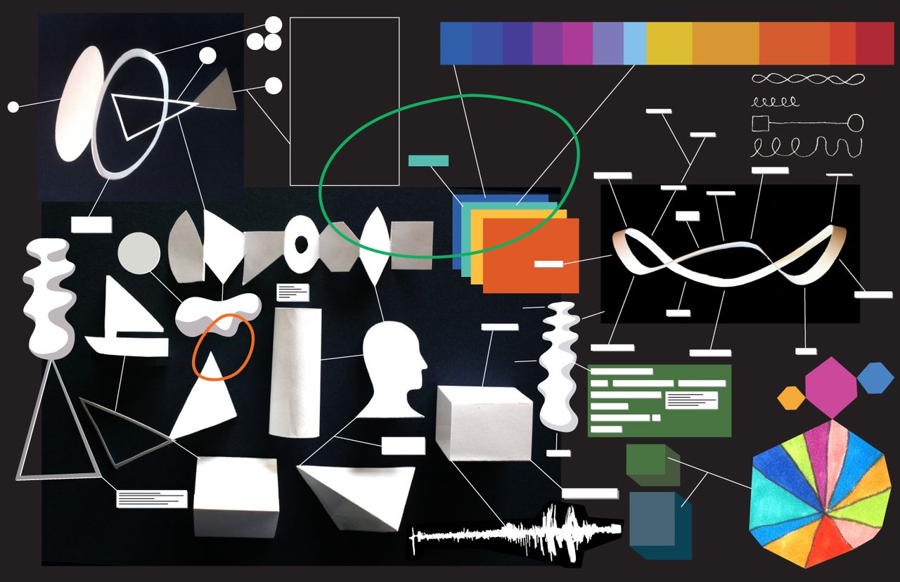
When it came to start thinking about how the interfaces would work, McFetridge — who had zero experience designing graphical user interfaces — started with an idea rather than an aesthetic: That you could see evidence of the hand in the interface.
He began by building wood models: gluing cut paper and painted dowels into layers and photographing it. “It was way too crafty, but that is what I was creating, this idea — I like the idea that you feel the thing you’re looking at, someone made that, there’s some authorship to it.”
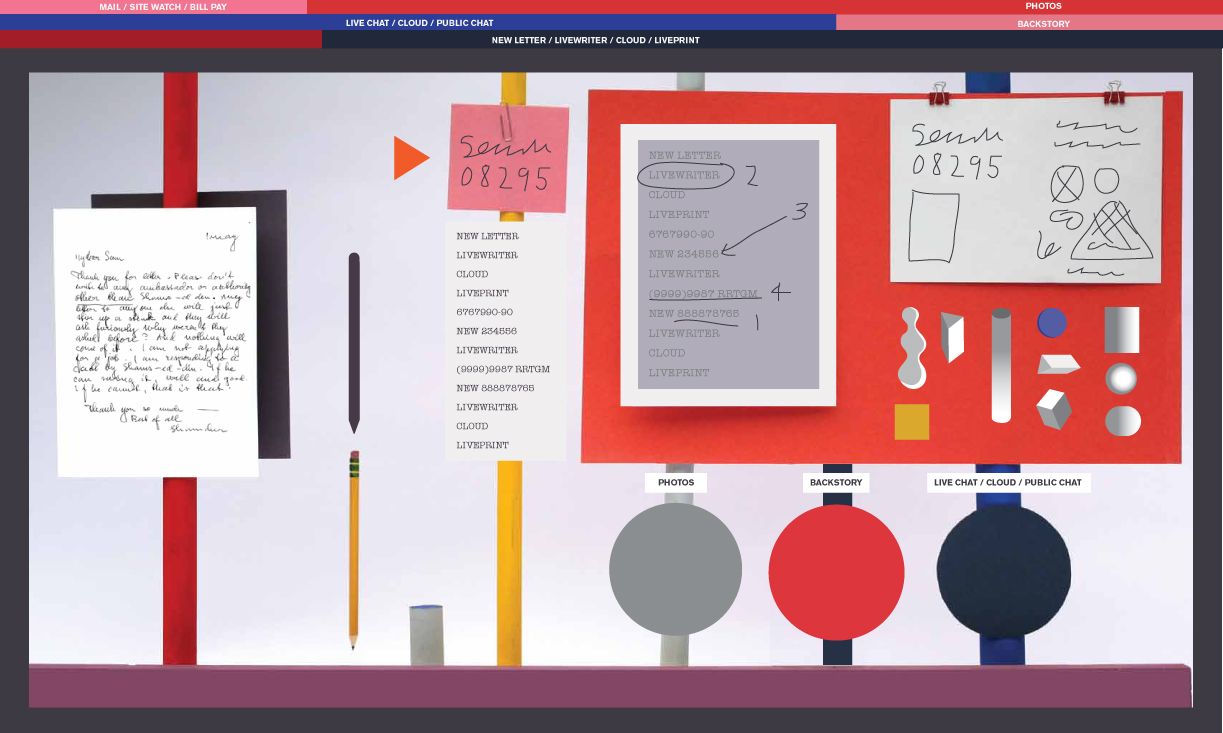
In the early conceptual phase, Jonze kept pushing for dimensional comps — “like Google Earth” — which McFetridge resisted. “If there’s one thing to say about my work, it’s that it’s really, really flat,” says McFetridge. “I’m just interested in flatness.” In fact, McFetridge’s concepts were evocative of the larger trend of flat design , the move away from skeumorphic design that’s recently been embraced by Apple.
Funnily enough, just as McFetridge was finalising his own look for the film’s screens, he received a bit of validation directly from Apple : “In the middle of this they release their new OS which is super flat and colourful!” Suddenly, McFetridge’s envisioned future seemed on the right track.
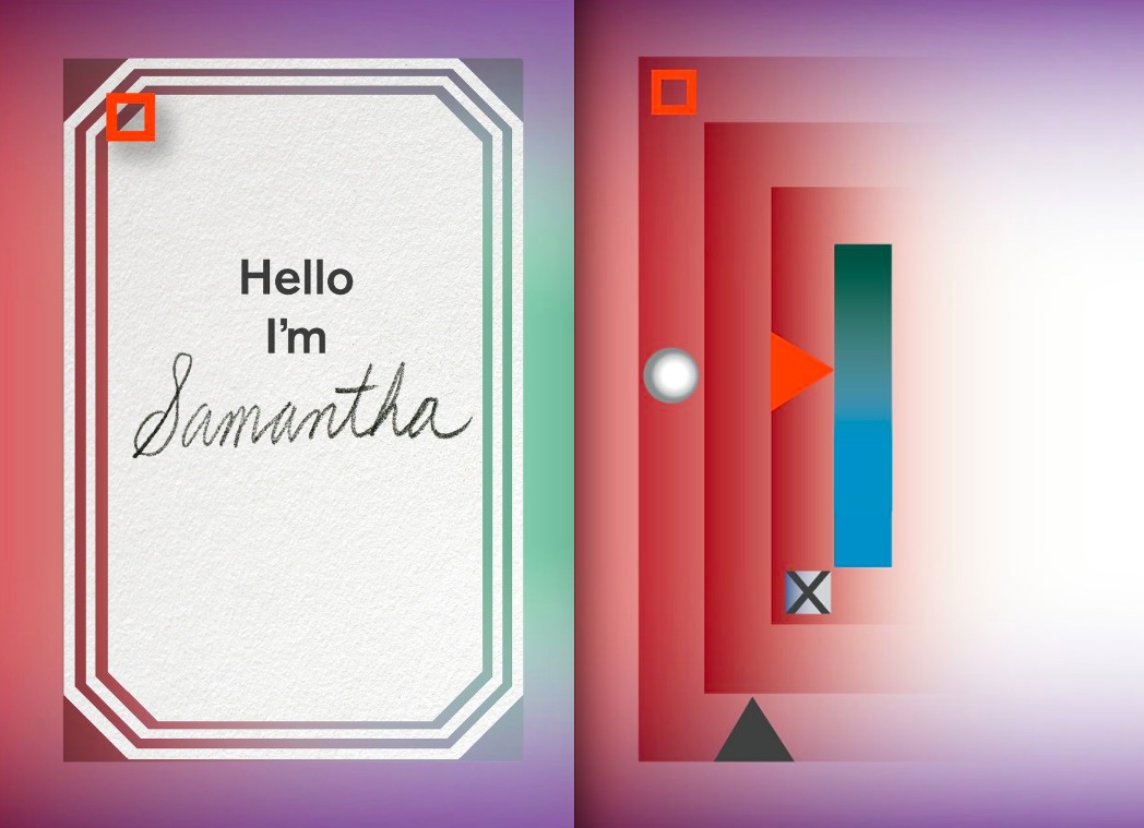
Within this flat, colourful world, McFetridge began looking at the monitors of the future as a frame, and the interface within it as a work of art. He was inspired by glowing, jewel-like colours of James Turrell and eventually borrowed a technique from the paintings of Mark Rothko, turning the artist’s signature blurred bands of bright colours on their side, so they became vertical, “more like a city than a sunset,” he says. The columns of colour then become a way to denote hierarchy, pushing the task at hand to the center of the screen. “You always return to the middle, in the middle is everything your computer knows about you.”
McFetridge says the fact that all the screens were voice-controlled actually made his job easy — didn’t have to design, say, text messages, which are notoriously hard for filmmakers to get right. But to make the interfaces feel as if they were part of a very rich and developed design language, he designed hundreds of icons and other elements which appear on Twombly’s screen, some for only a millisecond. “When she organizes his desktop it was very chaotic, we had to think, what does email look like when she goes through hundreds of thousands of emails?”
He also had to design a pivotal moment, when Twombly can’t reach Samantha: the equivalent of the blue screen of death. “I just made it look kind of scary, like a warning — international language of frightening.”
Another notable interface moment is the launch of OS 1 on his computer, beginning with an animated logo which morphs from an infinity symbol — the tagline is “We believe in infinity” — into dozens of shapes, then moves into an installation process which is not unlike installing a Mac operating system today. So I had to ask, did he have Apple in mind?
“It’s definitely a future Mac, but I do feel like the future Apple is going to be really different than Apple is now,” he says. For one, interface design won’t be standard, and it all won’t emanate from a single corporation, McFetridge thinks. “The horsepower of a single person is going to be so magnified in the future so this interface could be made by a 17-year-old.”
That’s a detail that might not be immediately obvious to viewers of the film — McFetridge envisioned that each interface in the film is completely customised for each user’s personality. Twombly’s interfaces are designed for his preferences, by some unseen designer — again, that auteur which McFetridge envisioned.
So instead of everyone waiting breathlessly for the mandated look of the next OS 28.3 update, designers will be able to use the sophisticated OS-level intelligence to create millions of customised interface experiences at once, he says. In essence, McFetridge is envisioning the ability to mass-produce a bespoke, hand-crafted, completely custom experience for our devices: “Someone’s going to release a new artificial intelligence standard, you plug that in, and there’s an artificial version of me in the future that will create an interface just for you.”
You can hear more from McFetridge in my interview over at KCRW’s DnA: Design and Architecture.
Images courtesy Geoff McFetridge, screengrabs from Her via Rhizome
