Sochi hasn’t been displaying the best of marketing strategies to date, with the world now fully aware that it still isn’t ready for the impending Olympics. Can its logo can help right some of its wrongs?
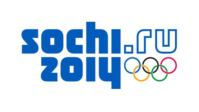
You’re going to see this piece of branding quite a lot over the next few weeks, so hopefully you like it. It’s surprisingly spartan, with no graphical element save for the Olympic ring, and features a simple blue font which allows the year and venue to (kind of) reflect each other. Speaking to the New Yorker, Guo Chunning, who designed the Beijing 2008 logo, provided his own thoughts:
When I first saw the Sochi Winter Olympic logo, I was taken by surprise. There was no graphic image, as one would expect. It was very simple, just blue lettering plus the five-ring Olympic emblem. Maybe the blue colour symbolized Russia and the winter season, I thought.
One particularly interesting element of the logo though is the “dot ru” which follows Sochi’s name. It’s pretty neat that a web address can be used to signify the fact that the games are taking place in Russia — and a nice design nod to the fact that digital culture is now globally pervasive.
But what do you think? Is it too simple for its own good? Or do you like the inherent simplicity? [New Yorker via The Verge]
