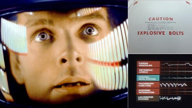
Stanley Kubrick’s 2001: A Space Odyssey is visually stunning. And the closer you examine, the more exquisite details you’ll find. That’s what Dave Addey has done in his in-depth, scene-by-scene examination of how this cinema masterpiece used typography to create a familiar yet still distant future.
Dave’s new blog, Typeset In the Future, is dedicated to examining typography and iconography in science fiction on the big and small screens. It’s blessedly nerdy, and the debut entry on Stanley Kubrick’s space saga is a master’s thesis on the significance of the typesets seen throughout the movie. Even if you’re like me, a typeset novice who doesn’t know much beyond Helvetica, Dave’s deep examination of Kubrick’s use of print stylisation to signify different eras is engrossing.
Check out the whole thing here; warning, there are spoilers if by some tragedy you haven’t seen 2001: A Space Odyssey (and shame on you if that’s the case). [Typeset In The Future via John Overholt]