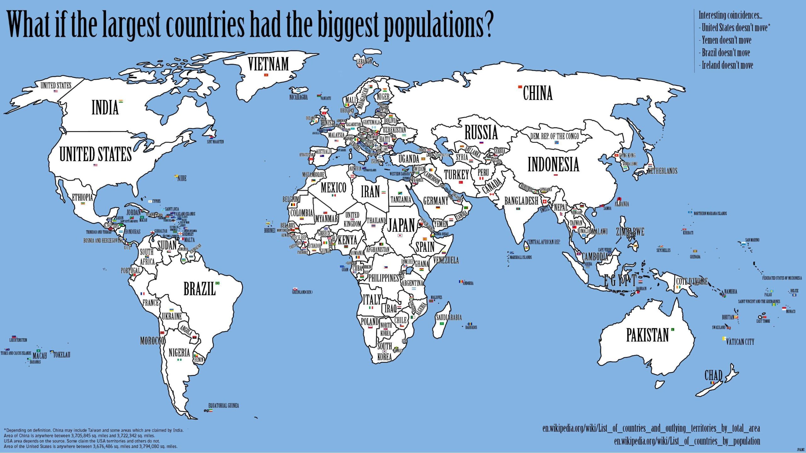
Here’s a fun way to look at the world. What if every country’s population actually matched its size? So more populous places like Japan and Vietnam that are cramped in tiny specks of land now get to stretch their feet a bit while uselessly big countries like Canada and Australia get their population booted to smaller spaces.
It’s not like we could swap out an entire population and fill in the world (because many of these giant countries have a lot of land that no person should live in) but it is a fun exercise of the imagination. All of a sudden countries flee Europe and Africa turns into a hodgepodge of populous places.
What perhaps is MOST interesting in this map is that four countries don’t move at all. That’d be Brazil, Ireland, Yemen and the United States of America. Cue the U-S-A chants. Below, you can click enlarge to make the map go big.

The map, which was recently spotted again by Maps on the Web, has been floating around for some time. Visiting Japan in Africa sounds like fun.
