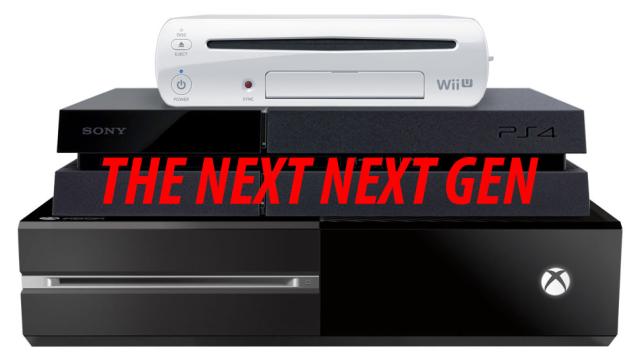
Most pieces of technology — like smartphones, TVs, and even computers — are replaced by new models every six or 12 months. Game consoles, on the other hand, are meant to last for at least five years. Which means that every generation is a true milestone of UI, gaming and industrial design. So what does the latest crop tell us about the state of the console?
The eighth generation of consoles, represented by the Wii U, Xbox One and PS4, is a transitional one. We’re sitting at the cusp of a revolution that’s about to take place in the living room, one that will quell the constant accumulation of boxes (cable boxes, internet modems, streaming boxes, Wi-Fi boxes, VHS/DVD/Blu-Ray players, gaming consoles) and finally deliver the endgame: a true living room computer.
As an industrial designer, I’m always mindful of the role designers play in transitions like this. Not only do we have to resolve all of the usual design considerations, but we also have to reconcile where we came from with where we are going. We can learn a lot from the design of this new generation of consoles, so let’s take a closer look.
First, an Ode to the Greatest Generation of Them All
In my opinion, the seventh generation of consoles — featuring the Wii, Xbox 360, and PS3 — was the best designed in history. After floundering around with the GameCube, Nintendo got up off the mat and dominated with the extremely confident Wii and Wiimote. Microsoft, whose first console was an X-Men movie prop come to life, knocked it out of the park with not one, but three well-designed consoles (the 360, 360 S, and the more recent 360 E), an all-time classic controller, and the Kinect. Of the big three, Sony’s launch PS3 console was my least favourite (too glossy black and chrome for my taste — also, that Spider-Man font!), but it came back strong with the PS3 Slim.
In many ways, Generation 7 arrived at “peak console.” It was the culmination of four decades of home video gaming; and most importantly, it was the last generation designed with a games-first mentality. Where we go from here is new territory. Sort of. You’ll see what I mean.
Wii U: The Design
If you don’t look too closely, you’d be forgiven for mistaking the Wii U for the Wii. I think that was the idea. The Wii was a monster success and Nintendo wants to link the U to the Wii as much as possible. All of the ports, media slots, and buttons are in essentially the same place. The size and proportions are essentially the same, although the U is a little bigger and longer. The Wii U could be called the first “sequel” console in history.
The major aesthetic difference from the boxy Wii is the U a bit, for lack of a better term, puffier. Instead of hard right angles and a chamfered front, the U has slightly rounded sides and a bulging face. I think it’s a step backwards. After the trim Wii, the puffiness of the U looks a little bloated.
The surprise of this design is the fact that the U doesn’t have a great vertical stand like the one which made the Wii iconic. Instead, the U comes with two oddly shaped little feet that feel very tacked-on. It’s clear the intention was for the U to always be laying on its belly.
As with the Wii, the star of the Wii U isn’t the console, but its unique controller. While it’s easy to say that it was influenced by touchscreen tablets — and I don’t think Nintendo entirely minds the comparison — to me, the GamePad just feels like the bottom half of a big 3DS. Like all of Nintendo’s controllers, the GamePad is built to survive two kids fighting over who gets to play with it first. The form is pleasant and the grips that have been added to the back are comfortable. I also like that the GamePad’s overall shape is a callback to the front face of the console.
If I have one issue with the Wii U, it’s the same one I have with most of Nintendo’s hardware: the detailing. Just take the front face of the console for example. This should be the most iconic view of the system. Designers like to call this the “hero shot,” or the view that will show up in all of the product’s marketing. A lot of work goes into making the hero shot as simple and memorable as possible. Instead, it’s weighed down with unnecessary button labels, a hacky port cover, and a red sync button that would scare away most people from wanting to push it.
They’re blemishes on what should otherwise be a simple and approachable front panel. If you’re going down the minimalist route, every single detail needs to be justified and meticulously refined — or else they’ll stick out in an unflattering way.
Why It Matters
The Wii U reflects a design world that is still heavily influenced by Apple. The 2006 Wii pulled inspiration from the Apple design language prevalent from 2001-2007: White plastic, soft rectangular forms, and simplified buttons. Apple has long since evolved from that language, with upgraded materials and processes, but Nintendo has stuck with “white plastic.” Which is kind of interesting. With the Wii U, Nintendo has continued to develop the plastic language, to the point where it’s now a unique variant. It works for Nintendo. Of the big three, it’s the one that emphasises friendly, approachable interaction for gamers of all ages — and this language reflects that ethos.
A common refrain heard from gamers and tech pundits is that Nintendo should start releasing games for iOS. There are lots of reasons for this, both obvious (money) and not-so-obvious (Nintendo understands games, but not platforms. Apple understands platforms, but not games). Don’t discount the fact that Nintendo’s use of this white (and black) plastic language contributes to people making the Apple connection.
The Wii’s industrial design was Nintendo’s most successful since the original NES, a console that also had hard right angles and chamfered edges. This should be the defining characteristic of all of Nintendo’s hardware: simple shapes tailored with hard edges. I wish some of that had made it to the Wii U. Nintendo’s hardware is so close to reaching an elegant purity, that to see them fall short just because of a few details is a little frustrating.
My dream is that someday Nintendo will hire master Japanese designer Naoto Fukasawa to work with their in-house design team to help bring their design language to the next level.
Xbox One: The Design
Xbox One is big. Maybe even shockingly big. In a world where devices have been on a relentless slope towards unimaginably small, it’s kind of odd.
Part of the reason it seems big is the way it’s proportioned, which makes the One seem to have roughly the same dimensions as a VCR or TiVo. As it turns out, this is by design. As Microsoft’s senior designer Scott Dallmeyer says in Wired’s terrific behind-the-scenes piece on the One’s development, “…this is meant to tie in with things that are already seen in your entertainment systems in your home. It’s supposed to reinforce that this is more of an entertainment box.”
That’s an incredibly fine line to walk. Communicating both entertainment box (typically quiet, in the background) and game console (typically expressive, in the foreground) is a difficult task, but I think Microsoft achieved just that with the One. At first glance it’s a very simple black box, but the detailing — chamfers, diagonal vents, glossy and matte finishes — make it look like a container unit designed by the military. Almost like the ubiquitous boxes that contain health upgrades in first person shooters.
The Xbox design team tried to minimize the console’s large footprint by dividing that big, black box into smaller sections — a classic industrial design trick. But they cut it up into so many different sections — gloss, matte, vent pattern — that they start to visually blur back together, almost like a checkerboard pattern. Ironically, they used this trick much more effectively on their redesigned XBox 360 E that flew under the radar at E3 this year. Had Microsoft taken a similar approach with the One — half-glossy and the other half-matte — I think the form would have dropped some of the “VCR-ness.”
Throughout Xbox’s history, Microsoft has excelled at creating cohesive hardware design languages and the One is no different. Every component feels like part of the One family. The Kinect 2 and new controller are great on their own, but with the console they visually tell the story that the One has been designed as a perfectly orchestrated kit of parts. Even the unfortunately large power brick looks like it belongs. The consistent use of materials, colour, finishes, diagonal venting patterns, and edge treatments make it clear a lot of care and effort went into the user experience. These details add up.
The 360 controller is my all-time favourite — and it looks like Microsoft has made some nice improvements for the One. The overall form has been cleaned up and tightened. The joysticks have a knurling pattern along the edge which should give a better grip. The streamlining of the battery pack lump on the back should also make it more comfortable to hold for people with larger hands. If I had two nitpicks, I’d say the chrome Xbox logo might be a hair too big for where it’s located and the triggers look a bit overly expressive for the otherwise stealth One design language.
Why It Matters
The Xbox One embodies an trend in industrial design right now: Masculine minimalism. You can see versions of this aesthetic popping up all over the place these days, usually in objects made by brands that want to combine minimalism with rugged features designed to withstand the rigour of daily life — for example, mobile accessories from Lunatik, Bell & Ross watches, Icon’s Jeep and Bronco updates.
Microsoft’s consistent and effective use of this language makes Xbox One the best designed ecosystem of this generation. All of its components work together harmoniously to create a cohesive user experience that should look great in most living rooms. You can definitely feel the effort that went into making this happen.
That said, the console feels off to me. On a micro level all of the details are well tailored. The box itself looks nice. It is designed well. But on a macro level, I don’t think they needed to be as literal with the media player proportions as they were. I totally buy the idea of wanting to blend into the living room — however, they’re trying to blend into the living room of an era that’s quickly passing us by.
The One is by far the most ambitious of this generation. If the inside is genuinely different, and the outside should reflect that. Why weigh the future down with echoes of the past? Cable boxes, DVRs, Blu-ray players… these things are all going away. Microsoft’s goal was to design a console that fades into the background, but I think this does the opposite. The One’s last gen entertainment box proportions make it stick out.
PS4: The Design
Conceptually, the PS4 and Xbox One consoles sound identical: Black boxes cut up into glossy and matte sections. However, when it came to the execution, Sony totally knocked it out of the park. I love the callback to the PS2’s monolithic slab, and the asymmetrical, italicized form is killer.
Sony uses the same trick to slim down the PS4 that Microsoft used on the Xbox One — visually cutting up the overall form into smaller sections — but it’s much more effective here. The design team starts by creating a floating effect between the top and bottom of the console by cutting it in half and using a wide gap to break up the form. That floating effect creates the illusion that the PS4 is made of two thin slabs as opposed to one large box. Sony then cuts a much smaller, asymmetrical divide between right and left sides to break the box into four quadrants (after all, it is the PS4). The use of matte textures accented by one glossy quadrant also works to further slim down the form
It’s interesting that of the big 3, only Sony designed its console to work vertically as well as horizontally. It of course pioneered the vertical console with the PS2, and last generation both Microsoft and Nintendo followed suit. That vertical stance became unique to consoles in the living room. It made them literally stand out from all of the other media boxes, which are more of a necessary evil, anyway. Consoles are the boxes you’re happy to have out. I miss that vertical stance on the Wii U and Xbox One, and I’m happy to see that Sony kept it as an option.
The PS4 continues to shine when you examine its details. The power and eject buttons are cleanly, almost invisibly, integrated into that asymmetrical segmentation. In fact, looking at the PS4, you realise that it doesn’t look like there’s a button anywhere on the console. This is really important — because it makes the PS4 look more like modern architecture and less like technology sitting on your mantle.
I’m also in love with the venting details on the back. Instead of just cutting out holes for venting, Sony continues the hole pattern along the entire length and hides the ports inside those faux vents. It’s a very clean way to integrate ports which are always a tricky detail to design around. Another huge plus for this design: no power brick. I do have one minor complaint about the design: the placement of the optical drive. Looking at the form, you would think the optical drive would be placed in the floating gap, logically lined up in the larger asymmetrical section. It’s in that gap, but located halfway between the glossy and matte sections. It’s admittedly a small detail, but only the small details standout when everything else is done right.
The accessories are where things start getting a little haywire. Unlike the Xbox One, PS4’s components don’t feel as if they were derived from the same consistent language. In fact it feels as though they were designed by different teams. The Eye camera is cool on its own, but it doesn’t share much in common with the console. Sony kept the matte and gloss combination, but I would love to have seen some of the console’s sharp angularity make it to the Eye.
The DualShock 4 controller replaces the venerable Dual Analogue/DualShock/Sixaxis controller design that has been around since the days of the PS1 back in 1997. (A quick eulogy for the old PlayStation controller: 17 years is a hell of a run for any design, let alone a gadget. To be able to work both functionally and aesthetically with three generations of consoles is a testament to the design work of Teiyu Goto and his design team as Sony. May you rest at peace with the knowledge that no one will spill Mountain Dew on you ever again.)
In the world of PlayStation controllers, this is a pretty big shakeup. If I had to guess, the main driver of this change is the addition of the touchpad, which requires more space than the old controller had to give. That allowed Sony to make ergonomic improvements to the controller that I’ve heard my Playstation friends ask for forever. The grips are more rounded and the triggers are more sculpted. Indeed, all of the reviews have said that the controller is much improved, ergonomically.
The tricky thing about making things more ergonomic is resisting the temptation to make them “look” ergonomic. At some point in the 1990s, anything soft and squishy looking became visual shorthand for “ergonomic.” But in reality, ANY shape can be ergonomic — as long as it’s tailored to its users’ needs. Just look at the Xbox One controller, which shares that console’s clean, sharp lines while maintaining a comfortable grip. I think the DualShock 4 got a little too carried away with trying to looking like it’s ergonomic, especially around the textured grip area.
Why It Matters
There is a design movement within the technology industry to make gadgets look less like gadgets and more like monolithic modern architecture. Think Bowers & Wilkins’ Zeppelin, Philips’ DesignLine TV and Apple’s new Mac Pro. This isn’t exactly new — PlayStation has been working this angle since the PS2 — but I would say it’s becoming more commonplace. I, for one, love it. Sure the PS4 is “just” a black box, but there’s a big difference between a simple black box and what Sony has done. The PS4 will look at home on your mantel, but it could also be the facade of an office building in downtown Tokyo.
As a cohesive design language, Sony dropped the ball with their accessories, but as a statement piece, the PS4 console is my favourite of this generation.
Into the Future: the Bridge Generation
The Wii’s white plastic, the Xbox’s masculine minimalism, and the PS4’s monolith architecture exhibit three major industrial design trends of the moment. When we look back in 20 years and try to remember what the tech world looked like in 2013, these will be pretty concise markers. Of the three, I’m a bit torn. I prefer the PS4’s console, but love the Xbox One’s controller and consistent design language. I think I give the edge to Microsoft this round.
But let’s look at the bigger picture: This is the last time game consoles will look like this. When “Generation Nine” is released sometime in 2018-2020, physical media should be more or less dead. That alone will radically change how these machines look. But the biggest change is coming from the looming living room revolution. At some point in the next couple of years, someone is going to crack the code for a true living room computer. One box and one UI that that merges all of the functions that were traditionally done by several boxes — dramatically simplifying the user experience. Those boxes include the cable box, router, Wi-Fi hub, streaming box, and yes, the game console.
This makes Generation Eight a “bridge” generation. In technology, bridge generations occur during the transition to new eras. Everyone knows the new era is coming — they just haven’t figured out how to implement it yet. Bridge generations also tend to look like futuristic versions of the older tech, whereas “breakthrough” generations look genuinely different because of a massive shift in functionality.
A good example of this? The bridge smartphones that emerged in the years between cell phones and the first iPhone. Take the 2006 Motorola Q. It had the proportions of a smartphone, but looked like an advanced RAZR flip phone. It also had features that we now consider standard, like email and a web browser, but other features were implemented in old fashioned ways — namely a hardware keyboard, small screen, and an underpowered OS.
This isn’t a knock on any of the Big Three for their Generation Eight efforts. We were due for a new console generation in 2012-13. The problem for the gaming industry is that while Generation Nine won’t be due until sometime around 2020, we’re probably only one to three years away from someone figuring out how to bring all of these living room pieces together. (Or from the cable/media companies figuring out they can make more money by working with, rather than against, tech companies. Whichever comes last, I suppose.) All of this means the Big Three could face a major upheaval right in the middle of Generation Eight.
This doesn’t mean game consoles are dead. Cell phones have survived smartphones and PCs haven’t disappeared overnight thanks to tablets. There will be a market for a dedicated gaming console for years to come, but that market will shrink dramatically.
Microsoft is the best positioned to take advantage of the coming revolution. It controls the hardware, OS, and cloud platform to a degree that Sony and Nintendo can’t touch. This is where the Xbox experiment has been heading since Bill Gates introduced the first Xbox in 2000: Gaming is the trojan horse to the entire living room. What has to scare Microsoft is that it’s been in this position before — with smartphones and tablets. In both of those cases it was embracing the future but just couldn’t let go of the past, creating a muddled user experience.
From our current vantage point, it’s hard to see how Microsoft’s Xbox One approach will fare in the long term. What we do know is that their competition isn’t Sony or Nintendo. It’s Apple and Google.