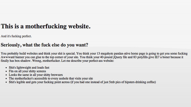
Let’s all take a look at this single serving site from Barry Smith and learn how we can make better internet. Yes, it contains lots and lots of cusses — it’s intended to illustrate how powerful simple design can be as long as the content is compelling. It’s hilarious and correct.
On first glance, Motherfucking Website looks like a relic from the Web 1.0 days; like a simple site that’s simple because the designer doesn’t have the tools or the knowledge to make something flashier. It looks like the web when connection speeds couldn’t support the behemoth sites that developers build today. It’s important to remember that sometimes all the ornamentation is superficial, and only distracts from what you’re trying to get across. Does Smith convey his message effectively? You’re motherfucking right he does. [Motherfuckingwebstie.com — Thanks Sean!]