Which countries are emerging superpowers? Which countries are in decline? This excellent infographic of population change, country by country, explains pretty much everything you need to know about what’s going to happen geopolitically in the next few decades.
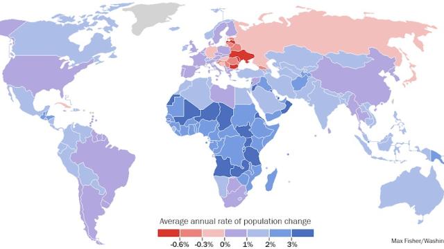
The data comes from the United Nation Population Fund, which has just released its State of World Population Report for 2013. What we’re looking at here is the estimated average annual rate of population change from 2010 to 2015: Blue means a country’s population is growing, and red means it’s shrinking. Purple means it will be about the same over that five-year period.
Why does this matter? An increase in population can be a sign of a healthy country, if the country has the economic resources to support that growth. In developing countries, better access to clean water, food and technology is almost certainly contributing to the population growth since people are living longer to a higher quality of life. However, as the report outlines, many times that growth in population is also due to an increase in the birth rate to young mothers, meaning that women are less likely to receive education or financial stability.
Most of the countries that are growing at a rate of 2 per cent or more are in Africa (and almost all the countries in Africa are growing). But there are some some outliers. Several countries in Central America like Guatemala and Belize are seeing 2 per cent and higher. Lebanon is growing at 3 per cent (I got the exact figures for all these from looking at the data [PDF]). And the Middle East will also see a population boom with 2 per cent or higher growth in Afghanistan, Iraq, Yemen and United Arab Emirates. The Middle East is also where you’ll find the countries that are growing faster than any other place on the planet: Qatar (5.9 per cent) and Oman (a whopping 7.8 per cent), two oil-rich, financially booming countries with large expat populations.
Now for the population losers: Eastern European countries are bleeding residents. Ukraine and Bulgaria are both seeing the most extreme population drops (-0.8 per cent), with other countries like Georgia, Latvia, Serbia, Romania and Belarus all in the negatives as well. These countries not only have low birthrates, they also have people emigrating elsewhere looking for better living conditions. But what’s more concerning are three superpowers — Germany, Russia and Japan — where population is decreasing, denoting that people are not only leaving but that the country is ageing in a way that more people are dependent on the government to care for them. This could lead to severe economic distress for these countries.
How are we doing here in Australia? We’re OK, actually. Our growth is a healthy 1.3 per cent — even though our birthrates are low — thanks to strong immigration. Interestingly, the countries seeing the healthiest overall growth are also the ones with the most welcoming immigration policies, while countries like Japan that have the most stringent immigration laws may be most in need of new residents to boost their economies. [Washington Post]