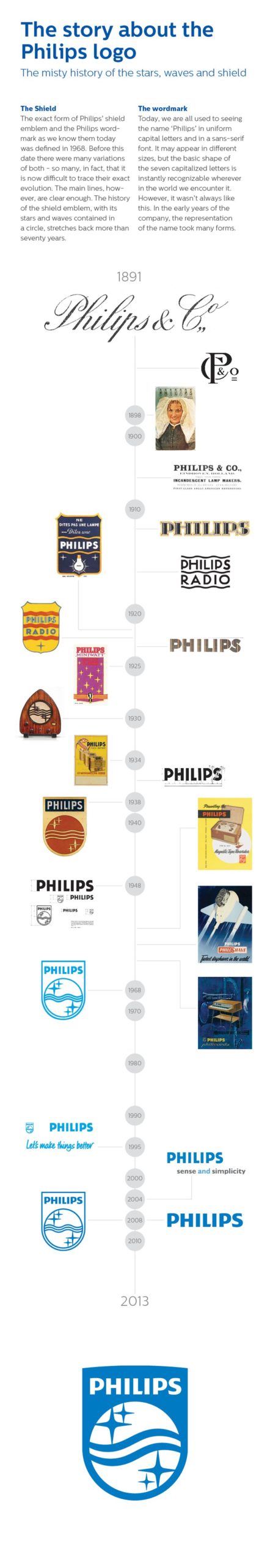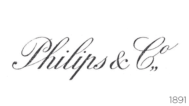
Seventy-five years after Philips debuted a circular “shield” logo filled with twinkling gold stars, the Dutch electronics giant has brought the design back as a bold monochromatic logomark. The new version is “modernised for use in this digital age,” according to company reps — in other words, it’s been flattened and simplified for digital screens.
The shield has appeared perennially in the company’s 120-odd years of operation, as you can see in our GIF history above, but it fell out of favour over the past few decades. A simpler, bolder logo that will read clearly on mobile devices definitely does make sense, given Philips’ recent forays into apps.
Along with the new mark, the company is swapping out its old tagline — “sense and simplicity” — for a more sassy “innovation and you”.
Check out a nice little graphic history of the company’s identity below. [StockLogos via Design Taxi]