The Enlightenment gave us many foundational ideas: Gravity! Democracy! Infographics! Wait, what? Yep. One of the age’s lesser-known byproducts was the niche field of “graphical statistics,” aka data visualisation. And it’s made more of an impact on our world that you might imagine.
William Playfair was a Scottish inventor and engineer (and reported scoundrel) who would’ve celebrated his 254th birthday at the end of September. It’s hard to imagine, but before Playfair’s time, words and drawings were two distinct ways of communicating that rarely converged. But as the burgeoning Enlightenment gave birth to modern science and the first traces of the Industrial Revolution, economists, engineers and historians found a need for a new language: One that could quantify data visually. Playfair, a voracious writer who roamed in the same circles as many of the day’s important thinkers, happened to be in the right place at the right time.
Playfair was often involved with transcribing or interpreting the work of others — which, incidentally, gained him a reputation as a plagiarist. But to convey the data other scientists were publishing, he started to turn to graphics. Beginning in the 1750s, he published a series of charts that represent the first instances of line graphs, bar charts, pie charts and circle graphs. Below are some of the earliest known data graphics.
The Line Graph
It was Playfair’s older brother — who required him to record every day’s temperature and record them a la the naturalists of the day — who inspired the line graph. It was simply a matter of tallying up each date’s number and connecting the dots.
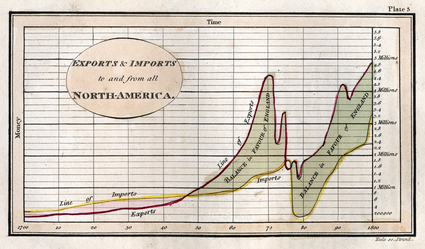
This chart shows imports and exports from America during the 18th century — that crux in the middle? That’s the Revolutionary War.
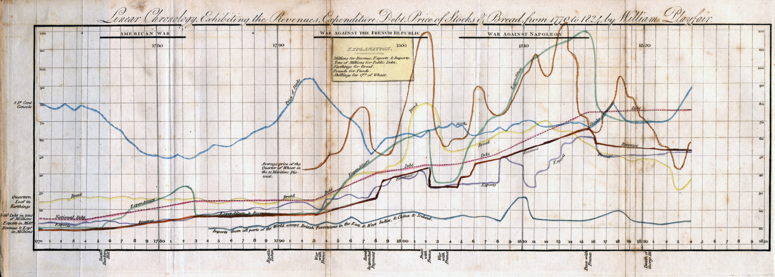
It looks complicated, but this 1824 line graph is actually fairly simple: It compares the price of bread and stocks, as well as national expenditures and debt, against wars fought by England between 1770 and 1824.
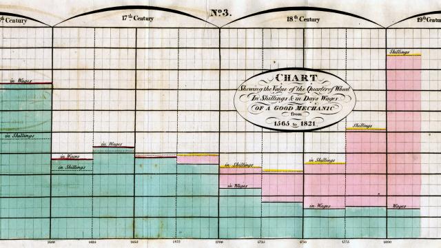
The Bar Chart
The provenance of the bar chart is less clear. Many scholars attribute it to the fact that Playfair had seen the work of Joseph Priestly, the creator of the first timeline chart — in this case, the biography of a single person.
This 1821 bar chart — quoted by many as one of the first — show a simple but powerful thing: How much a quarter of wheat cost over three centuries, show both in shillings and the days’ wages of a (good) mechanic. The cost in shillings goes up (presumably due to inflation), but the cost in wages goes down as workers’ rights improve.
The Circle Graph and Pie Chart
No one really knows how Playfair dreamt up the pie chart. Some wonder whether it’d always been around — and if Playfair was just the first to actually publish one. “Familiarity has dulled our sense of the importance of Playfair’s diagrams and it is easy to underestimate the ingenuity that was required to invent them,” argues historian Ian Spence in his concise 2005 paper on Playfair (PDF).
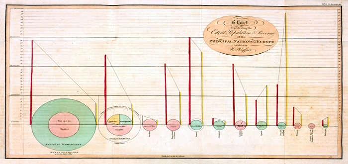
This is one of Playfair’s most well-known charts, though it’s tough to find a good scan of it. It shows population size versus land area — all compared to taxation.
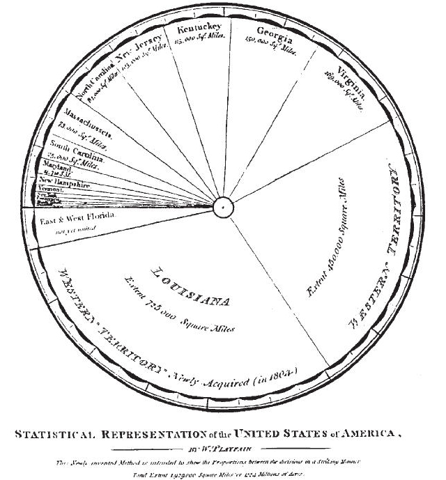
A pie chart showing each state in the United States, part of Playfair’s translation of A Statistical Account of the United States of America by D. F. Donnant.
To us, pie charts hearken back to bad PowerPoint slides of yore (in fact, even data visualisation expert Edward Tufte says they should never be used). But the pie, along with the bar chart, were revolutionary in Playfair’s time.
And they’ve had a massive impact on ours: Today, these prototypical forms are almost universal, allowing us to perceive meaning (or non-meaning) in a single glance. It also was a precursor to modern UI design, since it provided a common vocabulary for expressing information visually.
Sources: Princeton [PTAK [No Humble Pie: The Origins and Usage of a Statistical Chart by Ian Spence]
Top picture: PTAK