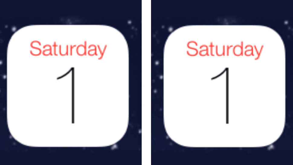
Rejoice, humans of the Earth, for the ugly off-centre 1 in Apple iOS 7’s Calendar app icon has been at last, FIXED! It took almost two entire years of design rants after every update, but someone in Cupertino has at last listened and corrected what was a horrible design decision made by someone else who is no longer in Cupertino. iOS 7 beta 4 has a perfectly centred “1”.
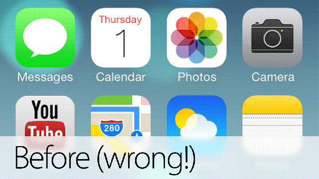
Before, Apple centred the first day of the calendar using its bounding box. This was especially horrible and annoying in any version of iOS previous to 7.0:
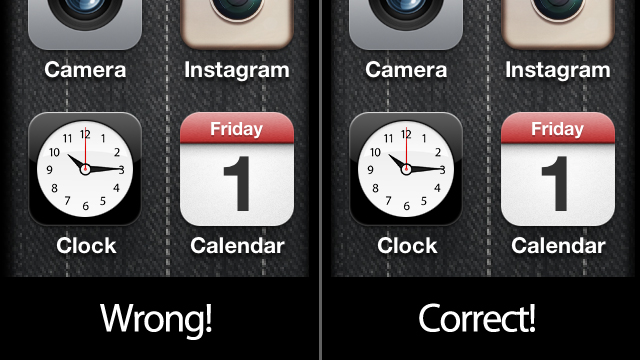
In iOS 7 things got sightly better but by no means perfect:
The problem on the left was not as obvious as before because it was a lighter font.
But instead of using the numeral’s bounding box, they should have used optical positioning, taking into consideration the visual distribution of the figure so it didn’t appear horribly off centre.
Now, this has been corrected. Notice that the stem is not centred in the corrected version, which is the one I kept pushing for. It’s just moved sightly to the left to optically compensate for the ear on top of the one.
It’s good to see that with Jony Ive at the helm Apple’s former insanely obsessive attention to detail is coming back to Apple. Even better: they listen.