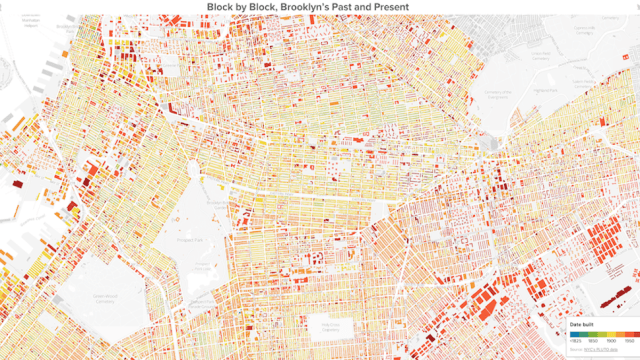
One of the most incredible things about Brooklyn — and New York City in general — is the consistent commingling of the young and the old, the modern and the antiquated. And never have we seen anything that captures this quality quite like Thomas Rhiel’s visualisation of Brooklyn, which maps every building based on the year it was constructed.
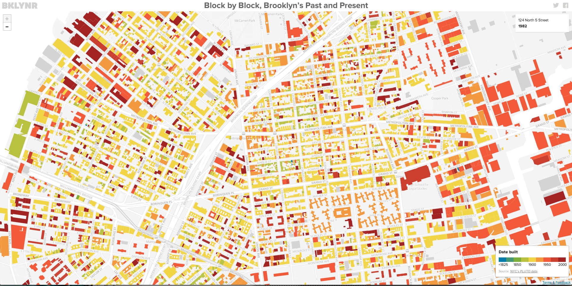
With roughly 320,000 buildings scattered across the borough, this was no easy task. Pulling data from a combination of the NYC Department of City Planning and the City’s NYCityMap, Rhiel was able to get to work plotting and shading the sporadic evolution of an area that’s still very much growing.
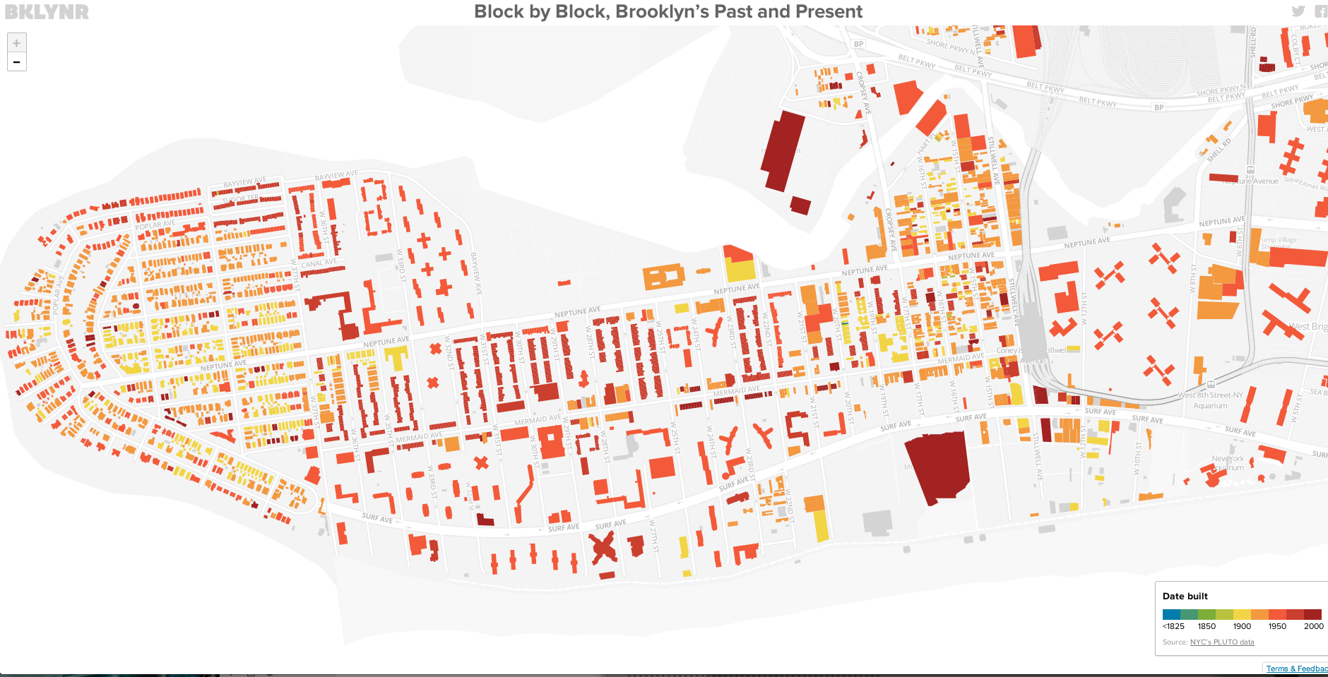
While the south-eastern portions of Brooklyn exist largely as blocks of red, head north-west and more and more mid-1800s green begins to peek through in old-world-charmed bunches. It really lets you get a feel for the outward expansion in more recent years, away from Manhattan and towards cheaper property values. It’s something you vaguely pick up as you walk through the streets, but this bird’s eye offers a totally new perspective that’s sure to change the way Brooklyners look at their borough. [BKLYNR via @andrewdelcolle]