Watching the animation above, it’s hard not to get goosebumps when the the clock hits 2012 and the whole United States goes red. That’s what it looks like from space when the Earth is parched.
The visualisation above combines data from NASA’s twin GRACE satellites with other satellite data to figure out how much water is stored at both the surface and root levels of the earth. NASA’s GRACE satellites are the first orbiters which don’t measure electromagnetic radiation. Instead, the the satellites take very detailed measurements of variations in Earth’s gravitational field, which in turn directly correlates to earth’s mass.
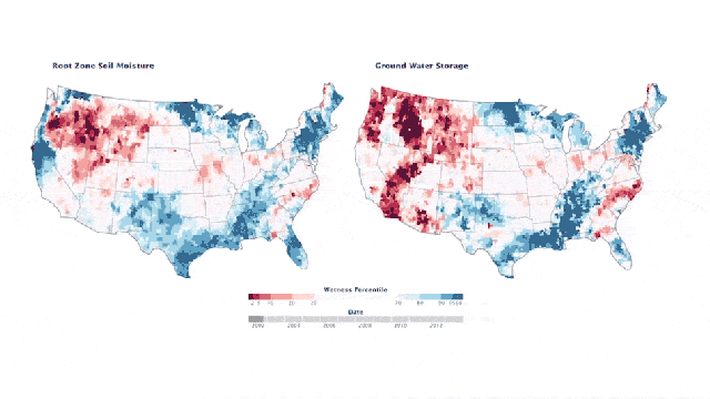
The release from NASA’s Earth Observatory explains that the ominous dark red is a very bad thing.
The first map shows the “wetness” or moisture content in the “root zone” — the top meter (39 inches) of soil. The second map shows water storage in shallow aquifers. The current water content is compared to a long-term average for early June between 1948 and 2009. The darkest red regions represent dry conditions that should occur only 2 per cent of the time (about once every 50 years).
In other words, it’s been a rough couple years for the United States’ water table. Oof. [NASA]