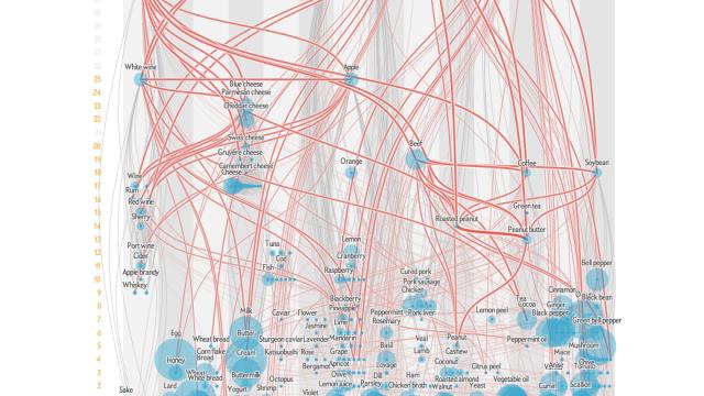
If you’ve ever wondered why certain foods taste great together — tomato and basil, peanut butter and jam — then wonder no longer. This amazing visualisation from Scientific American shows how flavours are linked and explains why certain combinations work so well.
In the fully interactive visualisation, each blue dot is a food which sits in one of 14 category columns — herb, meat, cereal and so on. The size of the dot represents how common the food is, and lines link foods which share at least one flavour-related chemical compound. The thicker the line, the more shared compounds.
Vertical height on the chart relates to the number of links, so those toward the bottom — like violet and sumac — are unique, while those at the top, like roast beef and strawberry, share lots of flavours with other foods. It’s great fun seeing how all these ingredients link up — and it might just tempt you to experiment more in the kitchen too. [Scientific American]